Introduction
Welcome back to the fourth and final part in this step-by-step guide to bulk RNA sequencing data analysis covering the streamlined workflow from raw reads to publication-ready figures for differential expression analysis.
In part one of this series we undertook raw sequencing (FASTQ) data processing on a HPC. In part two we read the resultant transcript counts matrix and experimental metadata into R and carried out exploratory and quality control (QC) analyses, before undertaking differential expression testing in part three.
This final post in the series will explore some common visualisation techniques that can be used to summarise the statistical testing results and enable conveyance of the insights obtained from our data.
Note: This tutorial is going to continue directly on from the previous tutorial in this series, so I will be assuming that you have all the requisite files downloaded, your project directory setup, software and dependencies installed and loaded, and the relevant objects created previously available in your R environment.
If you have not followed the previous tutorials in this series and just want to experiment with making some plots, the requisite DESeqDataSet object and annotated DE testing result for this tutorial can be downloaded as an RData file from here. Place this into the ./data/processed folder of your project directory tree and read the file by running the code below:
# load dds and res_cln objects
load(file = here("data", "processed", "ir_versus_ctr.rda"))
Now that everyone is on the same page, let’s make some plots!
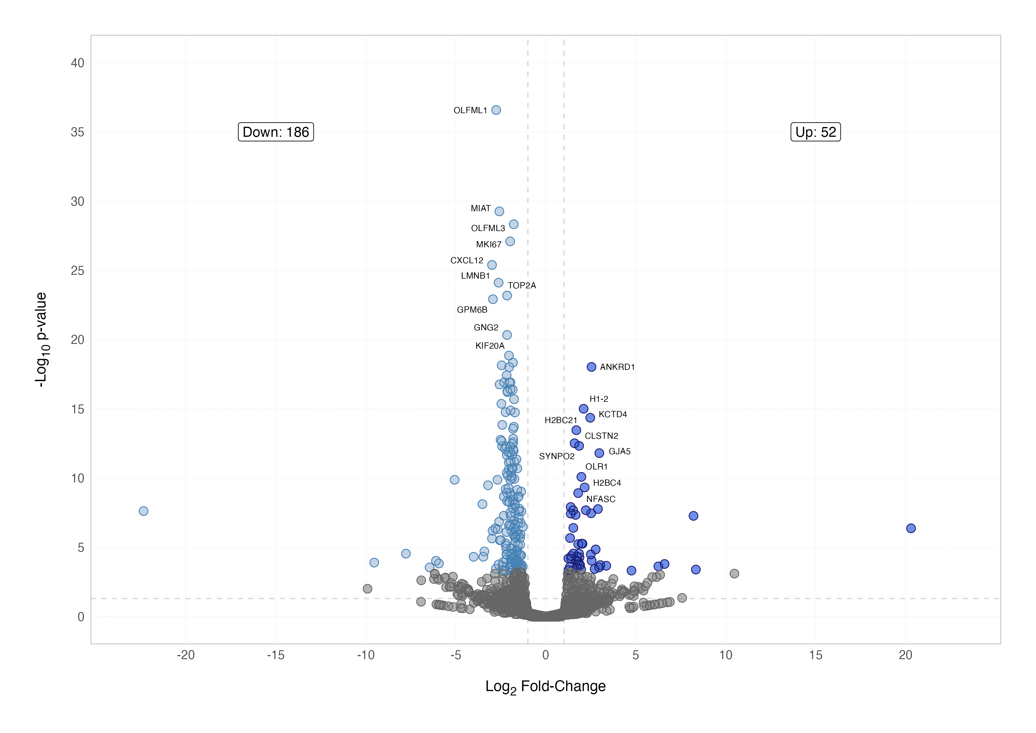
Volcano Plot
A volcano plot is one of the most effective ways to visualise differential expression results. It combines statistical significance and the magnitude of the difference between conditions by plotting the –log10 adjusted p-value (y-axis) against the log2 fold-change (x-axis). Points far from the origin in either direction stand out as both highly significant and biologically interesting.
To begin, we can generate a simple volcano plot using the cleaned differential expression results stored in the res_cln data frame.
# basic volcano plot
ggplot(res_cln, aes(x = lfc, y = -log10(pvalue))) +
  geom_point()
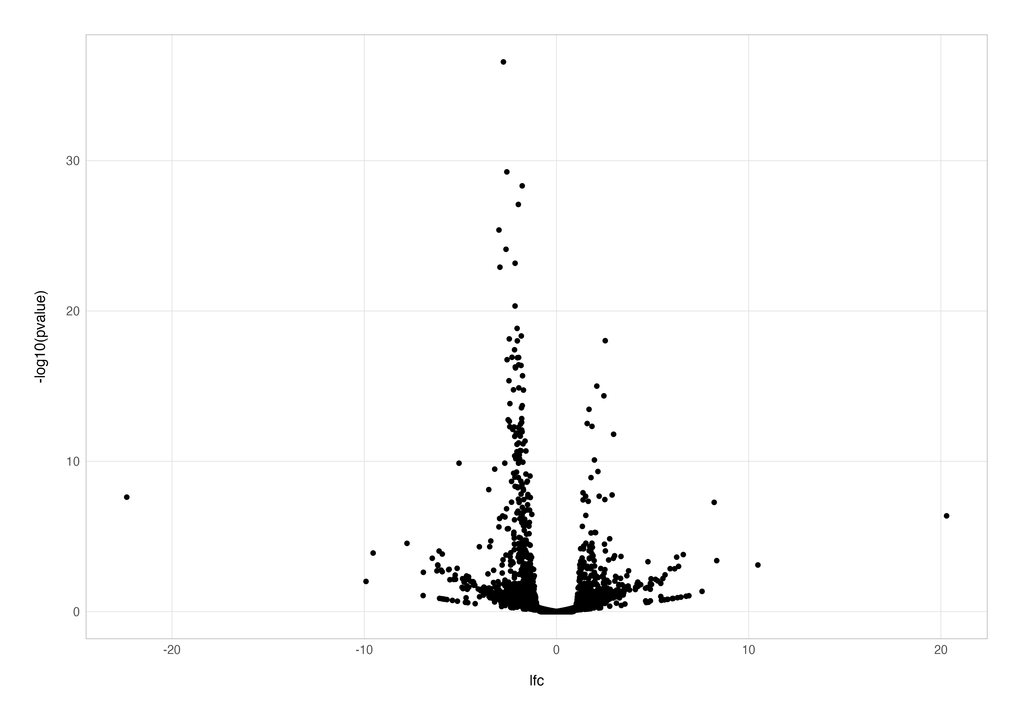
This plot is a good starting point but lacks detail. For instance, it doesn’t distinguish between significant and non-significant results. By adding a new column to indicate significance, we can colour the points accordingly, making the plot more informative.
# simple coloured points
res_cln %>%
  mutate(signif = padj < 0.05 & abs(lfc) > 1) %>%

  ggplot(aes(x = lfc, y = -log10(pvalue), colour = signif)) +
  geom_point()
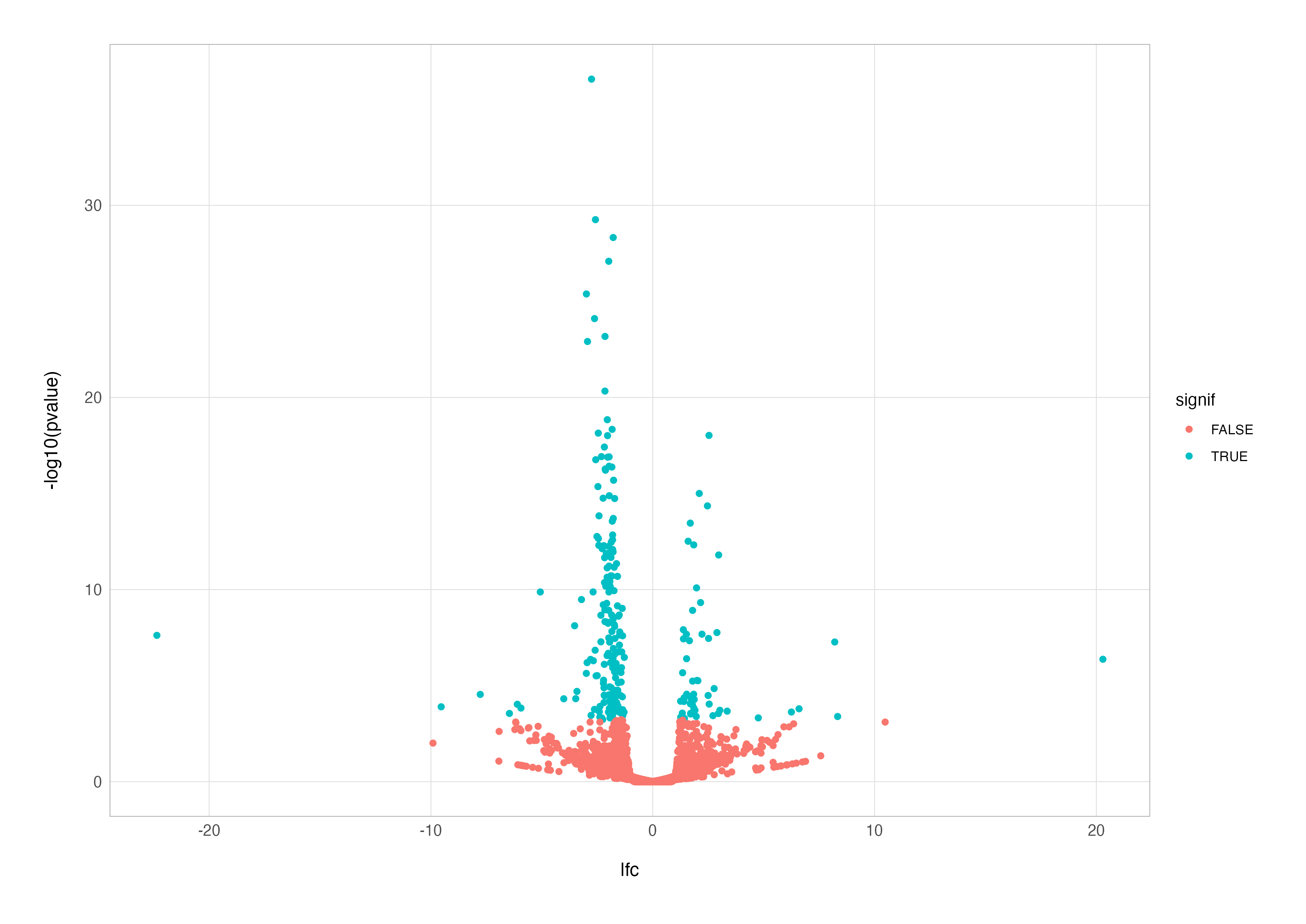
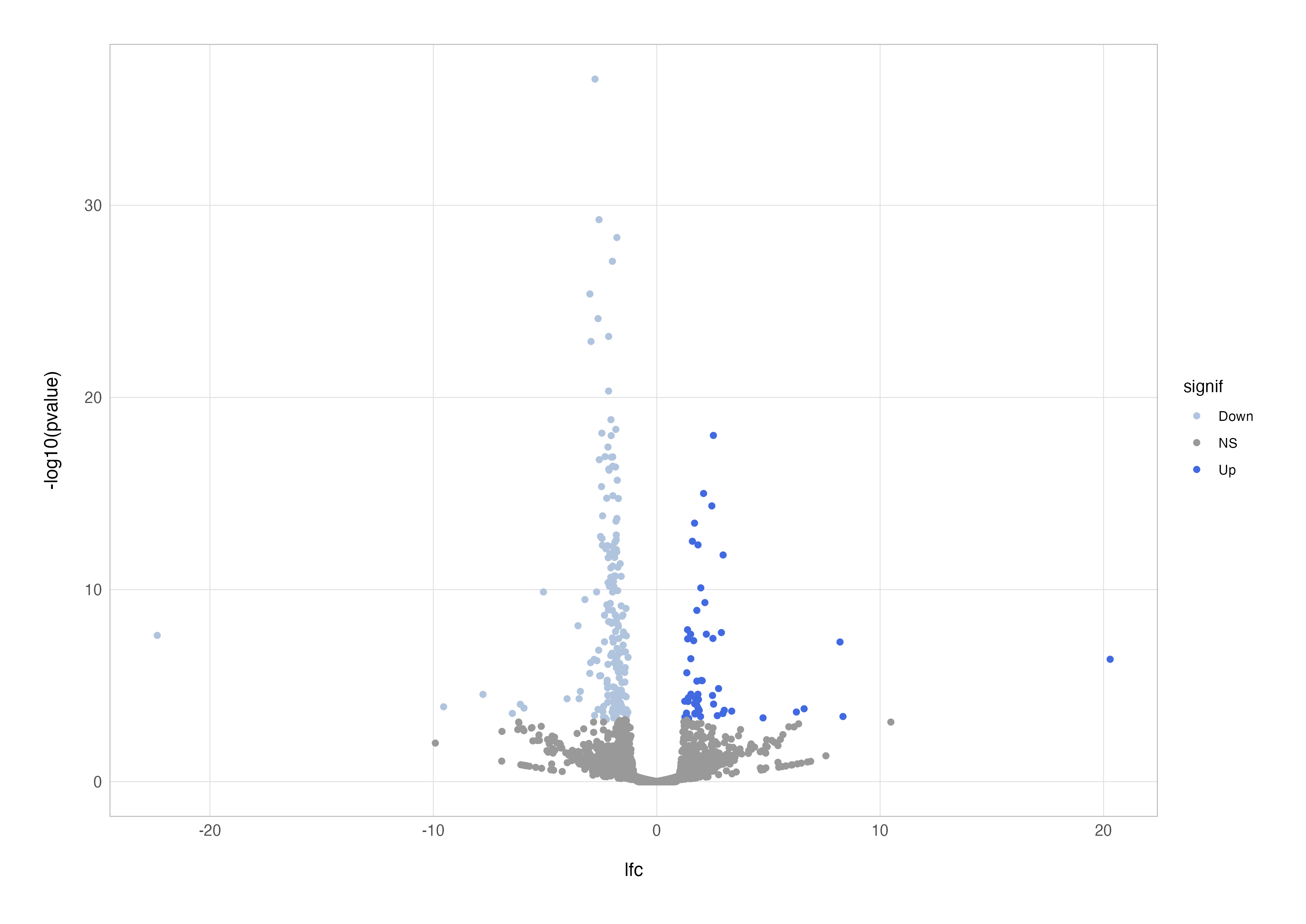
This improvement highlights significant genes, but we can take it a step further by distinguishing between up- and down-regulated genes. By using the case_when() function to categorise points, we can colour genes based on their direction of regulation.
# differential coloured points
res_cln %>%
  mutate(
    signif = case_when(
      padj < 0.05 & lfc > 1 ~ "Up",
      padj < 0.05 & lfc < -1 ~ "Down",
      padj > 0.05 ~ "NS"
    )
  ) %>%

  ggplot(aes(x = lfc, y = -log10(pvalue), colour = signif)) +
  geom_point() +
  scale_color_discrete(type = c("lightsteelblue", "grey60", "royalblue"))
Labelling specific genes can further enhance the plot’s usefulness, especially when highlighting biologically significant findings. Instead of overwhelming the plot with all gene names, we can selectively label the top 10 up- and down-regulated genes. Using the geom_text_repel() function from the ggrepel package ensures labels don’t overlap.
# annotated points
up <-
  res_cln %>%
  filter(lfc > 0) %>%
  slice_head(n = 10) %>%
  pull(symbol)

dn <-
  res_cln %>%
  filter(lfc < 0) %>%
  slice_head(n = 10) %>%
  pull(symbol)

res_cln %>%
  mutate(
    signif = case_when(
      padj < 0.05 & lfc > 1 ~ "Up",
      padj < 0.05 & lfc < -1 ~ "Down",
      padj > 0.05 ~ "NS"
    ),
    label = if_else(symbol %in% c(up, dn), true = symbol, false = "")
  ) %>%

  ggplot(aes(x = lfc, y = -log10(pvalue), label = label)) +
  geom_point(aes(colour = signif)) +
  scale_color_discrete(type = c("lightsteelblue", "grey60", "royalblue")) +
  geom_text_repel()
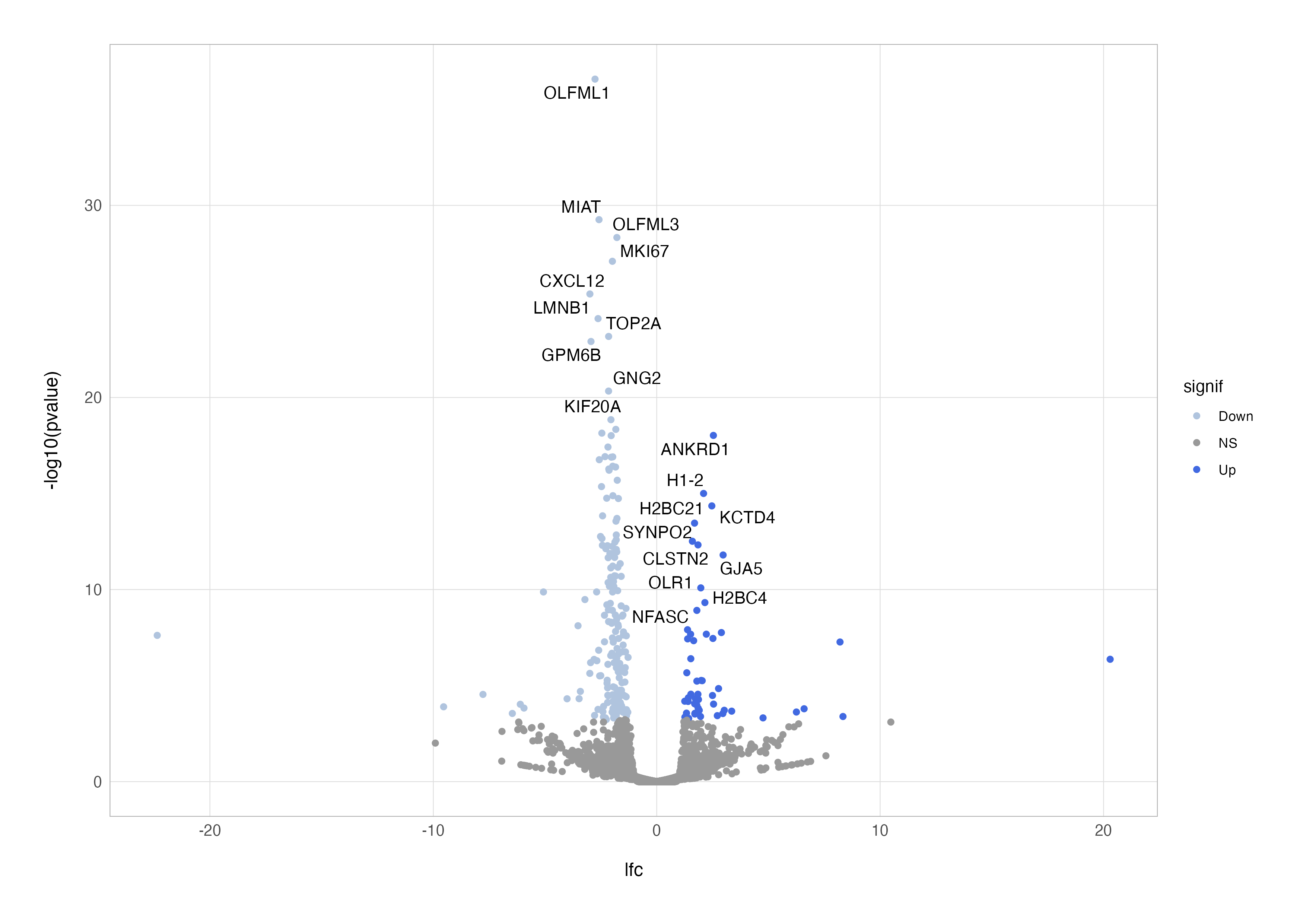
By combining these elements, we can customise the plot further to suit our dataset and biological questions. For example, instead of the most significant genes, you might choose to highlight genes in a specific pathway or those related to a hypothesis. In the plot below, I have tinkered with the ggplot2 aesthetics a little more to create a publication-ready figure.
Expression Plot
Expression plots are a powerful yet underutilised tool for visualising the expression levels of individual genes across experimental conditions, offering an intuitive way to validate statistical results by showing the actual distribution of normalised counts. These both direct complement the volcano plot and visual aid confirmation of differential expression.
To build an expression plot, we first extract the normalised counts for genes of interest. Here, I’ve chosen the top 15 most significant genes, but this can be tailored to highlight a specific pathway or gene set.
# subset DE testing result to top n most significant genes
top_res <-
  res_cln %>%
  slice_min(order_by = padj, n = 15)

# extract normalised counts matrix and subset to genes selected above
top_res_counts <-
  dds %>%
  estimateSizeFactors() %>%
  counts(normalized = TRUE) %>%
  as.data.frame() %>%
  filter(rownames(.) %in% top_res$ensembl)

# inspect the result
head(top_res_counts, n = 10)
                  ctr_bc_2  tgf_bc_4    ir_bc_5   ctr_bc_6  tgf_bc_7  ir_bc_12  ctr_bc_13 tgf_bc_14   ir_bc_15
ENSG00000011426  3732.2509 4020.6575 1176.88878  3548.5447 3981.9387 1193.7137  3694.6614 3460.2323  969.52236
ENSG00000046653   640.7015  145.8357   58.90107   521.1213  133.2389   87.3737   473.6476  142.8151   67.11284
ENSG00000066279  1367.9589 1588.9313  329.61948  1433.0837 1697.8438  343.5912  1794.8199 1238.6642  365.50683
ENSG00000089685   904.1324 1124.2918  207.28647   790.7925 1113.4962  220.7957   756.1558 1131.3195  199.27350
ENSG00000105989   989.7474 1666.0886  306.96522  1099.6389 1569.3635  247.9524   979.8519 1487.8905  230.24865
ENSG00000107562  9112.8265 5766.4470 1012.64540  8877.2837 6169.9112 1438.1239  8339.7686 5622.9941  861.10932
ENSG00000112984  1338.7933 1629.6296  251.46228  1111.4826 1541.7640  328.2418  1134.2337 1489.7574  287.03644
ENSG00000113368   774.2986 1217.5589   87.21890   754.3505 1235.3146  168.8438   751.9550 1121.9852  114.60807
ENSG00000115594 11402.7934 3480.5565 3084.37743 10936.2595 4072.3508 3437.0926 10596.6837 4346.9926 2739.23624
ENSG00000116774  4830.1932 6388.7925 1319.61061  4954.2969 6127.0844 1479.4493  4430.8631 6288.5311 1333.99669
The next step is to reformat the data into a long format suitable for plotting. Since tibbles in R do not support rownames, we first move the Ensembl IDs from the rownames into a dedicated column in the data frame before pivoting.
# pivot to long format data frame
top_res_counts_long <-
  top_res_counts %>%
  rownames_to_column(var = "ensembl") %>%
  pivot_longer(cols = !ensembl, names_to = "sample_id", values_to = "norm_count")

# inspect the result
print(top_res_counts_long)
# A tibble: 135 × 3
   ensembl         sample_id norm_count
   <chr>           <chr>          <dbl>
 1 ENSG00000046653 ctr_bc_2       641.
 2 ENSG00000046653 tgf_bc_4       146.
 3 ENSG00000046653 ir_bc_5         58.9
 4 ENSG00000046653 ctr_bc_6       521.
 5 ENSG00000046653 tgf_bc_7       133.
 6 ENSG00000046653 ir_bc_12        87.4
 7 ENSG00000046653 ctr_bc_13      474.
 8 ENSG00000046653 tgf_bc_14      143.
 9 ENSG00000046653 ir_bc_15        67.1
10 ENSG00000107562 ctr_bc_2      9113.
# ℹ 125 more rows
# ℹ Use `print(n = ...)` to see more rows
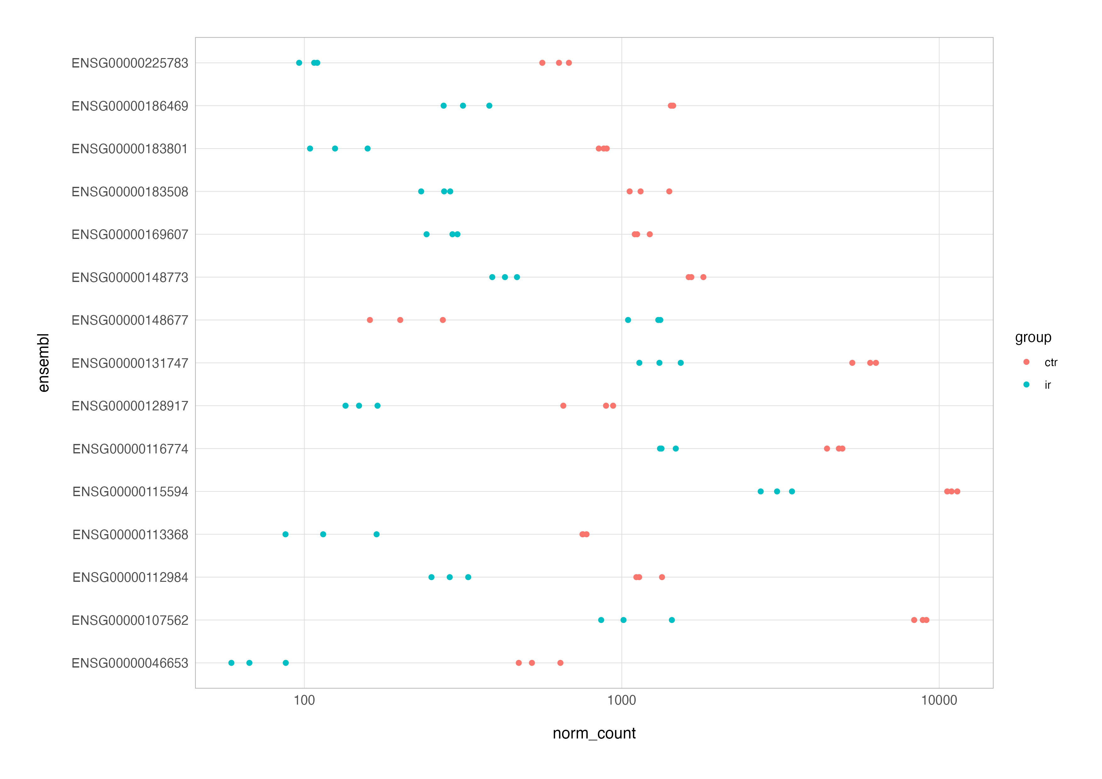
At this stage, we can create a basic expression plot. We’ll create a grouping variable from the sample IDs to colour the data points by replicate groups and enable exclusion of the TGF group data, as this is not part of the contrast of interest.
# basic expression plot
top_res_counts_long %>%
  mutate(group = str_remove(sample_id, "_.*")) %>%
  filter(group != "tgf") %>%

  ggplot(aes(x = norm_count, y = ensembl, colour = group)) +
  geom_point() +
  scale_x_log10()
To refine the plot, we can swap the Ensembl IDs for gene symbol annotation and reorder genes by the significance of differential expression (adjusted p-value) and add the metadata for additonal annotation e.g., colouring by group.
# join with metadata and columns from de testing result
top_res_counts_annot <-
  top_res_counts_long %>%
  left_join(top_res, by = "ensembl") %>%
  left_join(as.data.frame(colData(dds)), by = "sample_id") %>%
  filter(group != "TGF") %>%
  mutate(symbol = fct_reorder(symbol, padj, .desc = TRUE))

# expression plot
top_res_counts_annot %>%
  ggplot(aes(x = norm_count, y = symbol, colour = group)) +
  geom_point() +
  scale_x_log10()
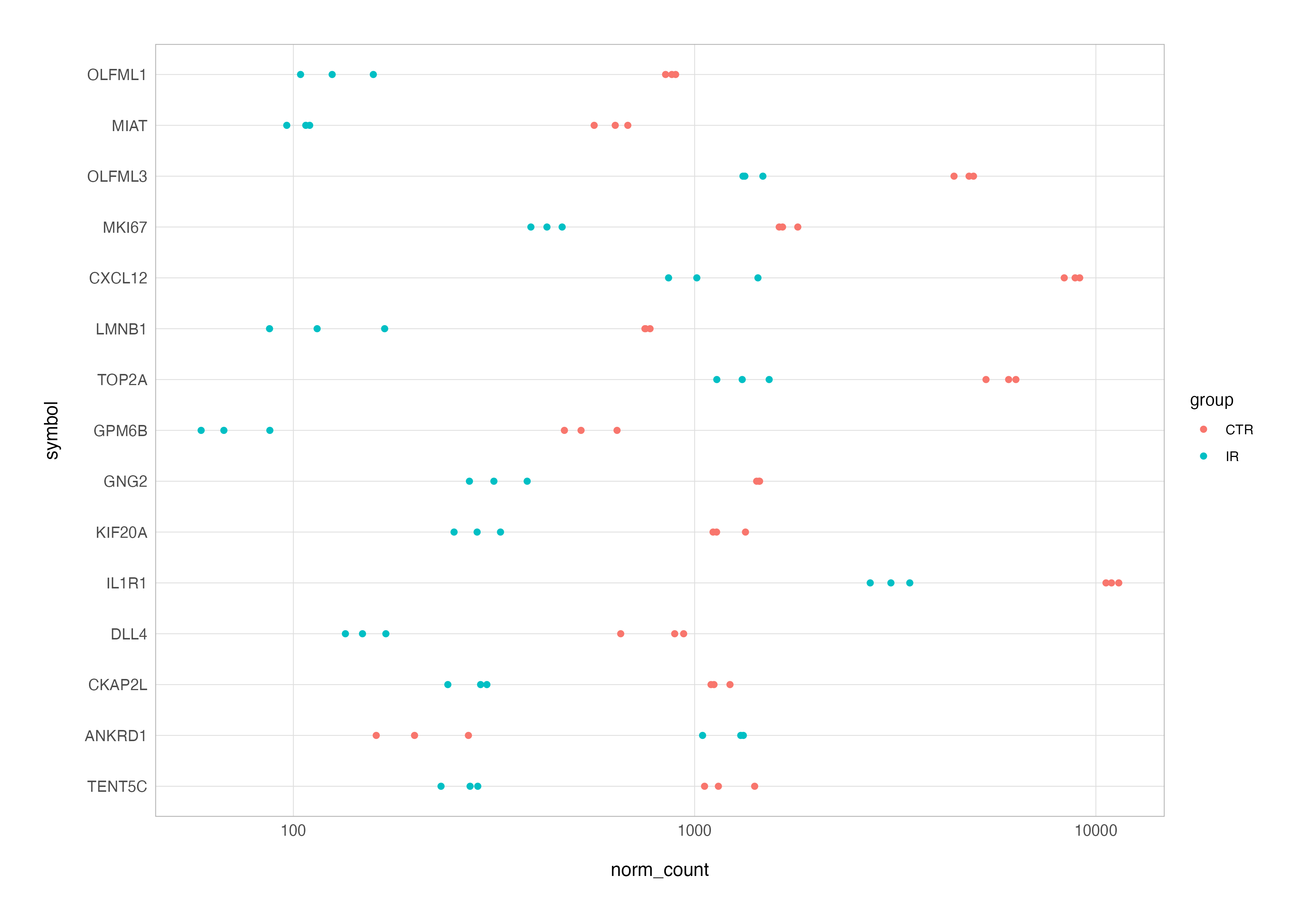
Finally, just as with the volcano plot we created earlier, spending time refining the plot aesthetics - such as adjusting colours, axis labels, or titles - can transform this preliminary version into a polished, publication-ready figure.
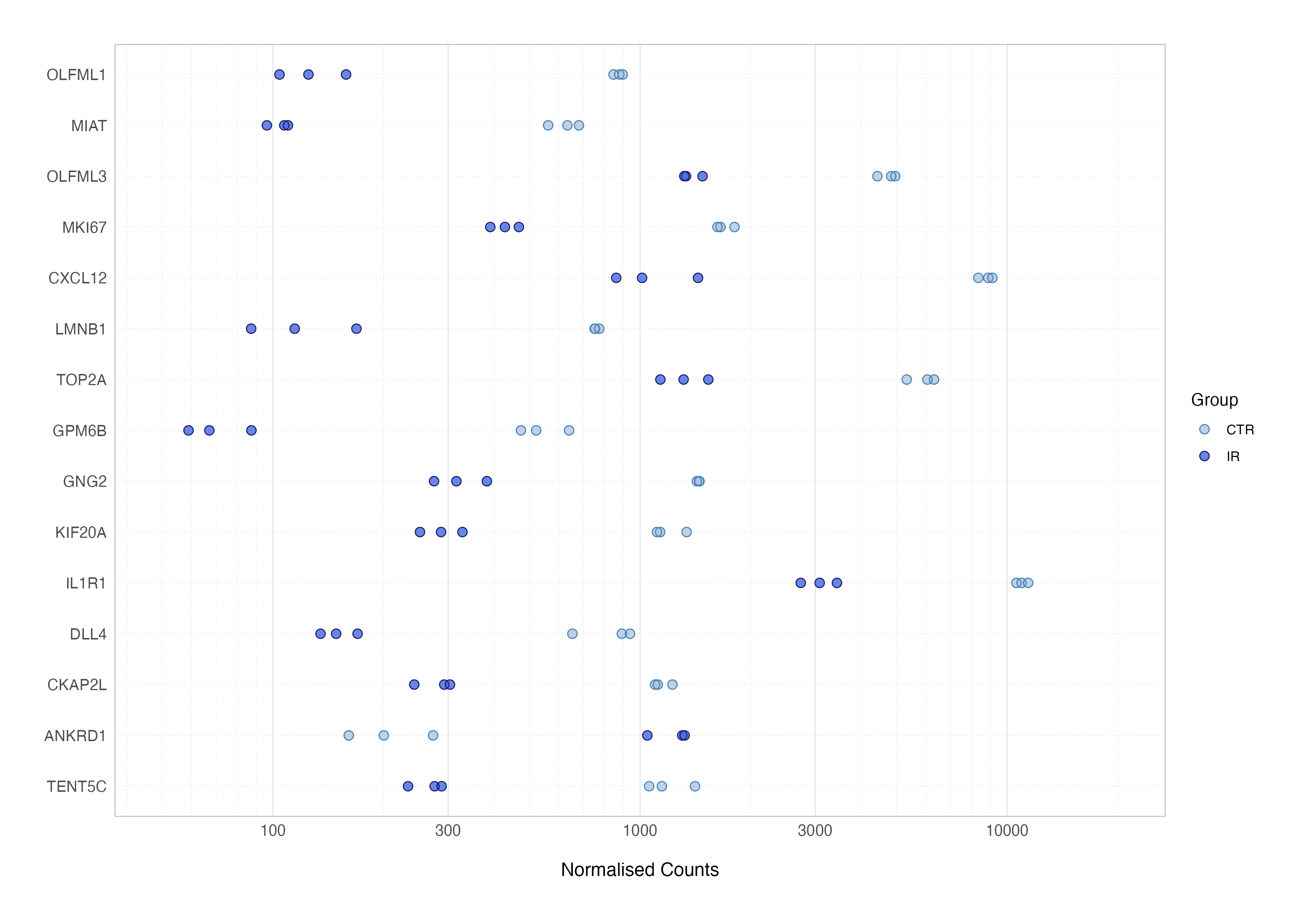
When interpreting expression plots, consistent clustering of samples within the same condition indicates low variability and reliability, while separation between groups reflects robust differential expression. Outliers and overlapping distributions should be carefully examined, as they could highlight data issues.
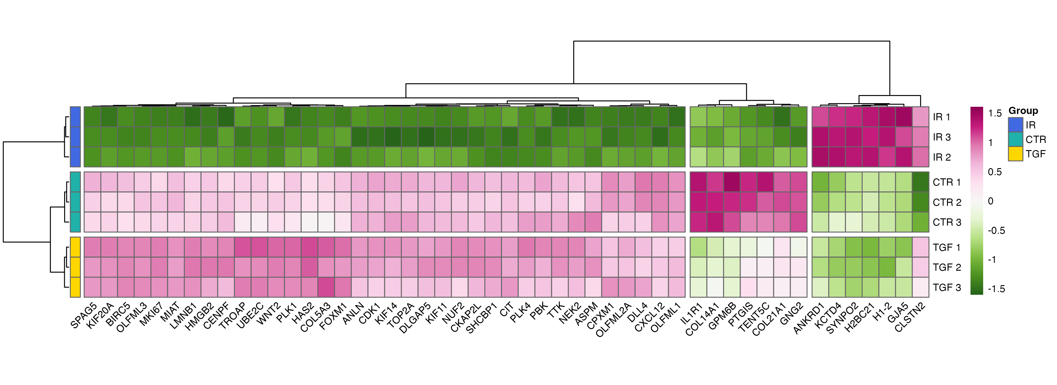
Clustered Heatmap
Clustered heatmaps are a powerful way to visualise patterns of gene expression across multiple samples. By clustering genes and samples with similar expression profiles, they reveal underlying structure in the data, such as co-regulated genes or the effects of experimental conditions. This visualisation is especially useful for identifying broader trends that might not be apparent from other plots.
Although ggplot2 has a geom_tile() function to make heatmaps, specialised packages such as pheatmap offer more functionality such as scaling values and clustering the data.
For our heatmap, we’ll use variance-stabilised counts, as these are more suitable for visualisation, particularly those using distance measures such as heatmaps with hierarchical clustering. We’ll start by selecting the top 50 differentially expressed genes based on significance.
# top 50 de results
top_results <-
  res_cln %>%
  slice_min(n = 50, order_by = padj)

# extract subsetted vst counts matrix
top_counts <-
  dds %>%
  vst() %>%
  assay() %>%
  subset(subset = rownames(.) %in% pull(top_results, ensembl))
With these data, we can create a basic heatmap. Note that the default colour palette goes from low expression in blue to high expression in red, which is a good alternative to the traditional red/green heatmaps which are not suitable for those with red-green colour-vision deficiency.
# basic heatmap
pheatmap(
  mat = top_counts,
  scale = "row"
)
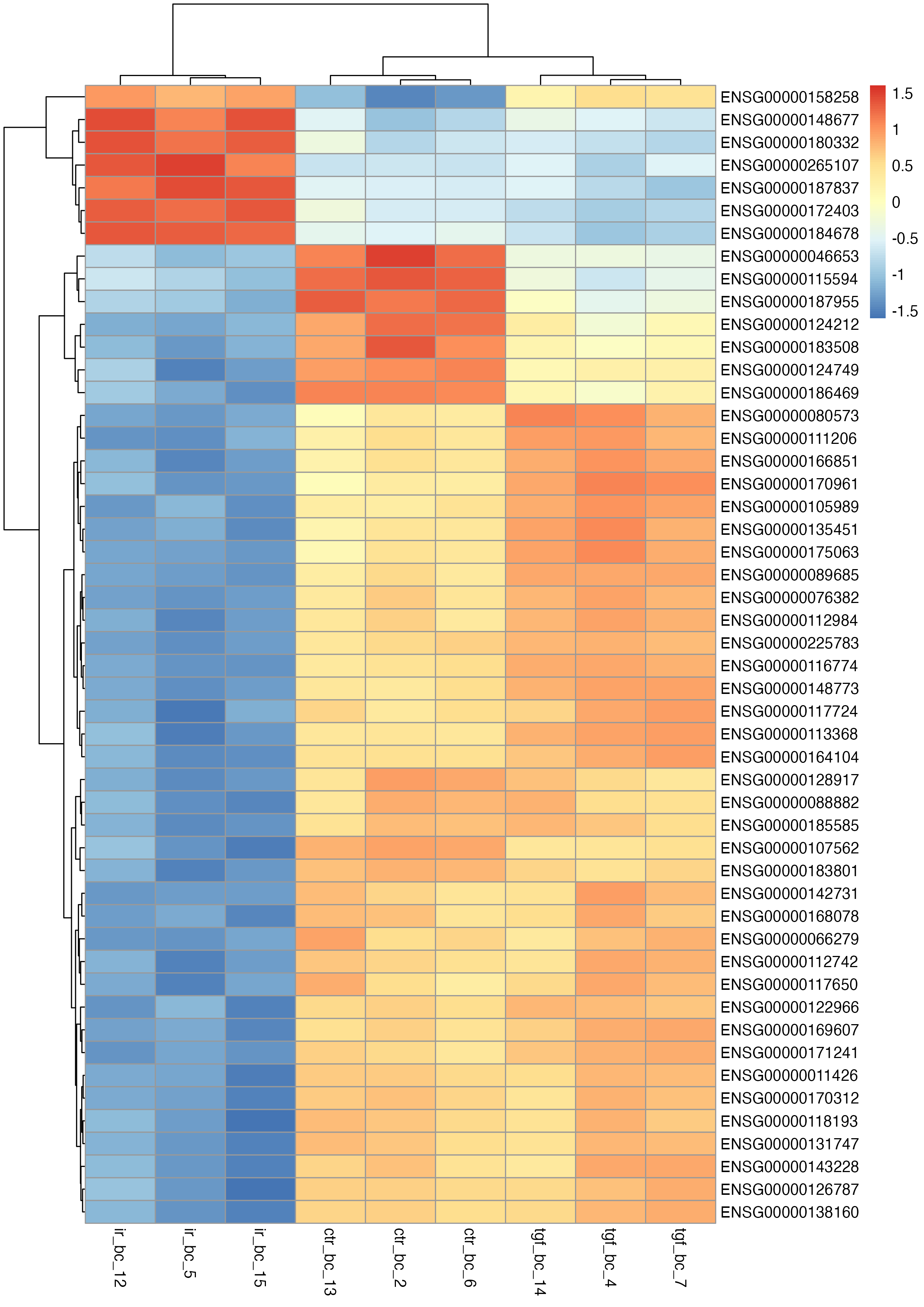
This plot provides a good starting point but isn’t very interpretable due to the Ensembl IDs in the row labels. To make it more user-friendly, we can replace these with HUGO gene symbols.
# change the ensembl ids to gene names
tc_symbol <-
  top_counts %>%
  as.data.frame() %>%
  rownames_to_column(var = "ensembl") %>%
  left_join(select(top_results, ensembl, symbol), by = "ensembl") %>%
  column_to_rownames(var = "symbol") %>%
  select(!ensembl) %>%
  as.matrix()

pheatmap(
  mat = tc_symbol,
  scale = "row"
)
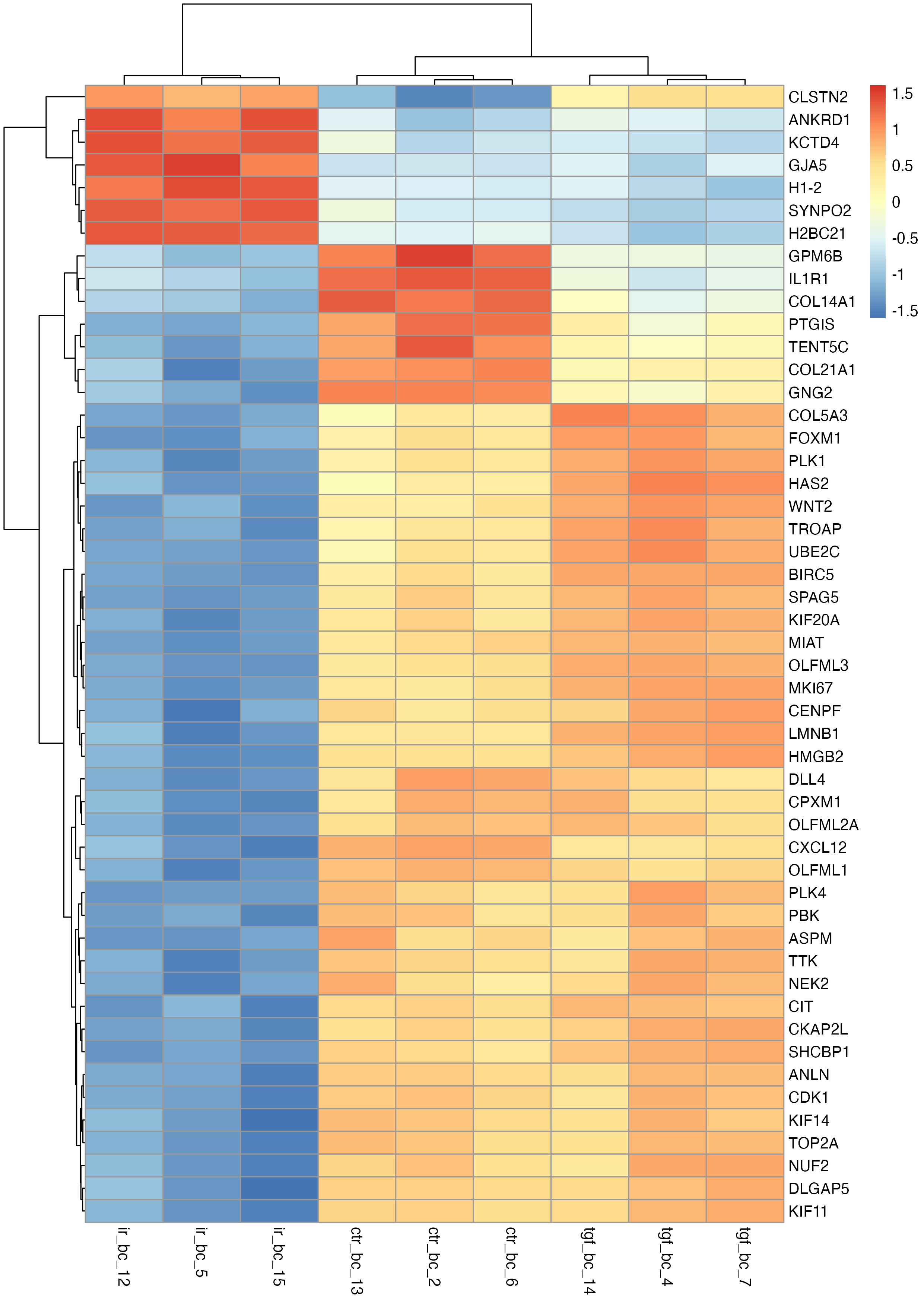
Note that there are a few ways of doing this, one of which is to use the labels_row argument. However, I personally prefer the above approach to using the labels_row option, mainly because this method enables dendrogram customisation and optimisation (as shown in my final example that uses MOLO method with average linkage) without the risk of mislabelling, or the hassle required to reorder the lables to avoid mislabelling.
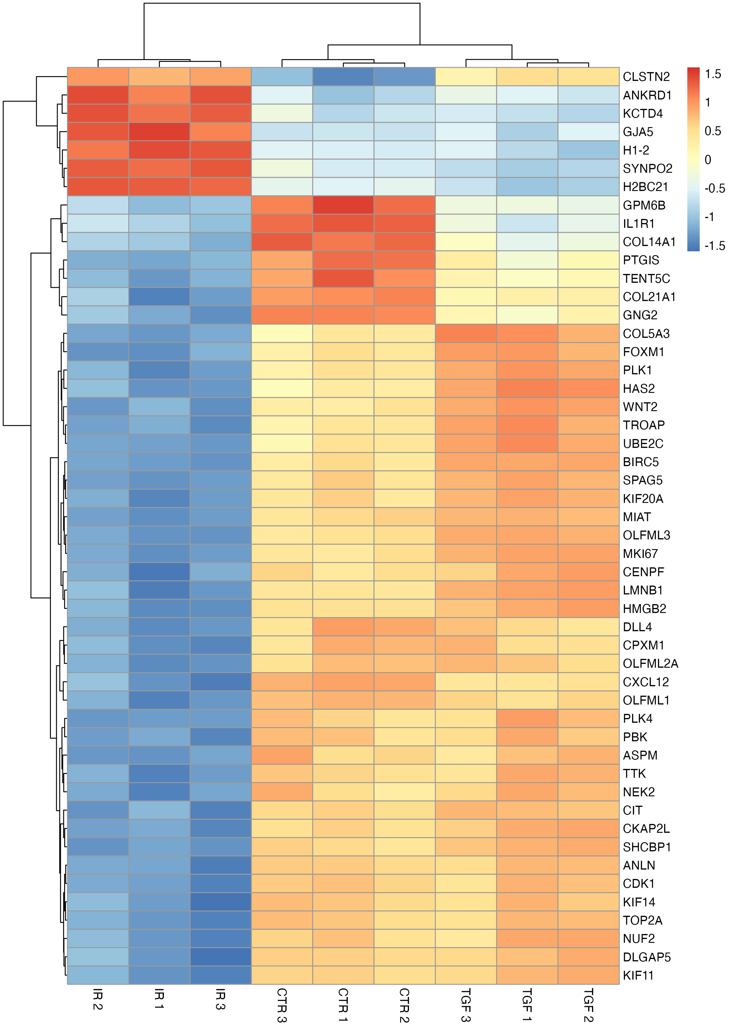
The column names can also be updated to reflect the experimental group and replicate to improve clarity.
# modify column names
col_labs <-
  dds %>%
  colData() %>%
  as.data.frame() %>%
  select(sample_id:rep) %>%
  mutate(label = str_c(group, rep, sep = " ")) %>%
  pull(label)

pheatmap(
  mat = tc_symbol,
  scale = "row",
  labels_col = col_labs
)
To add another layer of information, we can annotate the columns with sample metadata, such as experimental groups, using the annotation_col argument - this can be a little trickier than our previous modifications but essentially requires a data frame where the rownames match the colnames in the matrix passed to the pheatmap function.
# add sample info
sample_info <-
  dds %>%
  colData() %>%
  as.data.frame() %>%
  select("Group" = group)

pheatmap(
  mat = tc_symbol,
  scale = "row",
  labels_col = col_labs,
  annotation_col = sample_info,
  annotation_names_col = FALSE
)
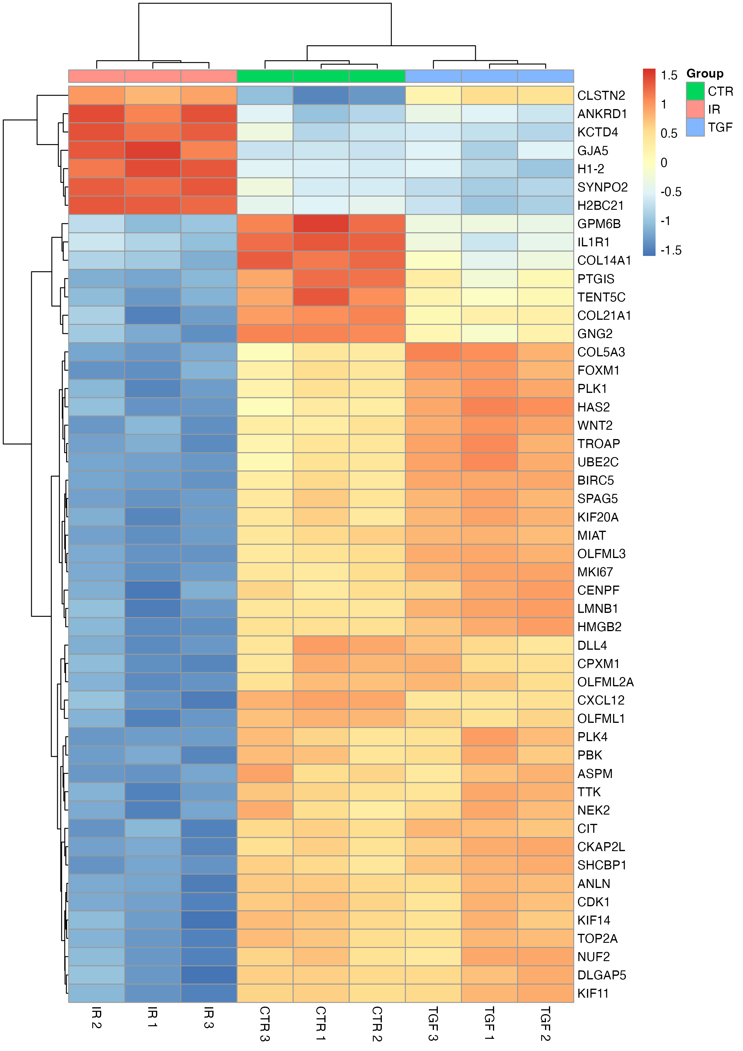
This annotated heatmap offers a much clearer view of the patterns in the data, highlighting how genes and samples cluster together.
For publication-ready figures, you can customise the heatmap further. Options include modifying the clustering algorithm, scaling, colour schemes, or even defining the order of rows and columns (manually or using other algorithms); doing so relies on a more in-depth understanding of unsupervised clustering and empirical clustering coefficient calculation, as well as lower-level familiarity with pheatmap and other great packages such as cluster or dendsort; all topics which are outside the scope of this tutorial. One for future, perhaps? Let me know in the tutorial video comments.
To save your heatmap, you can assign it to an object and use ggsave() for export.
# save output
heatmap <-
  pheatmap(
    mat = tc_symbol,
    scale = "row",
    annotation_col = sample_info,
    annotation_names_col = FALSE,
    silent = TRUE
  )

ggsave(
  plot = heatmap,
  filename = "heatmap.png",
  device = "png",
  path = here("results", "figures"),
  width = 8.27,
  height = 11.69,
  units = "in",
  dpi = 300
)
Adding the silent = TRUE argument here prevents the assignment operation also printing output to the plot viewer.
Summary
In this tutorial, we explored three core visualisation techniques for RNA-Seq differential expression analysis: volcano plots, expression plots, and clustered heatmaps. Each serves a unique purpose, from highlighting significant genes to uncovering broader patterns in the data.
From this point, there are many more analyses and visualisations to consider, such as pathway over-representation analysis, gene set enrichment analysis (GSEA) and variants thereof, myriad graph network analyses, or even preparing data for machine learning applications. I plan to cover some of these in future blog posts, so stay tuned!
If you’ve found this post or series on bulk RNA-Seq data analysis helpful, I’d love to hear your feedback. Please let me know if there’s anything you’d like me to explore in future tutorials.
See you next time.
Thanks for reading. I hope you enjoyed the article and that it helps you to get a job done more quickly or inspires you to further your data science journey. Please do let me know if there’s anything you want me to cover in future posts.
If this tutorials has helped you, consider supporting the blog on Ko-fi!
Happy Data Analysis!
Disclaimer: All views expressed on this site are exclusively my own and do not represent the opinions of any entity whatsoever with which I have been, am now or will be affiliated.