Introduction
Welcome back to my step-by-step guide through the journey of bulk RNA sequencing data analysis! This series of tutorials aims to navigate a streamlined bulk RNA-Seq data workflow from raw reads to publication-ready figures for differential expression analysis.
In the first tutorial we tackled the initial phase of the workflow by running the nf-core/rnaseq pipeline and acquiring a gene-level counts matrix as our primary output.
In this second instalment, we’ll begin our foray into local data processing using R. We’ll cover how to import count data into R for further processing, perform exploratory analysis, and conduct crucial quality control steps using the highly regarded DESeq2 workflow. We’ll see how to visualise data through common plots, how to address the challenges of data transformation, and how to detect potential sample mix-ups, outliers and batch effects.
By the end of this tutorial, you should be comfortable performing quality control (QC) assessments on RNA-Seq counts; these skills are fundamental as we prepare to delve into more complex downstream analyses in subsequent sessions, including differential expression testing and gene set enrichment analysis.
A slightly more profane version of the oft used “GIGO” is what I teach my students when it comes to the importance of QC analyses:
“If you put sh*t in, you will always get sh*t out, no matter how much glitter you roll it in!” — Dr Lewis A ‘Potty Mouth’ Quayle
For those of you with wet-lab inclinations, mastery of the QC report and exploratory data analysis for quality control purposes is where the battle of troubleshooting and improving your experimental workflow is won or lost. This is one skill set that might seem boring but is really of equal importance to the experimental outcomes as the differential expression analysis itself.
Note: Although we will be following one workflow that uses the DESeq2 package, various alternative workflows are available both using this package, and also using the equally excellent limma or edgeR packages, the latter being my personal favourite.
Setup
Whether you are continuing from part 1, or joining the tutorial series here, we will need to first make sure that you have setup both your local project directory tree and have installed the software required to follow along. To do so from here you will need:
- PC or Laptop with an internet connection
- R and RStudio installed on your local machine
For those of you joining at this stage, I have created a zip archive containing all the essential files that anyone who completed the first tutorial should already have. You can download the archive from here.
Local Project Directory
Once you have downloaded the nf-core/rnaseq output files, you will need to setup a local project directory to house everything. You can setup the directory hierarchy that I will be using on the command line by navigating to the location within your file system where you want your project directory to be located, then running the following one-line BASh command (after editing the project name) shown below:
# make the project directory hierarchy
mkdir -p ./yyyy_mm_dd_rnaseq_end_to_end/{data/{processed,raw,reference,sample_sheet},docs,results/{figures,reports,tables},src/{nf_config,nf_params,r,shell}}
You should relocate the files and folders within the nfcore_rnaseq_essential_outputs that you downloaded so that your directory tree looks like this:
/path/to/project/yyyy_mm_dd_rnaseq_end_to_end
|-- data
|   |-- processed
|   |   `-- star_rsem
|   |-- raw
|   |-- reference
|   `-- sample_sheet
|-- docs
|-- results
|   |-- figures
|   |-- reports
|   |   |-- multiqc
|   |   `-- pipeline_info
|   `-- tables
`-- src
    |-- nf_params
    |-- r
    `-- shell
The most important files to transfer and correctly locate are the sample metadata sheet and the ready-made gene-level and transcript-level expression counts matrices. These are located inside the sample_sheet and star_rsem directories respectively. All four of the latter are TSV files beginning “rsem.merged.”. These should be placed in a star_rsem directory inside of data/processed while the metadata sheet should be placed into the data/sample_sheet directory.
R and RStudio
The next thing to do is make sure that you have R and RStudio installed. This process will differ depending on what operating system you are using; follow the system-specific instructions outlined below.
Windows
Install R by downloading and running this executable file from CRAN. You will then need to download and run the RStudio Installer for Windows.
Note: if you have separate user and administrator accounts, you will need to run the installers as administrator (by right-clicking on the respective file and selecting “Run as Administrator” instead of double-clicking) otherwise you may face problems later when installing R packages.
Mac
Install R by downloading and running this this package file file from CRAN. You will then need to download and run the RStudio Installer for Mac.
Linux
You can download the binary files for your distribution from CRAN or you can use your package manager (e.g., sudo apt-get install r-base on Debian-based distributions or sudo yum install R on Fedora). You will also need to download and run the RStudio Installer for Linux.
R Package Installation
Now that R and RStudio have been installed, you will need to install the R packages that we are going to be using, along with their respective dependencies. To do this, copy the following into the RStudio console and press enter.
if (!require("BiocManager", quietly = TRUE))
  install.packages("BiocManager")

BiocManager::install(
  c(
    "biomaRt",
    "clusterProfiler",
    "DESeq2",
    "DOSE",
    "ggrepel",
    "ggtext",
    "here",
    "janitor",
    "org.Hs.eg.db",
    "pheatmap",
    "RColorBrewer",
    "tidyverse"
  ),
  suppressUpdates = TRUE
)
This code chunk will first check to see whether you have the BiocManager package installed and install it if not. It will then use this package to install the various other packages that we will need from the CRAN and Bioconductor repositories that are listed within the c() function call.
You can check whether the package installations have been successful by copying and running the following in your R console:
# function to check and install CRAN packages
check_install_cran <- function(pkg) {
  if (require(pkg, character.only = TRUE, quietly = TRUE)) {
    message(paste0("The ", pkg, " package has been installed"))
  } else {
    message(paste0("The ", pkg, " package has NOT been installed. Please try typing the command 'install.packages('", pkg, "')' again"))
  }
}

# function to check and install Bioconductor packages
check_install_bioc <- function(pkg) {
  if (suppressPackageStartupMessages(require(pkg, character.only = TRUE, quietly = TRUE))) {
    message(paste0("The ", pkg, " package has been installed"))
  } else {
    message(paste0("The ", pkg, " package has NOT been installed. Please try typing the command 'BiocManager::install('", pkg, "')' again"))
  }
}

# CRAN packages
cran_packages <- c("ggrepel", "ggtext", "here", "janitor", "pheatmap", "RColorBrewer", "tidyverse")

# Bioconductor packages
bioc_packages <- c("biomaRt", "clusterProfiler", "DESeq2", "DOSE", "org.Hs.eg.db")

# check installation of CRAN packages
invisible(sapply(cran_packages, check_install_cran))

# check installation of Bioconductor packages
invisible(sapply(bioc_packages, check_install_bioc))
It is not possible to pre-empt all the potential issues that could be encountered here (though hopefully these will be few); if you are unfortunate enough to encounter an error, pasting it into Google and reading the resultant entries on sites like Stack Overflow will usually offer a solution.
A Quick Note on Version Control
The first thing that I would usually do once I have setup my local directory tree and transferred the files that I need from the HPC is to put the project under version control using Git, as I show in the tutorial video.
A deep dive on how to install Git, get setup with GitHub, and initialising projects in R using these tools is outside the scope of this post but my previous R project setup guide and the links to my Git tutorial posts it contains should see you right on these topics if you wish to version your projects (which you really should be doing).
Of course, if you choose not to do this, then you can initialise a project in R using the project creation wizard pointing it at the directory you have just created and you’re good to go.
Metadata and Count Data
When conducting any omics-type experiments (e.g., transcriptomic profiling such as bulk RNA-Seq), we refer to the descriptive data that outlines the biological and technical characteristics of the samples we have sequenced as the experimental metadata.
Variables recorded in the experimental metadata will include things like cell line or patient IDs, the different control and experimental test group to which the respective samples belong, the technical replicate number, and data of collection, to name a few.
The importance of good metadata, amongst providing sample labels and enabling correct parameterisation of the models and contrasts needed for statistical testing later, is that it should also record any potential confounding factors that we might need to address as part of our quality assessment.
Metadata will typically be recorded in a flat file (e.g., CSV or TSV) or spreadsheet and often initially entered by hand. Once you have served sometime in the bioinformatics field you will encounter some weird but definitely NOT wonderful practices in terms of how some scientists record and supply their metadata for analysis. To avoid becoming one of those individuals looked upon with derision and scorn, consider digesting the contents of this fantastic best-practice guide on common errors to be avoiding when creating spreadsheets created by The Carpentries.
I began the previous tutorial by explaining where to obtain the metadata sheet for the data set that we are using in this series. If you have downloaded the nfcore_rnaseq_essential_outputs archive (or your processed data if following the previous tutorial) and correctly located the files as I have already described, the metadata sheet for this experiment PRJEB8248_metadata_sheet.csv should now be in the data/sample_sheet directory.
The previous tutorial also covered the process of taking the raw sequencing reads (FASTQ files) and processing them using the nf-core/rnaseq pipeline to obtain, amongst other things, a single file containing the digital gene-level expression data, also called counts data. Again, if you have correctly located the files as I have already described, the gene-level expression counts file rsem.merged.gene_counts.tsv should be in the data/processed/star_rsem directory. We now need to get these files into R.
The very first thing that we will do is load all of the packages required for the tutorial and setup a very modestly customised version of the theme_light() plotting theme that comes with ggplot2.
# load libraries
library(DESeq2)
library(ggrepel)
library(ggtext)
library(here)
library(magrittr)
library(pheatmap)
library(tidyverse)

# custom plot theme
theme_custom <- function() {
  theme_light() +
    theme(
      axis.text.x = element_text(size = 10),
      axis.text.y = element_text(size = 10),
      axis.ticks = element_blank(),
      axis.title.x = element_text(size = 12, margin = margin(t = 15)),
      axis.title.y = element_text(size = 12, margin = margin(r = 15)),
      panel.grid.minor = element_blank(),
      plot.margin = margin(1, 1, 1, 1, unit = "cm"),
      plot.title = element_text(size = 14, face = "bold", margin = margin(b = 10))
    )
}

# set plot theme
theme_set(theme_custom())
Note: The plot theme I have defined here is just an optional extra based entirely on my personal preference for font size and element spacing.
Importing Data
The specific method of importing count data into DESeq2 depends on the workflow used to generate the counts. The DESeq2 vignette provides many different examples.
As the metadata sheet is a comma-separated value (CSV) file and the pre-made counts matrix is a tab-separated value (TSV) file in this case, we can read them into the R global environment using the respective functions from the readr package which is part of the tidyverse.
# expt metadata
meta_data <- read_csv(file = here("data", "sample_sheet", "PRJEB8248_metadata_sheet.csv"))

# count data
count_data <- read_tsv(file = here("data", "processed", "star_rsem", "rsem.merged.gene_counts.tsv"))
Notice here (pun intended) that I am using the here() function from the eponymous package to create the file path string relative to the R project top-level.
Metadata
When we preview the metadata sheet using dplyr::glimpse(), we can see that it contains basic information about the samples that we will need for our analysis (e.g., assay name and phenotype), along with several variables which are good for understanding the data set but redundant in terms of analytical utility in this case (e.g., organism, cell type, growth condition etc).
Rows: 9
Columns: 29
$ `Source Name`        <chr> "1_CTR_BC_2", "2_TGF_BC_4", "3_IR_BC_5", "4_CTR_BC_6", "5_TGF_BC_7", "6_IR_BC_12…
$ ENA_SAMPLE           <chr> "ERS640813", "ERS640818", "ERS640817", "ERS640816", "ERS640819", "ERS640820", "E…
$ organism             <chr> "Homo sapiens", "Homo sapiens", "Homo sapiens", "Homo sapiens", "Homo sapiens", …
$ `cell type`          <chr> "foetal foreskin fibroblast", "foetal foreskin fibroblast", "foetal foreskin fib…
$ `growth condition`   <chr> "DMEM supplemented 10% FBS and 10% CO2", "DMEM supplemented 10% FBS and 10% CO2"…
$ `cell line`          <chr> "HFFF2", "HFFF2", "HFFF2", "HFFF2", "HFFF2", "HFFF2", "HFFF2", "HFFF2", "HFFF2"
$ `Material Type`      <chr> "cell", "cell", "cell", "cell", "cell", "cell", "cell", "cell", "cell"
$ Description          <chr> "Five hundred thousand HFFF2 cultured for seven days", "Five hundred thousand HF…
$ `Protocol REF...9`   <chr> "P-MTAB-42899", "P-MTAB-42899", "P-MTAB-42899", "P-MTAB-42899", "P-MTAB-42899", …
$ Performer...10       <chr> "Massimiliano Mellone", "Massimiliano Mellone", "Massimiliano Mellone", "Massimi…
$ `Protocol REF...11`  <chr> "P-MTAB-42100", "P-MTAB-42100", "P-MTAB-42100", "P-MTAB-42100", "P-MTAB-42100", …
$ Performer...12       <chr> "La Jolla Institute for Allergy & Immunology", "La Jolla Institute for Allergy &…
$ `Extract Name`       <chr> "1_CTR_BC_2", "2_TGF_BC_4", "3_IR_BC_5", "4_CTR_BC_6", "5_TGF_BC_7", "6_IR_BC_12…
$ LIBRARY_LAYOUT       <chr> "SINGLE", "SINGLE", "SINGLE", "SINGLE", "SINGLE", "SINGLE", "SINGLE", "SINGLE", …
$ LIBRARY_SELECTION    <chr> "size fractionation", "size fractionation", "size fractionation", "size fraction…
$ LIBRARY_SOURCE       <chr> "TRANSCRIPTOMIC", "TRANSCRIPTOMIC", "TRANSCRIPTOMIC", "TRANSCRIPTOMIC", "TRANSCR…
$ LIBRARY_STRAND       <chr> "first strand", "first strand", "first strand", "first strand", "first strand", …
$ LIBRARY_STRATEGY     <chr> "RNA-Seq", "RNA-Seq", "RNA-Seq", "RNA-Seq", "RNA-Seq", "RNA-Seq", "RNA-Seq", "RN…
$ `Protocol REF...19`  <chr> "P-MTAB-42898", "P-MTAB-42898", "P-MTAB-42898", "P-MTAB-42898", "P-MTAB-42898", …
$ Performer...20       <chr> "La Jolla Institute for Allergy & Immunology", "La Jolla Institute for Allergy &…
$ `Technology Type`    <chr> "sequencing assay", "sequencing assay", "sequencing assay", "sequencing assay", …
$ ENA_EXPERIMENT       <chr> "ERX676593", "ERX676598", "ERX676597", "ERX676596", "ERX676599", "ERX676600", "E…
$ `Scan Name`          <chr> "1_CTR_BC_2.fastq.gz", "2_TGF_BC_4.fastq.gz", "3_IR_BC_5.fastq.gz", "4_CTR_BC_6.…
$ SUBMITTED_FILE_NAME  <chr> "1_CTR_BC_2.fastq.gz", "2_TGF_BC_4.fastq.gz", "3_IR_BC_5.fastq.gz", "4_CTR_BC_6.…
$ `Protocol REF...25`  <chr> "P-MTAB-42099", "P-MTAB-42099", "P-MTAB-42099", "P-MTAB-42099", "P-MTAB-42099", …
$ Performer...26       <chr> "Edwin Garcia", "Edwin Garcia", "Edwin Garcia", "Edwin Garcia", "Edwin Garcia", …
$ `Normalization Name` <chr> "1_CTR_BC_2accepted_hits.sorted.renumbered.sam.tar.gz", "2_TGF_BC_4accepted_hits…
$ phenotype            <chr> "control", "TGF-beta-1 induced myofibroblast differentiation", "gamma irradiatio…
$ `Assay Name`         <chr> "1_CTR_BC_2", "2_TGF_BC_4", "3_IR_BC_5", "4_CTR_BC_6", "5_TGF_BC_7", "6_IR_BC_12…
We will therefore need to do a little bit of data wrangling to clean up the metadata to make it analysis-ready:
# wrangle metadata
meta_data_cln <-
  meta_data %>%
  janitor::clean_names() %>%
  select(assay_name, phenotype) %>%
  mutate(
    sample_id = assay_name %>%
      str_remove("^\\d_") %>%
      str_to_lower(),
    group = assay_name %>%
      str_remove_all("^\\d_|_BC.+") %>%
      factor(),
    rep = factor(rep(1:3, each = 3))
  )

# preview cleaned metadata
meta_data_cln
# A tibble: 9 × 5
  assay_name  phenotype                                        sample_id group rep
  <chr>       <chr>                                            <chr>     <fct> <fct>
1 1_CTR_BC_2  control                                          ctr_bc_2  CTR   1
2 2_TGF_BC_4  TGF-beta-1 induced myofibroblast differentiation tgf_bc_4  TGF   1
3 3_IR_BC_5   gamma irradiation induced senescence             ir_bc_5   IR    1
4 4_CTR_BC_6  control                                          ctr_bc_6  CTR   2
5 5_TGF_BC_7  TGF-beta-1 induced myofibroblast differentiation tgf_bc_7  TGF   2
6 6_IR_BC_12  gamma irradiation induced senescence             ir_bc_12  IR    2
7 7_CTR_BC_13 control                                          ctr_bc_13 CTR   3
8 8_TGF_BC_14 TGF-beta-1 induced myofibroblast differentiation tgf_bc_14 TGF   3
9 9_IR_BC_15  gamma irradiation induced senescence             ir_bc_15  IR    3
The code block above transforms the variable names into syntactically correct snake case column names, selects the relevant variables, creates a sample ID that will match syntactically correct column names in the counts matrix (see the next section), parses the biological condition groups from the assay_name variable, before finally adding a variable for the technical replicate number. Note that both newly created variables are created as nominal categorical variables (factors) rather than character strings.
Now that we have the essential information from the metadata in the format that we need, we can move on to look at the counts data.
Counts Data
Previewing the counts data frame shows that the nfcore/rnaseq output that we are using in this case rsem.merged.gene_counts.tsv already contains all our experimental samples and the counts data for these have been summarised to the gene-level i.e., we have combined counts for all transcripts produced by each coding gene. This is incredibly convenient and saves us a fair amount of extra data wrangling. All that’s left to do is to do a little data wrangling to convert the data frame to a matrix object compatible with the DESeq2 workflow:
# wrangle count data
count_matrix <-
  count_data %>%
  set_colnames(value = str_remove(colnames(.), "\\d_")) %>%
  janitor::clean_names() %>%
  select(!transcript_id_s) %>%
  column_to_rownames(var = "gene_id") %>%
  as.matrix() %>%
  round()

# coerce storage mode from double to integer
mode(count_matrix) <- "integer"

# preview count matrix
head(count_matrix, n = 10)
                ctr_bc_2 tgf_bc_4 ir_bc_5 ctr_bc_6 tgf_bc_7 ir_bc_12 ctr_bc_13 tgf_bc_14 ir_bc_15
ENSG00000000003     1484     1462    1244     1608     1334     1156      1453      1313     1175
ENSG00000000005        0        0       0        0        0        0         0         0        1
ENSG00000000419     1771     1801    1849     1864     1913     1794      1826      1548     2027
ENSG00000000457      599      523     522      624      542      451       624       533      540
ENSG00000000460      234      295      90      214      259       90       248       276      109
ENSG00000000938        9        5      10        6        1        1        18         4        7
ENSG00000000971     5793     4822    4353     5741     4568     4005      4801      4590     4447
ENSG00000001036     3777     3185    3609     3991     2694     3432      3353      2992     3906
ENSG00000001084      980      892     880      916      873      797       873       778      867
ENSG00000001167     1547     1692    1069     1422     1561      914      1170      1411     1085
This code chunk removes the leading numeric digit in the sample column names, converts these to snake case (thus now matching the sample_id variable in the cleaned metadata), removes the variable detailing which transcripts were summed during calculation of each gene level count, sets the Ensembl gene IDs to the row names, and then coerces the object to an integer matrix.
Quality Control of Counts Data
The DESeq2 package workflow is based around the specialist DESeqDataSet S4 object class. There are several functions available to create these (all beginning with “DESeqDataSetFrom”) that differ depending on the input data type and the upstream worklow used. In this case, we have count data in the form of a counts matrix and metadata in the form of a tibble data frame, so we can use the DESeqDataSetFromMatrix() function.
Along with the counts and metadata, an experimental design for the experiment also needs to be specified. This will define how differential expression analysis is carried out but can be changed at a later stage, so for now we can simply use group as our factor of interest.
# create the DESeq2 data set object
dds <-
  DESeqDataSetFromMatrix(
    countData = count_matrix,
    colData = meta_data_cln,
    design = ~group
  )
Printing the contents of dds (short for DESeqDataSet) to the screen gives details of how the data are represented.
print(dds)
class: DESeqDataSet
dim: 63241 9
metadata(1): version
assays(1): counts
rownames(63241): ENSG00000000003 ENSG00000000005 ... ENSG00000293559 ENSG00000293560
rowData names(0):
colnames(9): ctr_bc_2 tgf_bc_4 ... tgf_bc_14 ir_bc_15
colData names(5): assay_name phenotype sample_id group rep
The counts data stored within the object can be retrieved with the counts() or assay() functions, while the metadata stored within the object can be retrieved using the colData() function. Running these on the dds object should produce outputs that look similar or identical to those we saw for the objects used to create dds above.
# retrieve the counts data from a DESeqDataSet
counts(dds)
assay(dds)

# retrieve the metadata from a DESeqDataSet
colData(dds)
Individual columns from the metadata can be accessed using the $ notation just as with regular data frames, and like regular data frames, this can be used for variable reassignment.
# access individual metadata variables
dds$group

# reassign individual metadata variables
dds$group <- as.factor(dds$group)
This is useful in cases where, for example, we might have forgotten to encode the group variable as a factor; we have already pre-emptively done this as it is required later when we want to use the group variable to conduct differential expression testing.
Visualising Library Size and Count Distribution
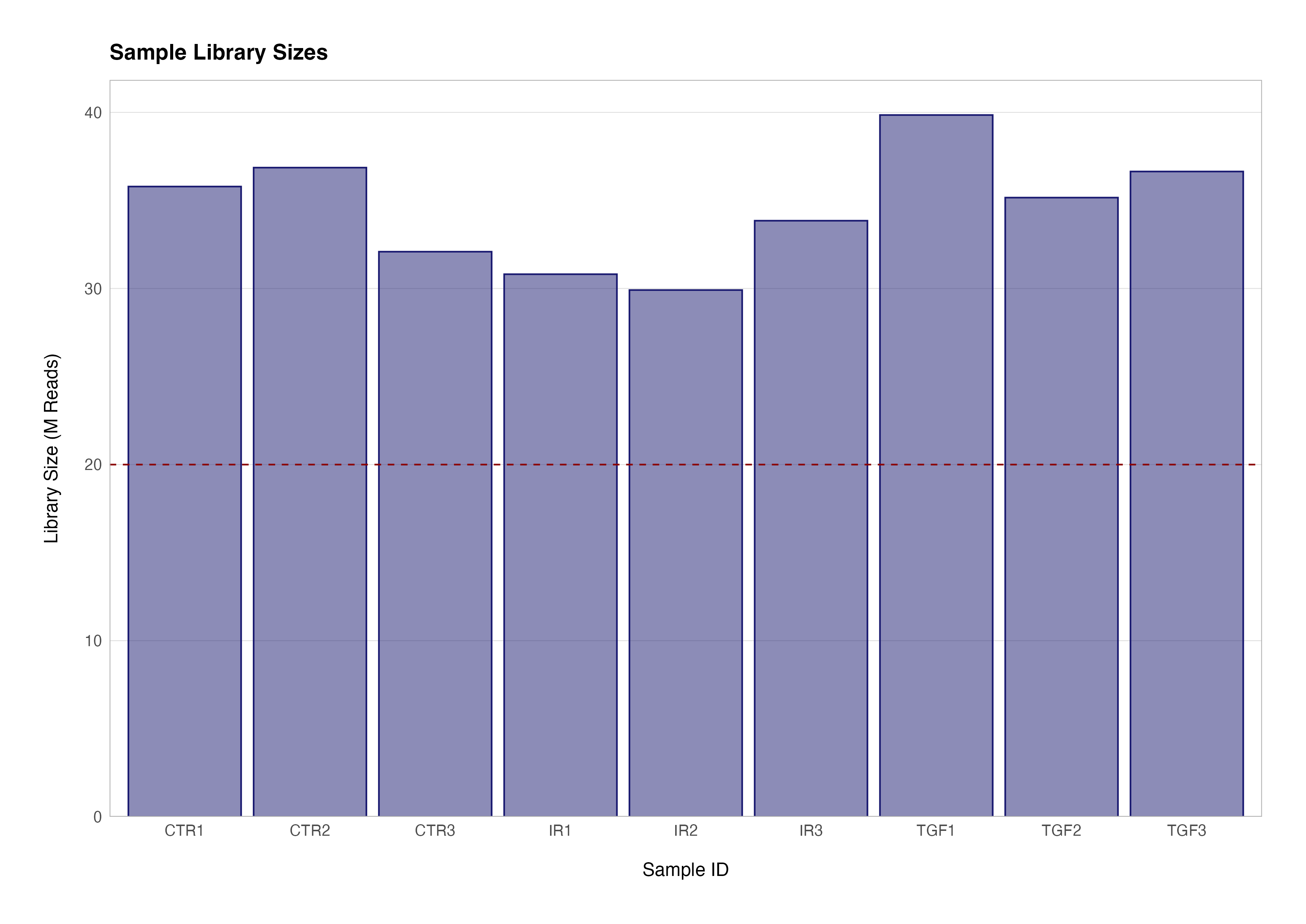
The first step in our series of quality control checks is to determine how many reads we have for each sample in the data set. The sum of each column in the count matrix gives us the total number of sequenced reads for that sample. To get the total number of sequenced reads for all samples we can use the colSums() function to return a named numeric vector.
# total reads for the first sample (ctr_bc_2)
sum(counts(dds)[ ,1])

# total reads for all samples
colSums(counts(dds))
> sum(counts(dds)[ ,1])
[1] 35788780

> colSums(counts(dds))
 ctr_bc_2  tgf_bc_4   ir_bc_5  ctr_bc_6  tgf_bc_7  ir_bc_12 ctr_bc_13 tgf_bc_14  ir_bc_15
 35788780  39850877  30810519  36863606  35160373  29910870  32089140  36643265  33848959
We can easily use functions from the tidyverse package dplyr to add these sample summaries to variables from the metadata data frame to create a visualisation of these library sizes:
meta_data_cln %>%
  mutate(label = str_c(group, rep)) %>%
  left_join(
    enframe(
      colSums(counts(dds)),
      name = "sample_id",
      value = "lib_size"
    ),
    by = "sample_id"
  ) %>%

  ggplot(aes(x = label, y = divide_by(lib_size, 1e+06))) +
  geom_col(colour = "transparent", fill = "midnightblue", alpha = 0.5) +
  geom_col(colour = "midnightblue", fill = "transparent") +
  geom_hline(yintercept = 20, linetype = "dashed", colour = "darkred") +
  scale_y_continuous(expand = expansion(mult = c(0, 0.05))) +
  theme(panel.grid.major.x = element_blank()) +
  labs(
    title = "Sample Library Sizes",
    x = "Sample ID",
    y = "Library Size (M Reads)"
  )
Similarly, it is possible to use a boxplot to visualise difference in the distributions of the counts data.
counts(dds) %>%
  t() %>%
  as.data.frame() %>%
  rownames_to_column(var = "sample_id") %>%
  left_join(meta_data_cln, ., by = "sample_id") %>%
  pivot_longer(cols = !assay_name:rep, names_to = "gene_id", values_to = "count") %>%
  mutate(label = str_c(group, rep)) %>%

  ggplot(aes(x = label, y = divide_by(count, 1e+06))) +
  geom_boxplot() +
  theme(panel.grid.major.x = element_blank()) +
  labs(
    title = "Raw Count Distribution",
    x = "Sample ID",
    y = "Number of Counts (M)"
  )
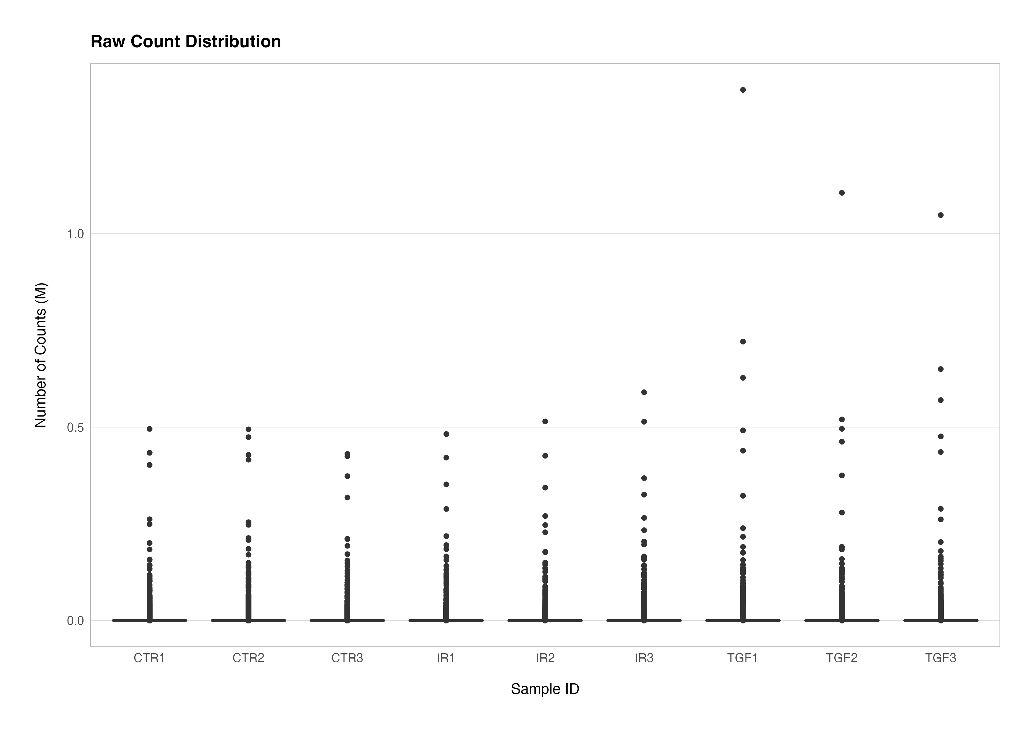
As you can see, visualising the raw count distributions reveals that a small number of genes with very large counts dominate the distributions and likely contribute very strongly towards the differences in the libraries seen above. There are several biological and technical reasons why this phenomenon might occur:
-
Biological
- Longer genes resulting in more fragments that can be sequenced
- High constitutive expression e.g., housekeeping genes
- Differential expression between biological conditions
-
Technical
- Library prep. biases due to preferential PCR sequence amplification
- Differences in sequencing depth between libraries
Genes with high absolute counts can introduce a lot of variance, making it challenging to detect true differences in expression for genes with lower counts. This is why transformation techniques (e.g., log transformation, variance stabilising transformation) are often applied to RNA-Seq data before downstream analysis.
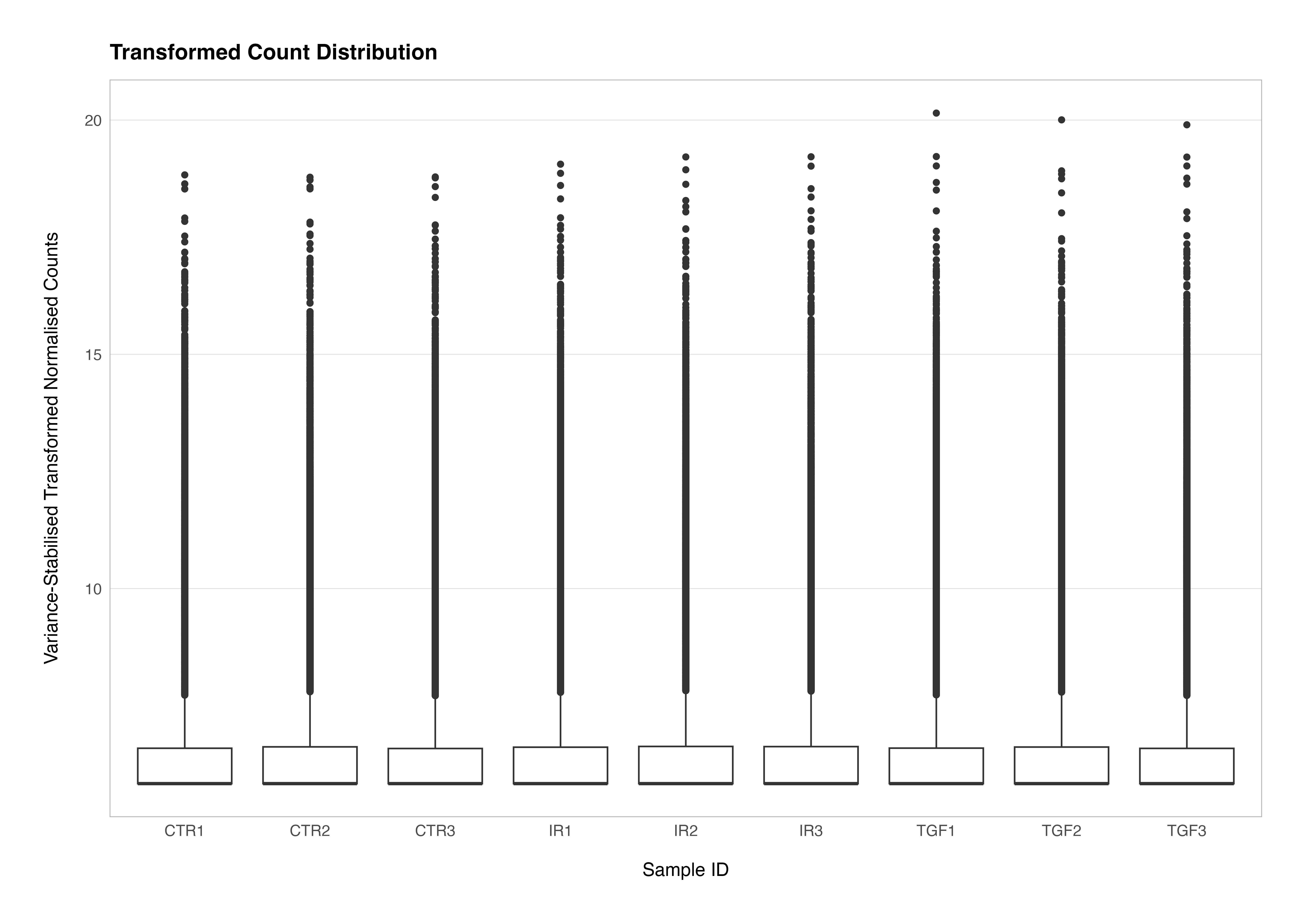
In DESeq2, the vst() or rlog() functions can be used to transform the data and compensate for the effect of different library sizes. The effect of these transformations removes the dependence of the variance on the mean average and the high variance of the logarithm of count data when the mean is low. A detailed discussion of these issues can be found in the DESeq2 vignette.
We can see how undertaking transformation of the data, in this case using the vst() function to undertake a variance stabilising transformation, alters the differences in the distribution of the counts data. We set the blind argument to TRUE to ensure that the transformation is not influenced by the sample groupings or experimental design. This is critical for maintaining an unbiased perspective during unsupervised QC analyses.
# transform the counts data
vsd <- vst(dds, blind = TRUE)

# plot the transformed counts distributions
assay(vsd) %>%
  t() %>%
  as.data.frame() %>%
  rownames_to_column(var = "sample_id") %>%
  left_join(meta_data_cln, ., by = "sample_id") %>%
  pivot_longer(cols = !assay_name:rep, names_to = "gene_id", values_to = "count") %>%
  mutate(label = str_c(group, rep)) %>%

  ggplot(aes(x = label, y = count)) +
  geom_boxplot() +
  theme(
    axis.title.y = element_markdown(),
    panel.grid.major.x = element_blank()
  ) +
  labs(
    title = "Transformed Count Distribution",
    x = "Sample ID",
    y = "Variance-Stabilised Transformed Normalised Counts"
  )
Principal Component Analysis
Principal Component Analysis (PCA) is a fundamental technique in the analysis of bulk RNA-Seq data quality control and exploratory data analysis that transforms a set of possibly correlated variables into a set of linearly uncorrelated variables called principal components. This transformation is accomplished in such a way that the first principal component accounts for the largest possible variance in the data, with each succeeding component accounting for the highest variance possible under the constraint that it is orthogonal to the preceding components.
In the context of bulk RNA-Seq experiments, PCA is employed to reduce the dimensionality of the data while preserving as much variability as possible. A typical RNA-Seq dataset, such as the one we are analysing here, comprises thousands of genes measured across several samples, resulting in high-dimensional data that is difficult to interpret directly.
Using PCA to simplify this complexity allows us to visualise the data in a two-dimensional space, highlighting the main patterns in clustering among samples, and enabling identification of sources of variation as well as potential outlier samples.
Conducting PCA with DESeq2
There are multiple ways to perform PCA on RNA-Seq data in R, including the classic prcomp() workflow or the more recent tidymodels workflow using step_pca(). Both are powerful general workflows applicable to data sets other than RNA-Seq but are relatively complex and require a good understanding of the requisite data preprocessing as well as how to handle the analysis result for presentation.
Luckily, the DESeq2 has a convenient plotPCA() function for PCA to which we can pass transformed data, a grouping variable of interest, and the number of top genes to use for principal components which are selected by highest row variance (n = 500 by default).
# plot PCA using DESeq2
plotPCA(vsd, intgroup = "group", ntop = 500)
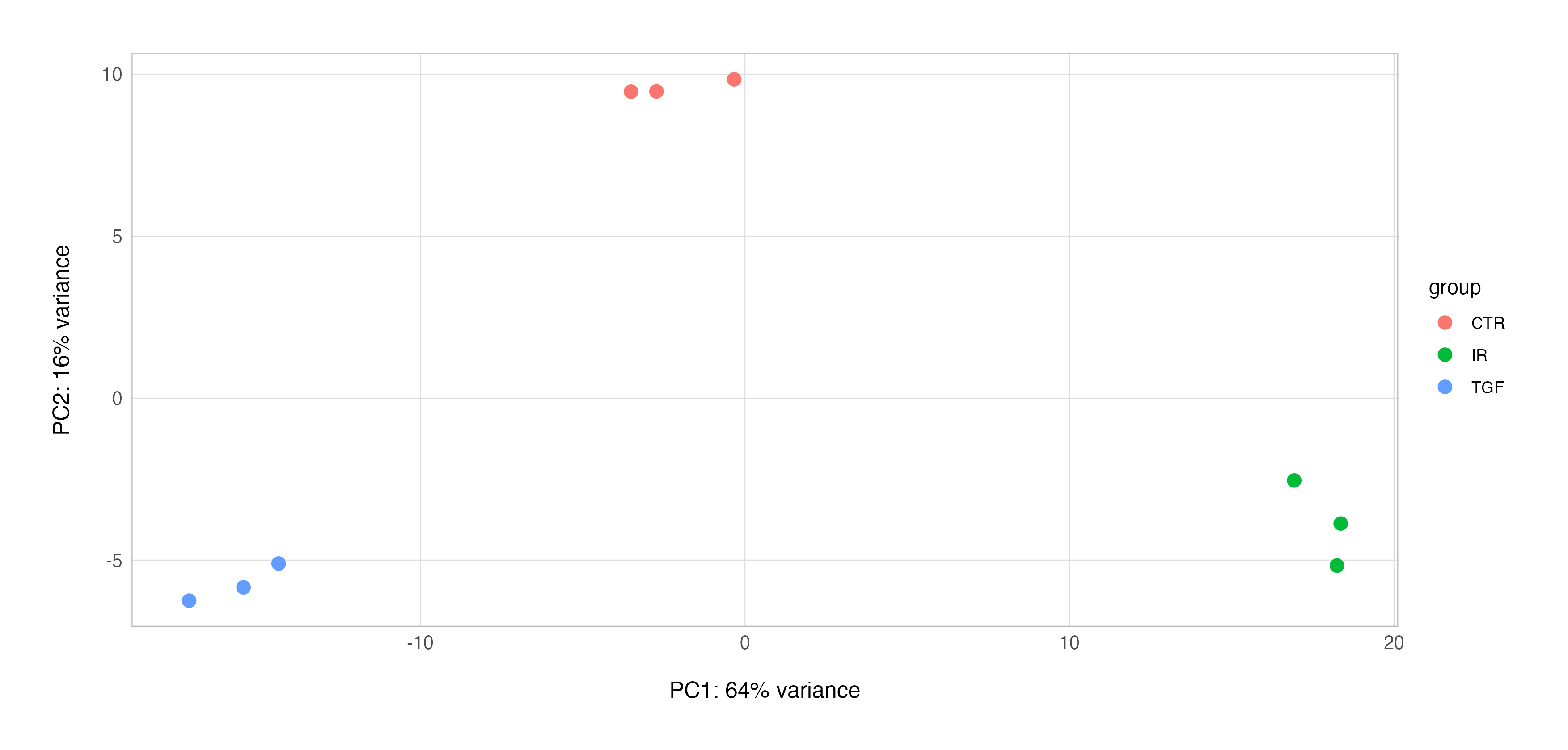
This function will not only provide a serviceable exploratory PCA plot using the ggplot2 graphics package, but it also enables us to extract the underlying PCA results, enabling us to work with the result and, for example, build our own customised PCA plot.
# conduct pca and annotate result
pca_res <-
  vsd %>%
  plotPCA(intgroup = "group", ntop = 500, returnData = TRUE) %>%
  janitor::clean_names() %>%
  left_join(meta_data_cln, by = c("name" = "sample_id")) %>%
  select(name, group = group.y, rep, pc1, pc2)

# extract the variance explained PC1 & PC2
perc_var <-
  pca_res %>%
  attr("percentVar") %>%
  multiply_by(100) %>%
  round(digits = 2)

# plot
pca_res %>%
  mutate(label = str_c(group, " ", rep)) %>%

  ggplot(aes(x = pc1, y = pc2)) +
  geom_hline(yintercept = 0, linetype = "dashed", colour = "midnightblue", alpha = 0.5) +
  geom_vline(xintercept = 0, linetype = "dashed", colour = "midnightblue", alpha = 0.5) +
  geom_point(aes(fill = group), colour = "transparent", size = 4, shape = 21, alpha = 0.4) +
  geom_point(aes(colour = group), fill = "transparent", size = 4, shape = 21, stroke = 1) +
  geom_text_repel(aes(label = label), seed = 123, point.padding = 10, nudge_y = -0.1, size = 3.5) +
  scale_x_continuous(limits = c(-20, 20), breaks = seq(-20, 20, 2)) +
  scale_y_continuous(limits = c(-8, 12), breaks = seq(-8, 12, 2)) +
  scale_shape_manual(values = c(21, 22)) +
  theme(
    axis.title = element_markdown(),
    legend.title = element_text(face = "bold"),
    panel.grid.major = element_line(linetype = "dotted")
  ) +
  labs(
    x = str_c("<strong>PC1</strong> (", perc_var[[1]], "%)"),
    y = str_c("<strong>PC2</strong> (", perc_var[[2]], "%)"),
    colour = "Group",
    fill = "Group"
  )
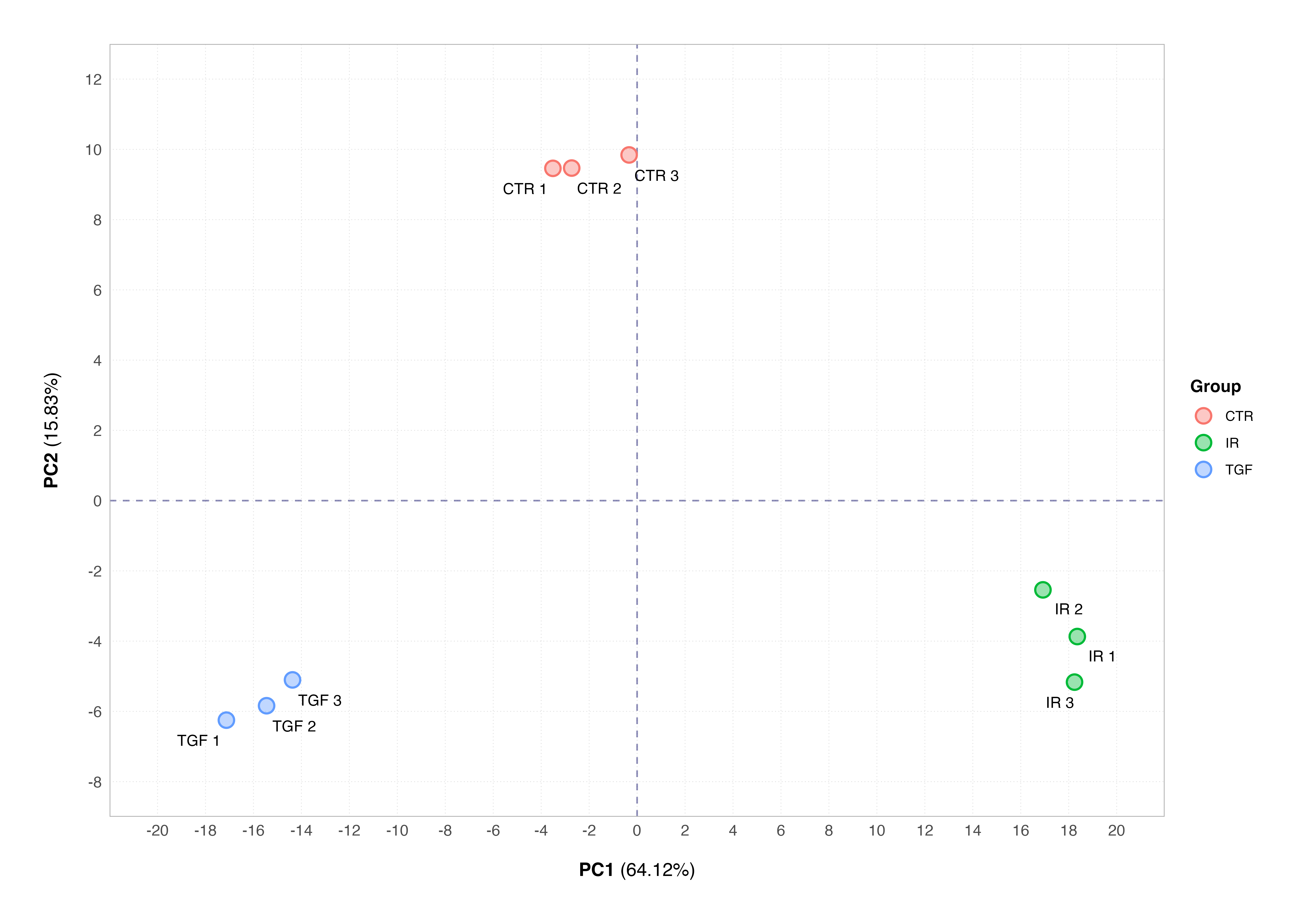
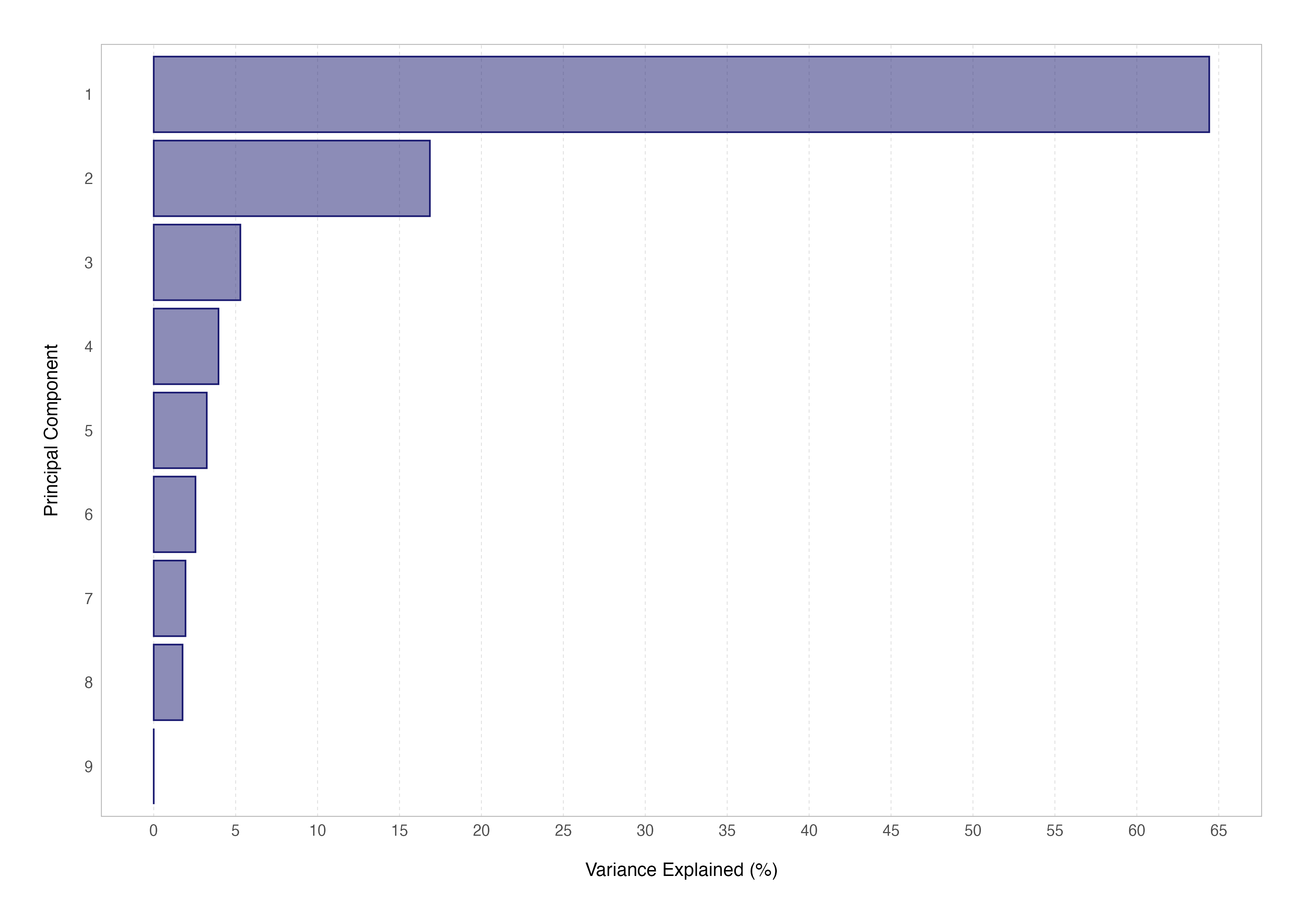
You will note that both PCA plots display the percentage of variance explained by the respective principal component; this is important as interpreting these plots requires us to understand how much of the total variability in the dataset is captured by the components displayed on the plot.
Another way to assess this in practice is by generating a scree plot for our data showing the variance explained by each principal component. This cannot be done using the DESeq2 plotPCA() function, so we have to fall back on prcomp() to do so.
# extract the ntop most variable features
var_features <-
  rowVars(assay(vsd)) %>%
  enframe(name = "gene_id", value = "variance") %>%
  arrange(desc(variance)) %>%
  slice_head(n = 500) %>%
  pull(gene_id)

# undertake PCA for this subset of features
scree_data <- prcomp(t(assay(vsd)[var_features, ]), scale = TRUE)

# compute the variance explained by each principal component
var_explained <- scree_data$sdev^2 / sum(scree_data$sdev^2)

# create the scree plot
var_explained %>%
  enframe(name = "pc", value = "var_explained") %>%
  mutate(
    pc = pc %>%
      as_factor() %>%
      fct_reorder(var_explained),
    var_explained = multiply_by(var_explained, 100)
  ) %>%

  ggplot(aes(x = var_explained, y = pc)) +
  geom_col(colour = "transparent", fill = "midnightblue", alpha = 0.5) +
  geom_col(colour = "midnightblue", fill = "transparent") +
  scale_x_continuous(breaks = seq(0, 70, 5)) +
  theme(
    panel.grid.major.x = element_line(linetype = "dashed"),
    panel.grid.major.y = element_blank()
  ) +
  labs(
    x = "Variance Explained (%)",
    y = "Principal Component"
  )
Attaining mastery over PCA and it’s more advanced aspects (such as computing the PCA loadings or eigenvectors) will not only set you in good stead for transcriptomic analyses and understanding other dimensionality reduction techniques used in single-cell studies (such as tSNE and UMAP) but will also be an indispensable tool for other bioinformatic data science analyses.
A Note on Batch Effects
Using PCA to assess the overall structure of an RNA-Seq data set can show us whether the samples cluster according to known biological conditions. In the example we have seen so far using our data set, PCA indicates that the main source of variation (64% of all variation in the data set) is due to the effects of our biological conditions.
The PCA plot is also a key tool in identification of systematic variation in data arising from technical artifacts (e.g., differences in library preparation, sequencing depth, or sample handling) rather than from the biological variables of interest. This phenomenon is known as batch effect, and these can confound downstream analyses if not identified and counteracted as part of our workflow. The below plot shows a simulated example of a batch effect that might have occurred in our data set.
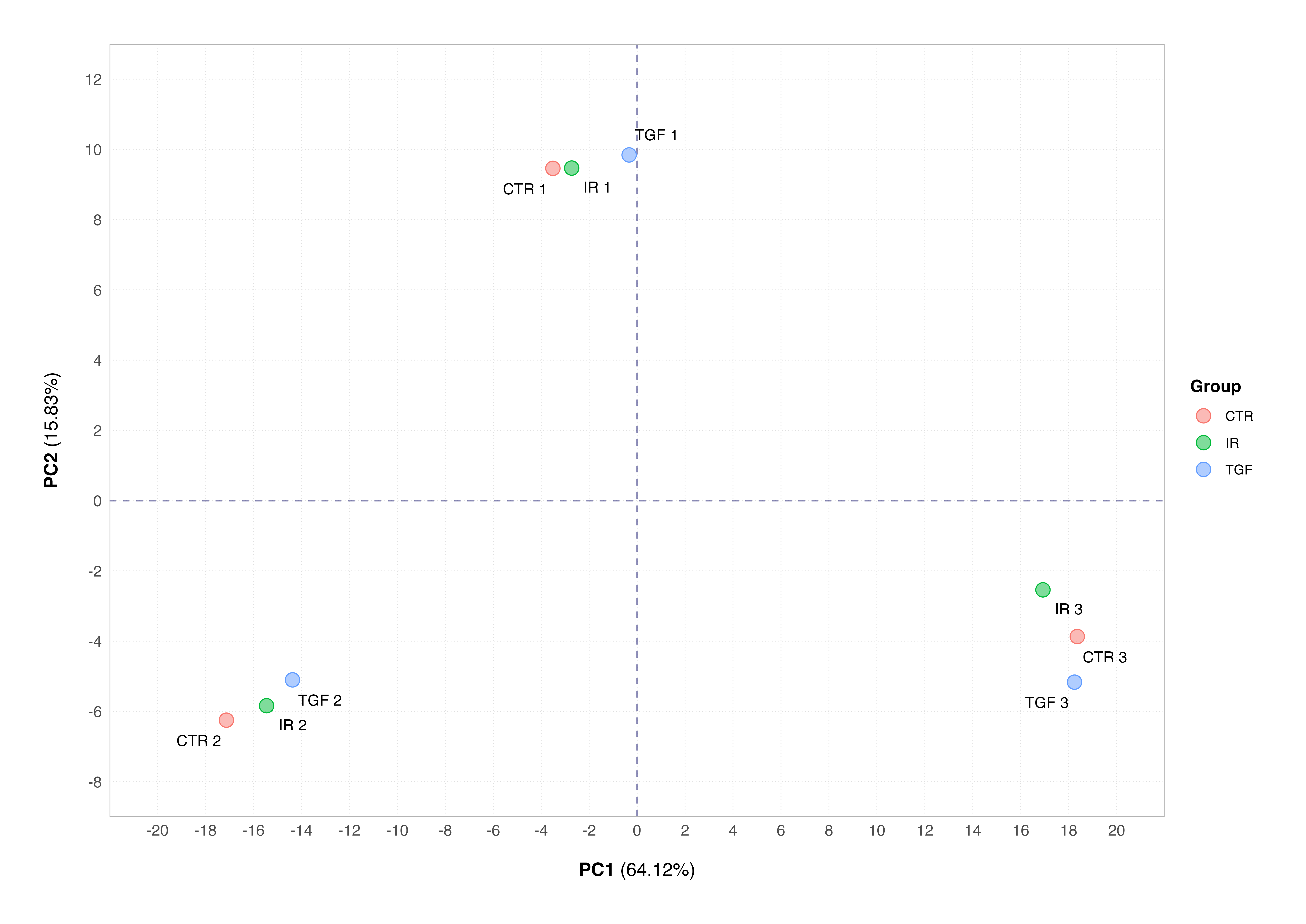
This plot shows the samples clustering by the technical replicate rather than the biological condition; this is a classic example of a batch effect. Many will panic when their samples do not cluster according to their biological conditions of interest, but it is nothing major to worry about assuming that we have designed our experiment properly and recorded all the correct information about how samples were collected and processed.
The SVA package can be used to correct for batch effects in bulk RNA-Seq (and microarray) data sets, if representatives of the groups of interest appear in each batch and batches aren’t confounded by another variable of interest e.g., cell line. Alternatively, the batch or confounding factor can be incorporated into the experimental design during differential expression analysis; we will see an example of this next time.
Summary
That’s it for this part! You are now equipped with the fundamental skills required to import your RNA-Seq data into R, undertake data transformation, and conduct exploratory analysis for quality assessment and identification of outliers, mixed-up samples and batch effects in your data.
In the next tutorial we will look at experimental designs, how to conduct differential gene expression analysis using DESeq2, and how to undertake gene-level annotation.
See you next time.
Thanks for reading. I hope you enjoyed the article and that it helps you to get a job done more quickly or inspires you to further your data science journey. Please do let me know if there’s anything you want me to cover in future posts.
If this tutorials has helped you, consider supporting the blog on Ko-fi!
Happy Data Analysis!
Disclaimer: All views expressed on this site are exclusively my own and do not represent the opinions of any entity whatsoever with which I have been, am now or will be affiliated.