ggplot(introduction)
Data visualisation is a form of both graphical data analysis and visual communication that combines statistics and aesthetic design to not only make plots attractive but to aid information conveyance, emphasise accurate representation, and to facilitate the interpretation and understanding of data.
“The greatest value of a picture is when it forces us to notice what we never expected to see” — John Tukey
The ggplot2 package in R has become a leading tool for data visualisation as it presents a system that seamlessly combines both of these elements. It provides a structured and compact plotting syntax, a series of carefully chosen defaults for common components, and a comprehensive theming system; these features all combine to allow the user to produce an almost limitless array of publication-quality graphs while maintaining focus on accurately representing and emphasising the message contained within their data.
The real power of ggplot2 is derived from the “Layered Grammar of Graphics” framework around which it is based. In common with other formal systems, ggplot2 can be useful when you don’t understand the underlying model but gaining an intimate grasp how the grammar of graphics is applied in ggplot2 will empower you to go beyond recreating common and basic plots to produce heavily customised, bespoke, and novel types of graphical visualisations.
 Learn ggplot2 and harness the power of the grammar of graphics
In this introduction to ggplot2 series, we are going to learn about the grammar of graphics and how to work with each of the fundamental mapping components used in its implementation within ggplot2.
Grammar of Graphics 101
All plots are composed of the data i.e., the information you want to visualise, and a mapping i.e., a description of how the variables in the data set are mapped to aesthetic attributes (e.g., colour, shape, size) of geometric objects (e.g., points, lines, bars).
The implementation of the grammar of graphics in ggplot2 is centred around the primacy of layers; a plot is formed adding a series of mapping components in a layered and iterative manner.
There are five main mapping components:
1. Layers
A layer is a collection of geometric elements and statistical transformations.
Geometric elements, known as “geoms” for short, represent what you actually see in the plot: points, lines, polygons, etc.
Statistical transformations, “stats” for short, summarise the data. For example, binning and counting observations to create a histogram, or plotting mean averages with error bars showing standard deviation.
2. Scales
Scales map values in the data to values in the aesthetics. This includes the axes, and the use of colour, shape, or size. Scales also draw the legend. Axes and legends make it possible to read the original data values from the aesthetic mappings on the plot.
3. Coordinates
A coordinate system, or “coord” for short, describes how data coordinates are mapped to the plane of the graphic. It also provides axes and gridlines to help read the graph.
4. Facets
A facet specifies how to break up and display subsets of data as small multiples. This is also occasionally referred to as conditioning, latticing, or trellising.
5. Theming
A theme controls the finer points of display, all the non-data ink like fonts and background colour. While the defaults in ggplot2 have been chosen with careful consideration, you may need to modify these to create an attractive plot.
The three essential elements for making a plot are data, aesthetics, and geometries. The remainder are optional layers. This series will mainly be concerned with these essential elements, as well as theming. We will cover the stats, coords and facet layers in a future intermediate ggplot2 series.
Setup
Make sure you’ve loaded the dplyr and ggplot2 packages that we will need for this tutorial. If you do not have these installed, you can do can do this first by removing the “#” at the start of each line and running the install.packages() functions, as shown.
## install packages

# install.packages("dplyr")
# install.packages("ggplot2")

## load packages

library("dplyr")
library("ggplot2")
Now, if we are going to learn how to make plots, we will need some data to work with, so let’s get a data set and load it into the R environment.
We’re going to use a data set formed from IMDb lists of top-rated horror, sci-fi and war movies. I described how to collect these data a few months ago when I wrote a series of posts on basic web scraping in R. Anyone that read my previous data visualisation-related post on prototyping graphs in R with the esquisse package will already have encountered this data set.
Go ahead and download the ready-to-use IMDb top rated data set from here.
The file you’ve just downloaded is in one of the native R data formats, so we can simply use the load() function with the path to the file to make it available in our global environment. Here, I am going to load the file directly from my “Downloads” directory.
# load imdb top rated data set
load(file = file.path("~", "Downloads", "imdb_top_rated_clean.rds"))
If you don’t know how to use the file.path() function for writing paths in a platform-independent manner, I would recommend consulting the function’s help file using help(file.path) as it’s a really handy function to know.
The IMDb top rated data set currently has some rows with missing values that I intentionally left in for a future data cleaning tutorial; let’s go ahead and remove those.
# remove missing observations
imdb_data_clean <- imdb_data %>%
  filter(!is.na(gross_boxoffice)) %>%
  filter(!is.na(metascores))
We’re also going to simplify the data set by creating a summary data frame from which all the plots in this tutorial will be built; we want to focus on what’s going on in the plotting code here and not get distracted by the complexities of the data.
# create a summary data frame for use in this tutorial
imdb_summary <- imdb_data_clean %>%
  group_by(genre, imdb_rating) %>%
  summarise(
    mean_boxoffice = mean(gross_boxoffice)/1e+06,
    mean_runtime = mean(runtime)
  )
Don’t worry if you don’t understand what’s going on in the data manipulation code here; I am going to write a whole series on data manipulation in the future. For now, just run the code to get the data in the required format required for this tutorial.
If you want to take a quick peak at the data frame we have just created, you can do so by running glimpse(imdb_summary) to preview the variable names, variable types, and the first few rows of data in each column.
One last thing I have chosen to do is change the default theme from theme_grey() to theme_light() as I much prefer how this looks as far as the built-in ggplot2 themes go. You don’t have to do this, but your plots will look slightly different to the ones shown in the examples if you don’t. We will look at using and customising themes in a later post.
# update the default theme used for plotting to theme_light()
theme_set(theme_light())
That’s all the basic admin out of the way, let’s make some plots.
Drawing Your First Plot
To get a feel for ggplot2, let’s try running a basic ggplot2 command using our newly created data frame.
# run your first ggplot command
ggplot(data = imdb_summary, mapping = aes(x = imdb_rating, y = mean_boxoffice)) +
  geom_point()
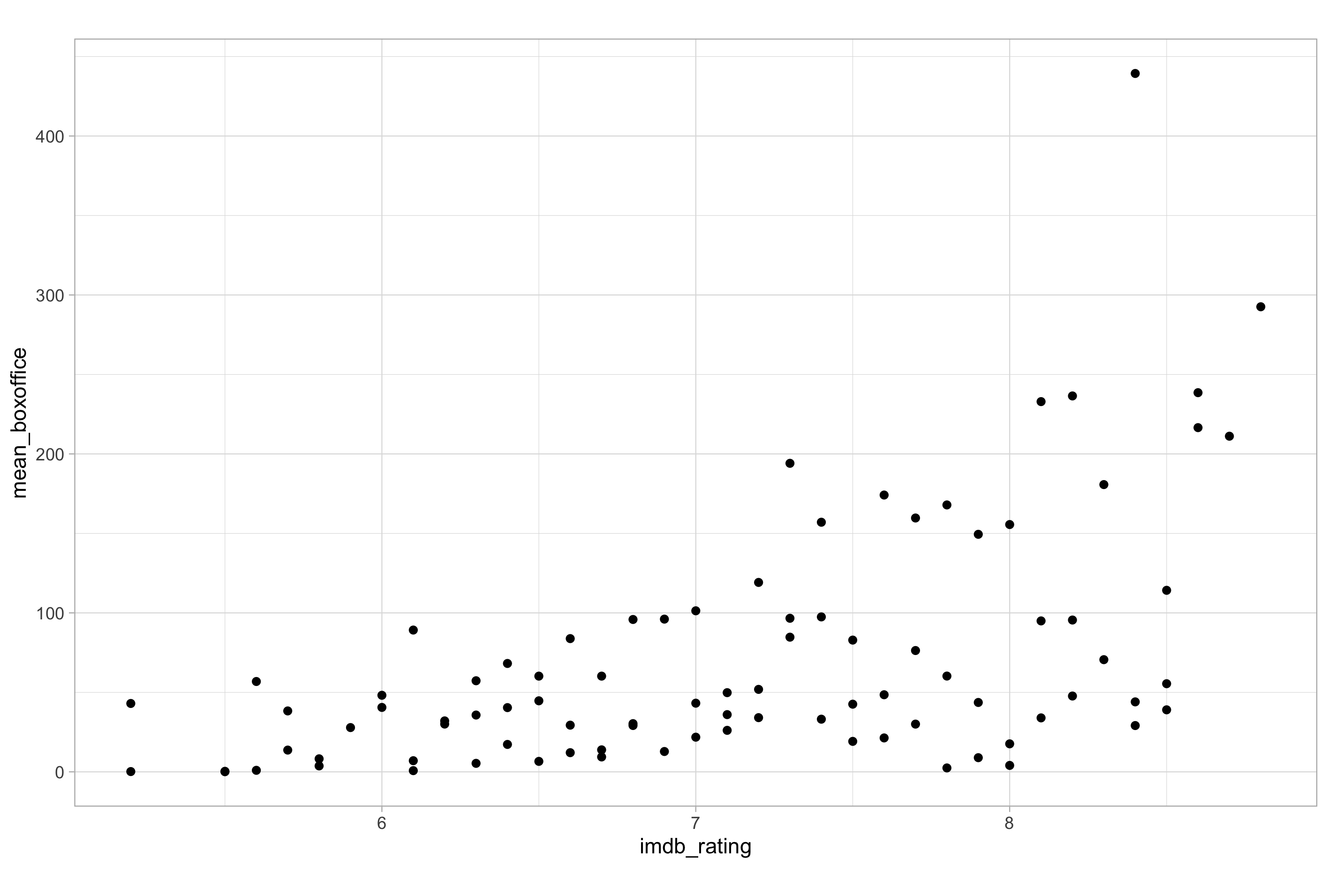
In the code chunk above, I have been very explicit in showing you how the ggplot() function expects to be used in basic cases. In reality, most people would not be so verbose and would simply pass arguments to the ggplot() function by order or position while omitting the argument names.
# a "real world" version of your first ggplot command
ggplot(imdb_summary, aes(x = imdb_rating, y = mean_boxoffice)) +
  geom_point()
In this example, you can see that it is commonplace to pass arguments to aes() by name. Although it is entirely possible to pass arguments to aes() by order alone, a particularly common convention with the x and y arguments, I think it is best to retain the aes() argument names, even if you insist on not doing so when passing arguments to ggplot(); this will help you keep track of variable-to-aesthetic mapping when you are using more than one or two aesthetic parameters.
Mapping Variables to Aesthetics
In ggplot2, the mapping of aesthetics elements is a key concept to master. Exactly what we mean by “mapping” hopefully becomes clear upon realisation that the X and Y axes on a straightforward scatter plot like the one we just made are aesthetics; they define the position of dots on a common scale. In the previous example, the imdb_rating variable was mapped onto the X-axis via the x aesthetic and the gross_boxoffice variable was mapped onto the Y-axis via the y aesthetic.
Many aesthetics we will encounter function as both mappings (i.e., linked to a variable in the data) and fixed aesthetic attributes of geom layers. One of the most common mistakes beginners make is confusing the two or overwriting aesthetic mappings with fixed attributes or vice versa. We always call aesthetics using the aes() function.
Now let’s look at the most common visual aesthetics. We will encounter aesthetics other than the ones we are about to see later in our ggplot2 journey.
Colour and Fill
We’re going to start by adding some colour to your first plot by mapping the genre variable to the colour aesthetic. Doing so enables us to colour the data points according to the genre of film to which each data point pertains.
# mapping a variable to the colour aesthetic
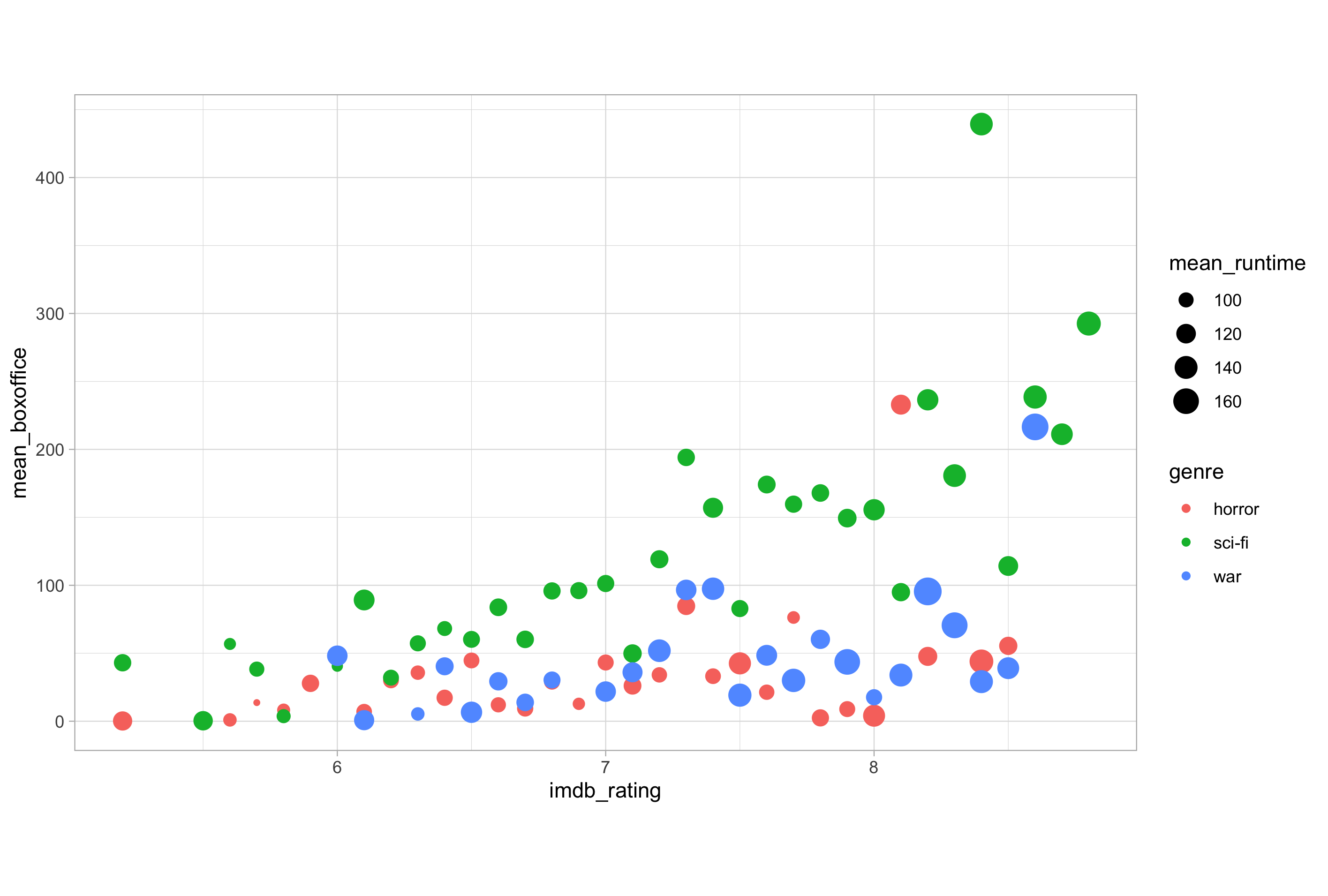
ggplot(imdb_summary, aes(x = imdb_rating, y = mean_boxoffice, colour = genre)) +
geom_point()
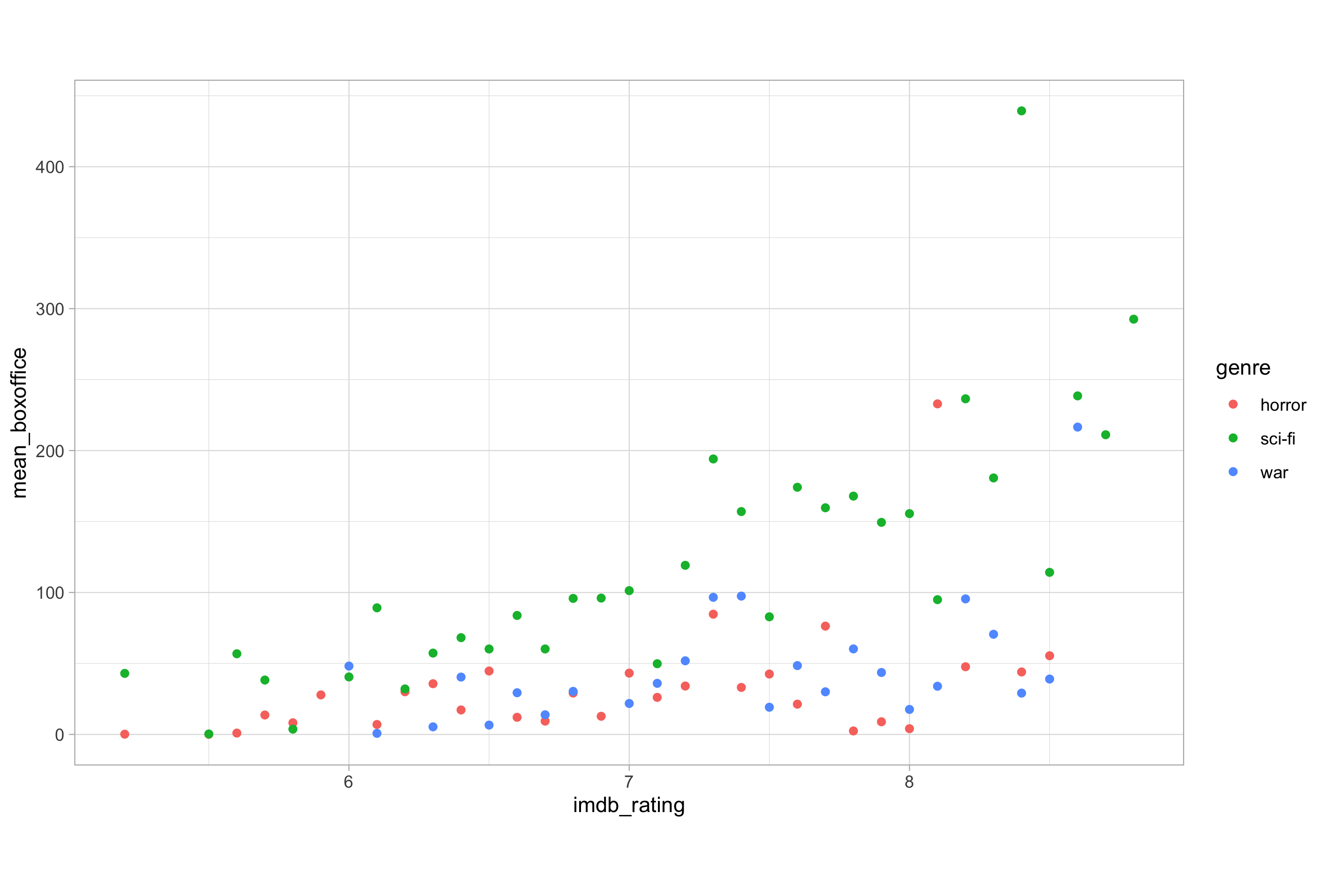
It’s probably worth mentioning now that there are multiple accepted names for the colour aesthetic; I am sure you will encounter different people using each different convention. The three code chunks shown below all produce identical output.
# correct UK English - the one I use (obviously)
ggplot(imdb_summary, aes(x = imdb_rating, y = mean_boxoffice, colour = genre)) +
  geom_point()

# alternative US English (a.k.a. incorrect spelling)
ggplot(imdb_summary, aes(x = imdb_rating, y = mean_boxoffice, color = genre)) +
  geom_point()

# the lazy typist
ggplot(imdb_summary, aes(x = imdb_rating, y = mean_boxoffice, col = genre)) +
  geom_point()
Fill is another distinct but very similar aesthetic to colour. The colour aesthetic usually refers to the outside of a shape and the fill aesthetic the inside. This is not always the case though, which can cause some confusion. The only rule of thumb I can offer here is that if you’re using colour and it doesn’t alter the colour of the shape you thought it should, you probably need fill.
Modifying our previous example to force geom_point() to use a filled circle shape instead of the default solid point to display the data should illustrate the difference between the colour and fill aesthetics. We will cover modifying the attributes of a geom layer in more detail later.
# forcing geom_point() to use filled points
ggplot(imdb_summary, aes(x = imdb_rating, y = mean_boxoffice, colour = genre)) +
  geom_point(shape = "circle filled")
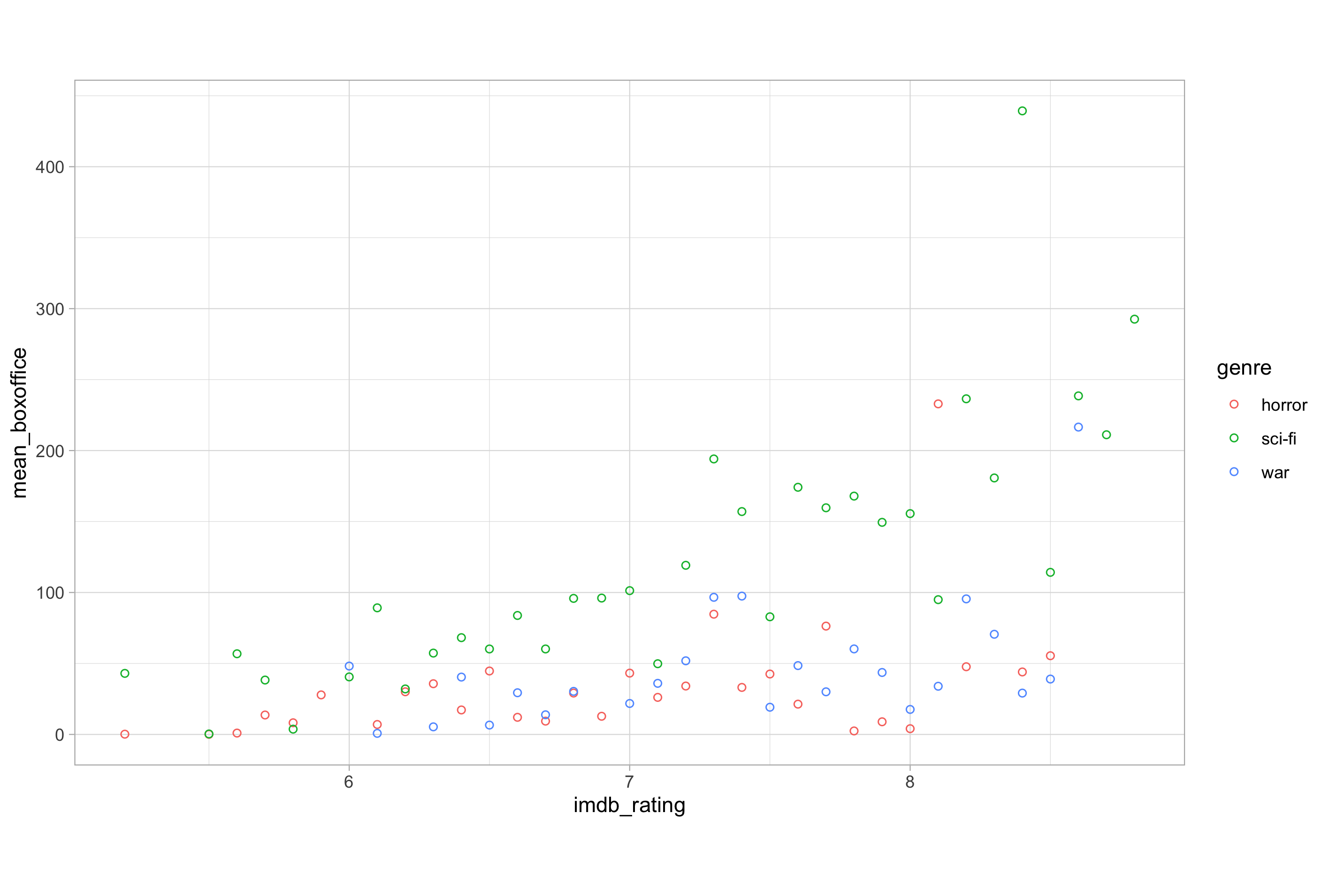
In this example, the genre variable is mapped to the colour aesthetic but nothing is mapped to the fill aesthetic, so we get “empty” data points. To fill the data points in this case, we would need to map genre to the fill aesthetic.
# mapping a variable to the fill aesthetic
ggplot(imdb_summary, aes(x = imdb_rating, y = mean_boxoffice, fill = genre)) +
  geom_point(shape = "circle filled")
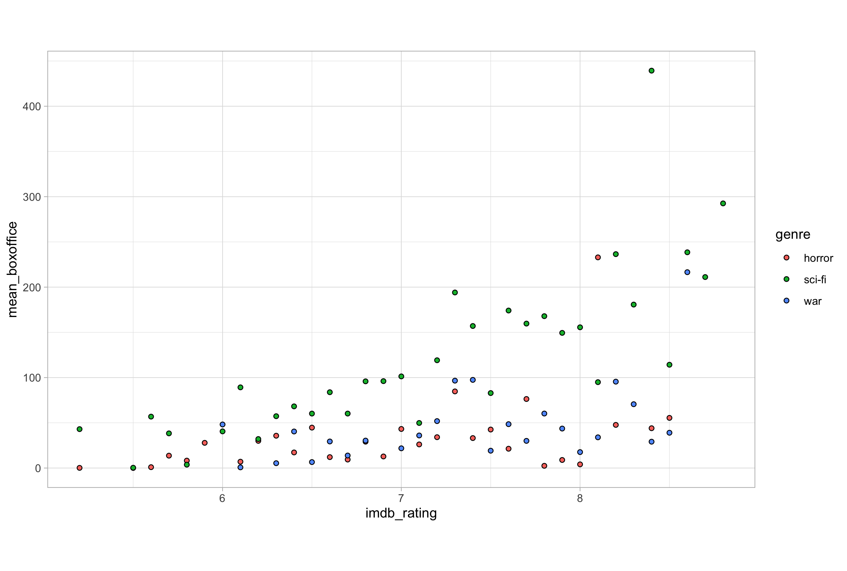
Notice how removing the mapping to the colour aesthetic means that geom_point() reverts to using the pre-defined default value in order to colour the outline of the data points. We could of course either map both or modify the default attribute; we will see how to do this shortly.
Both the colour and fill aesthetics can be mapped to categorical variables and to numerical variables. In the example above, we mapped these to genre, a nominal categorical variable.
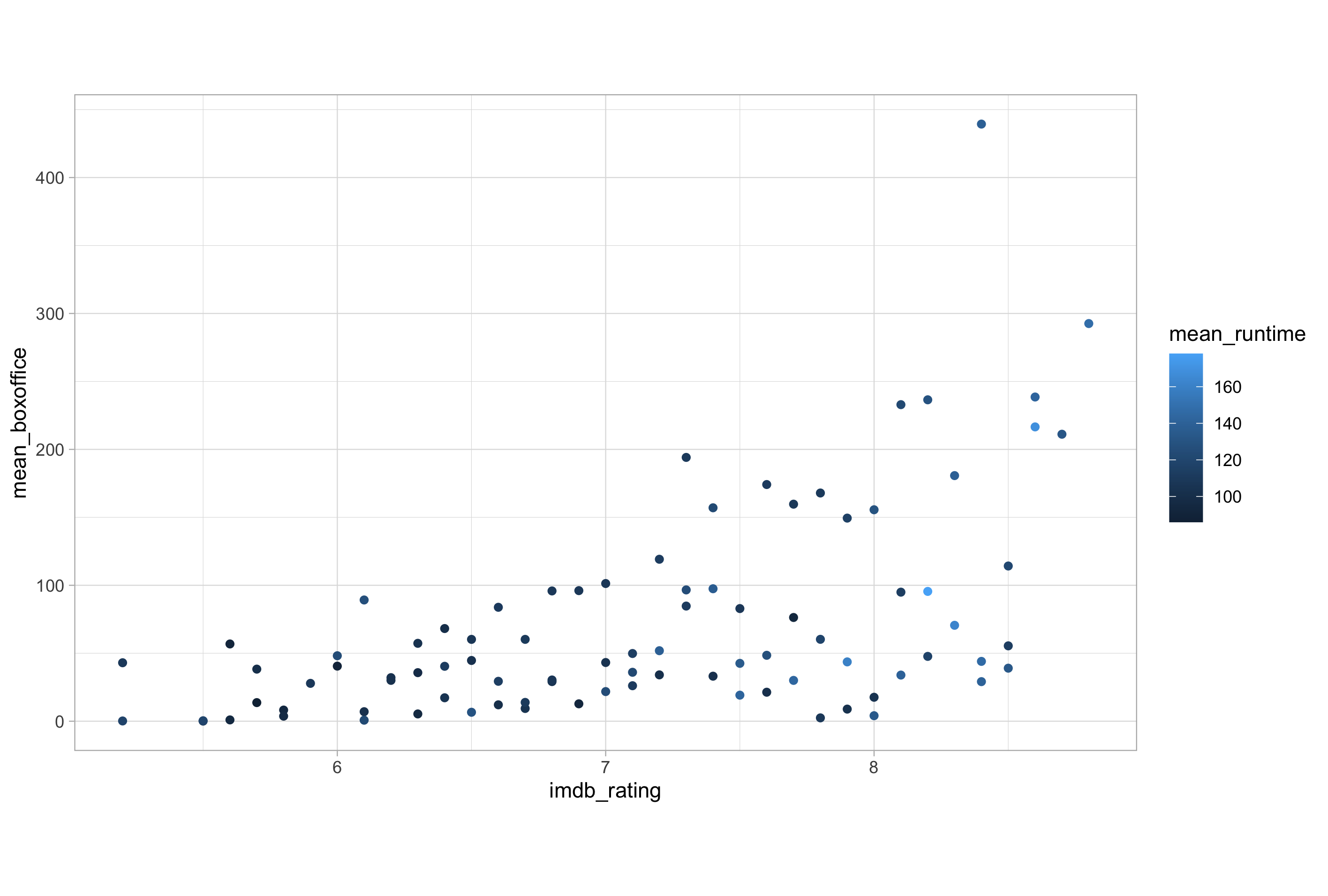
Mapping colour or fill variables to numerical variables results in a colour or fill gradient mapped to the numeric scale. Here’s an example:
# mapping a continuous variable to the colour aesthetic
ggplot(imdb_summary, aes(x = imdb_rating, y = mean_boxoffice, colour = mean_runtime)) +
  geom_point()
Size
The size aesthetic is somewhat similar to colour and fill in that it can be mapped to numeric variables. Size adjusts the area or radius of points, the thickness of lines (e.g., when using geom_line()) and the font size of text (e.g., when using geom_text()).
# mapping a continuous variable to the size aesthetic
ggplot(imdb_summary, aes(x = imdb_rating, y = mean_boxoffice, size = mean_runtime)) +
  geom_point()
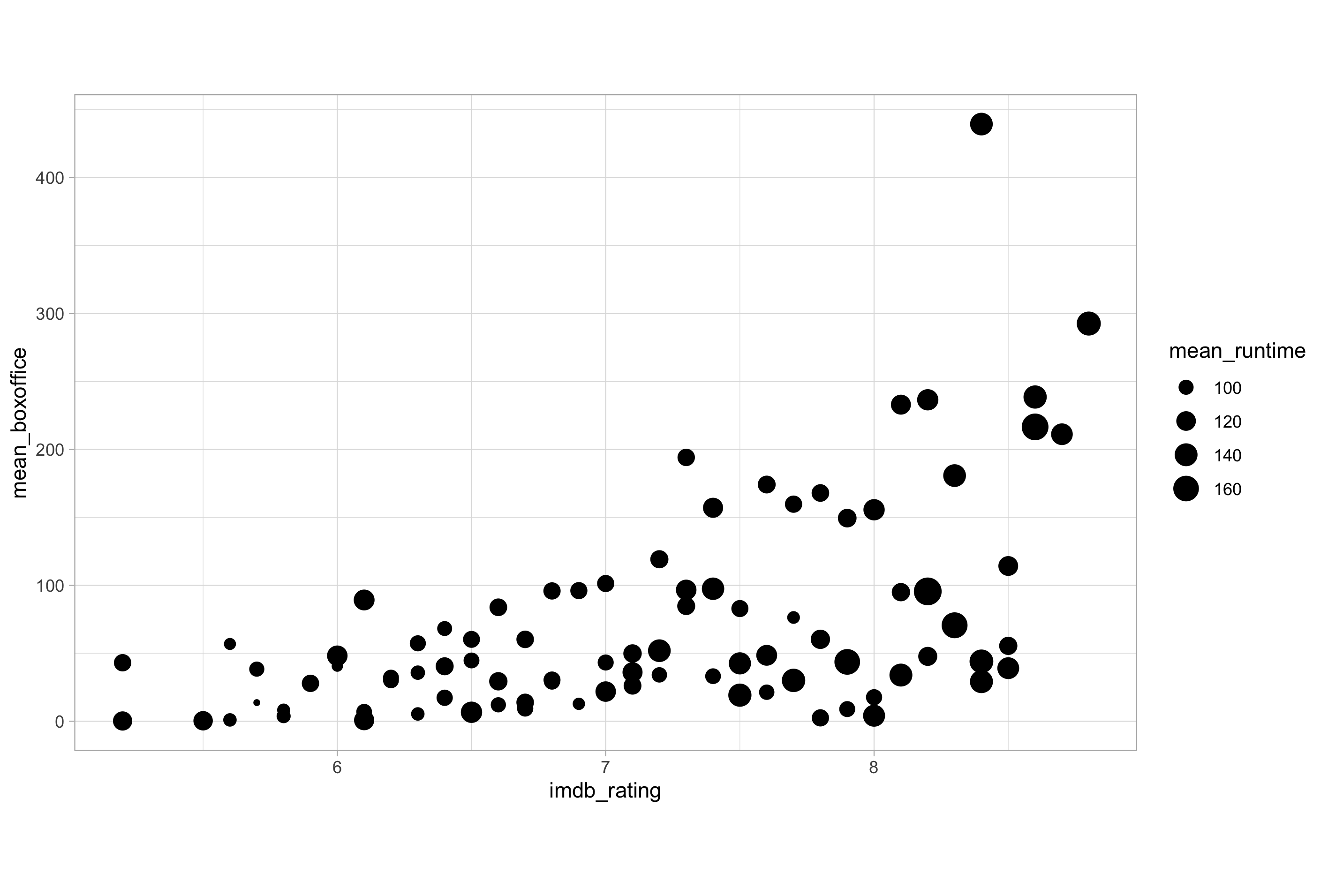
Generally speaking, size is a less useful aesthetic mapping than colour and fill, as the binning of data values to sizes can sometimes create difficulties in reading the original data values from the legend scale. As the old saying about size goes, it’s knowing how to use it effectively that counts. 😉
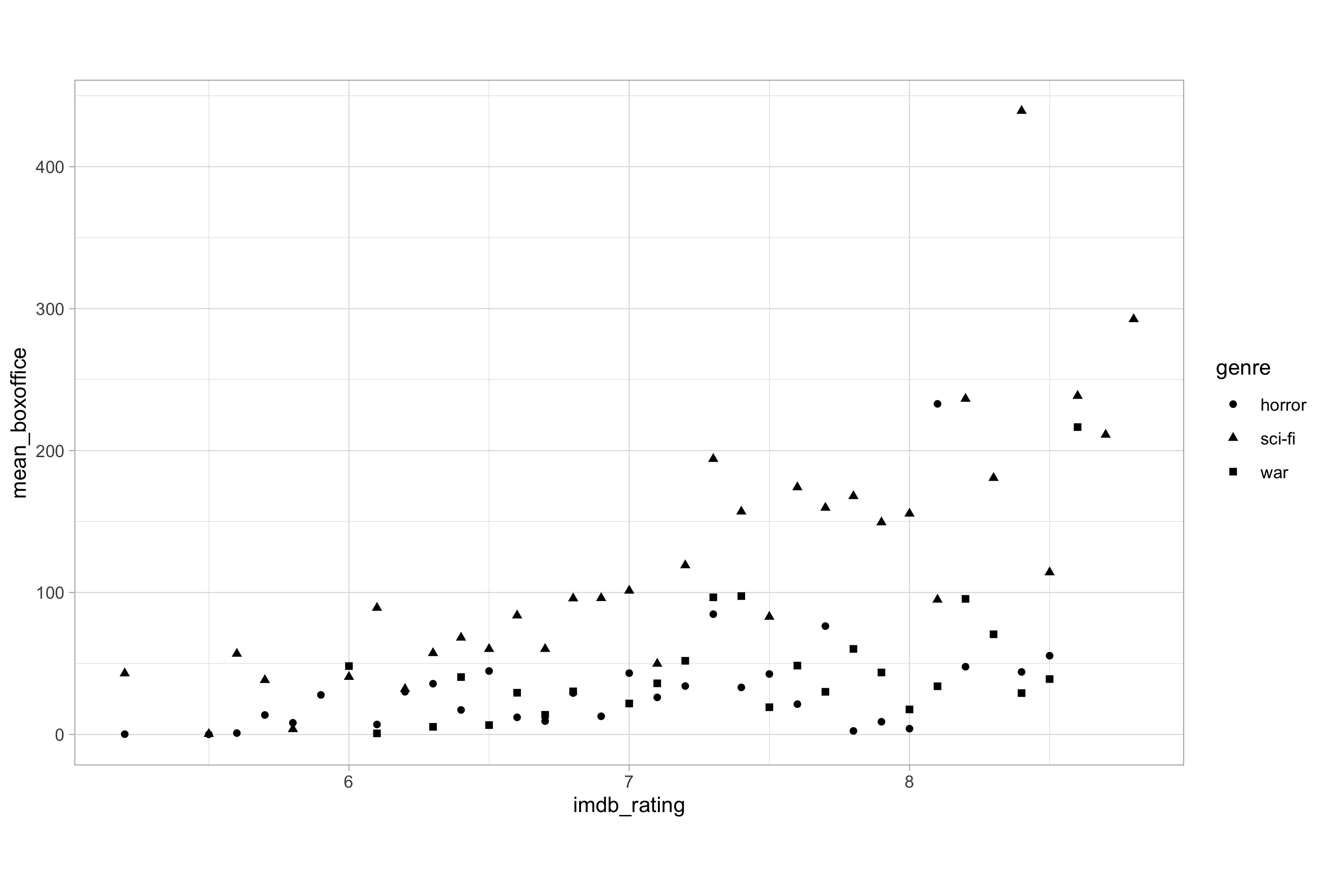
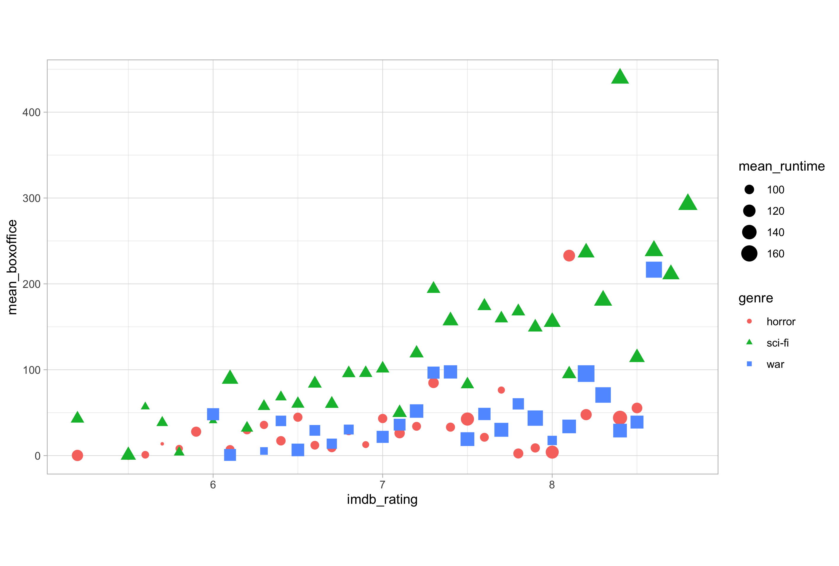
Shape
Another common aesthetic mapping is shape which, as you may have guessed, refers to the shape of data points. Given that there are a finite number of shapes available to assign to points, shape is best used with categorical variables.
# mapping a categorical variable to the shape aesthetic
ggplot(imdb_summary, aes(x = imdb_rating, y = mean_boxoffice, shape = genre)) +
  geom_point()
Alpha
The last common visual aesthetic mapping I want to cover for now is alpha which is short for alpha-blending and adjusts the opacity or transparency of a shape.
# mapping a continuous variable to the alpha aesthetic
ggplot(imdb_summary, aes(x = imdb_rating, y = mean_boxoffice, alpha = mean_runtime)) +
  geom_point()
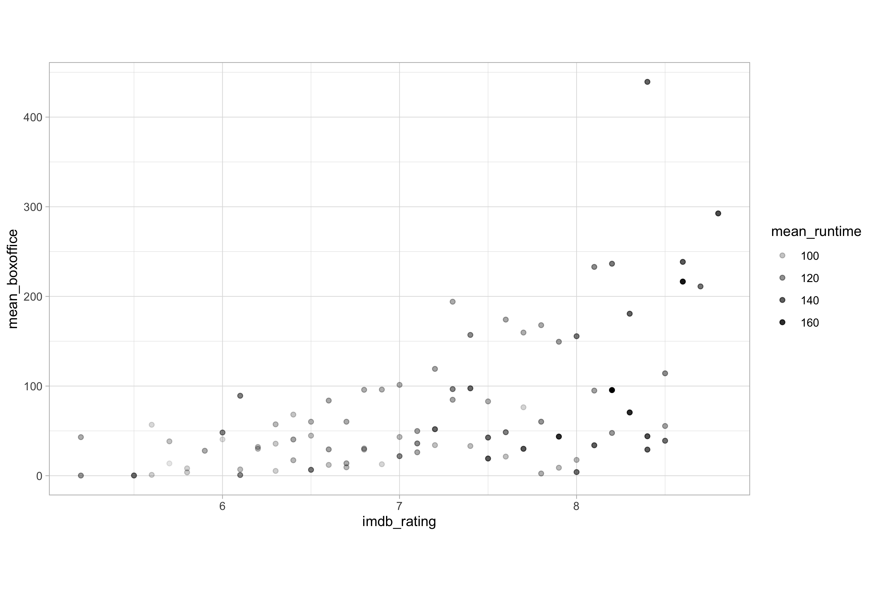
Here, no variables in the data are mapped to colour or fill so the output we receive is based on the defaults used by geom_point() with the opacity of the points being dependent on the mean_runtime variable to which the alpha aesthetic is mapped. Like size, alpha values are binned to data values of the variable to which it is mapped, so caution is warranted to ensure alpha is used in an appropriate manner that doesn’t hinder data interpretability.
Hopefully, the main thing you will have taken away from this brief demonstration of how to map variables in a data set to common aesthetics is the requirement for understanding the variable types available in a data set. If you’re a little sketchy on this topic, you might want to check out a post I wrote about understanding data types way back when I started this blog.
Geometries
Geometries or “geoms” are the shapes that are used to display the data on the aesthetic scales to which they have been mapped. The most basic plot consists of the ggplot() function to which we add the data and aesthetic mapping layers, and then at least one geom to display the mapped data.
# basic plot template
ggplot(data, aes(x, y)) +
  geom_*()
In all the examples so far, we have been creating scatter plots in which the numeric variables imdb_rating and metascores have been mapped to the scales of the X and Y axes, respectively. To actually display the data on these scales we have been using a point shape, which we have been calling using geom_point().
As I mentioned earlier, ggplot2 functionality is based around forming plots by adding a series of mapping components in a layered and iterative manner. This means, to add a geom, you literally add a geom using the + operator.
Let’s demonstrate this point by adding a smooth line to the scatter plot of mean_boxoffice versus imdb_rating that we made earlier.
# adding a smooth line to a scatter plot by adding a second geom
ggplot(imdb_summary, aes(x = imdb_rating, y = mean_boxoffice, size = mean_runtime)) +
  geom_point() +
  geom_smooth()
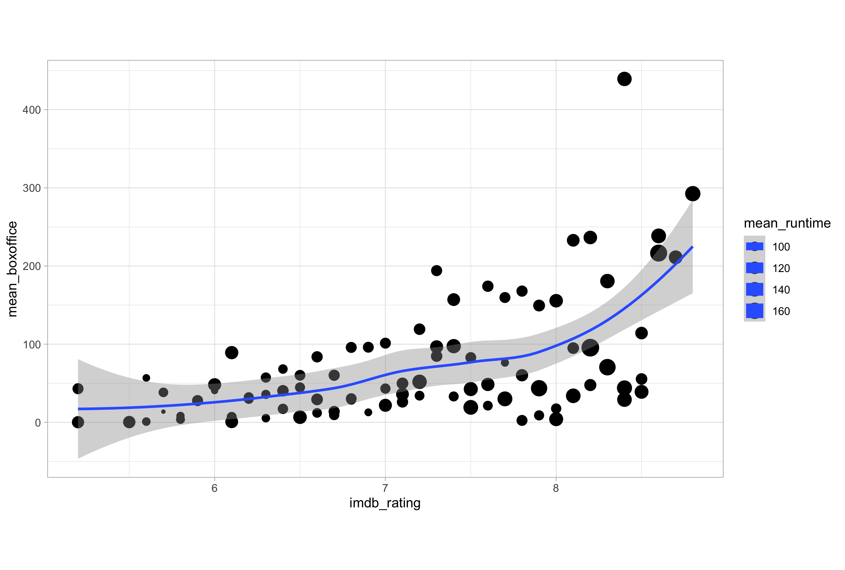
Now that we have two geoms, it seems like an opportune time to point out that the layers used to create a plot are built up in the order they are added. Take a good look at the plot we have just created, particularly the legend. Anything seem a little weird looking?
Now consider the following code and the plot it produces:
# order matters
ggplot(imdb_data_summary, aes(x = imdb_rating, y = mean_boxoffice, size = mean_runtime)) +
  geom_smooth() +
  geom_point()
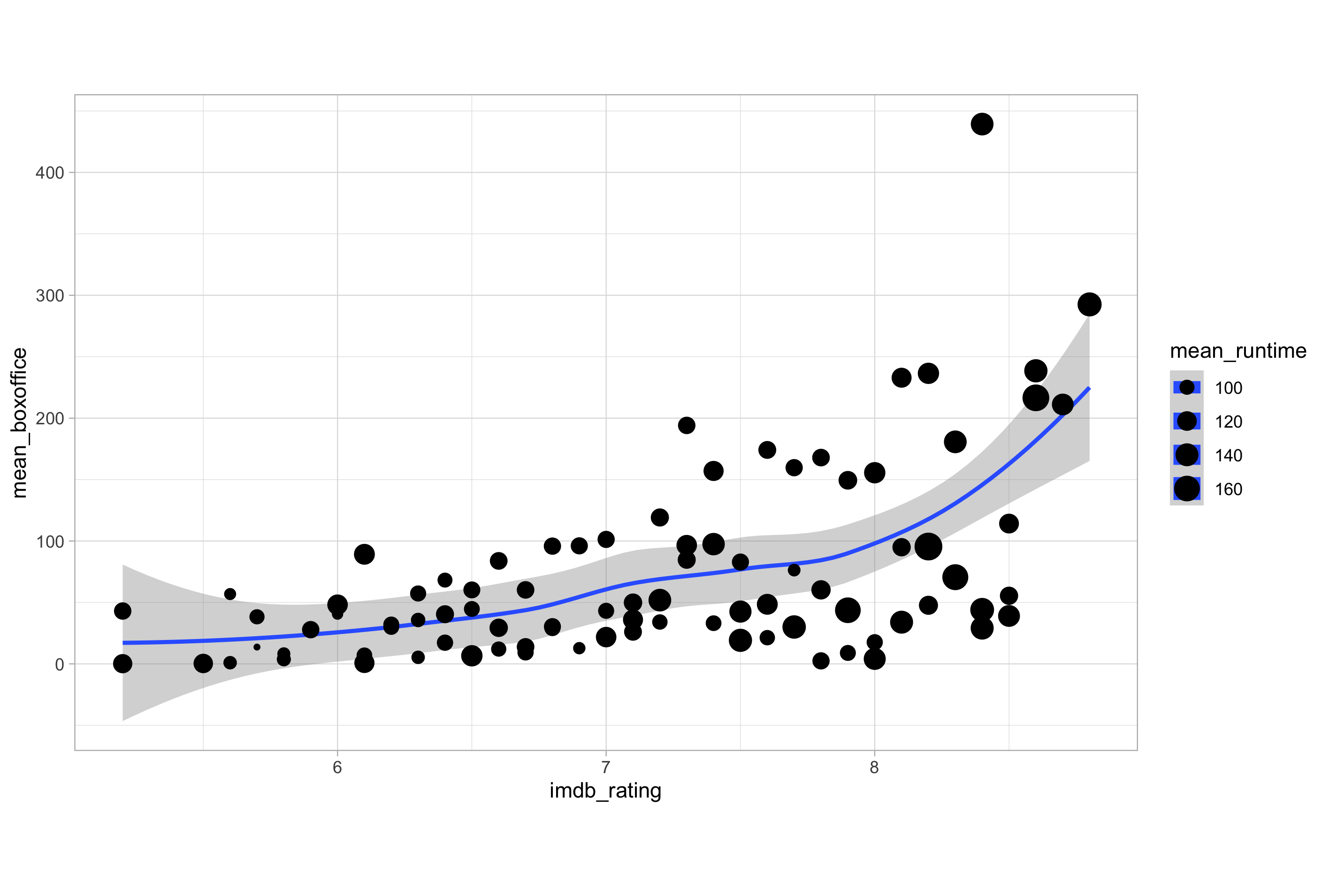
The keen eyed amongst you may notice that the points have been brought forward so they are now plotted on top of the smooth line, whereas they were previously plotted first, and the smooth line plotted on top.
Remember that order matters in ggplot2 as the layers are added on top of one another sequentially.
One last thing to mention before we move on is that, in order to add a straight line to the plot instead of the default loess smoothing line used by geom_smooth(), we would need to modify the smoothing method or function applied. This can be done using the method argument of geom_smooth() set to “lm” to specify a linear model. We will cover lines later in our ggplot2 voyage.
One Geom or Every Geom?
If you have multiple geoms, as in the previous example, then mapping an aesthetic to data variable inside the call to ggplot() will change all the geoms. We can demonstrate this by modifying the previous example and attempting to map the genre variable to the colour aesthetic.
# mapping genre to colour alters all geom layers
ggplot(imdb_summary, aes(x = imdb_rating, y = mean_boxoffice, size = mean_runtime, colour = genre)) +
  geom_smooth() +
  geom_point()
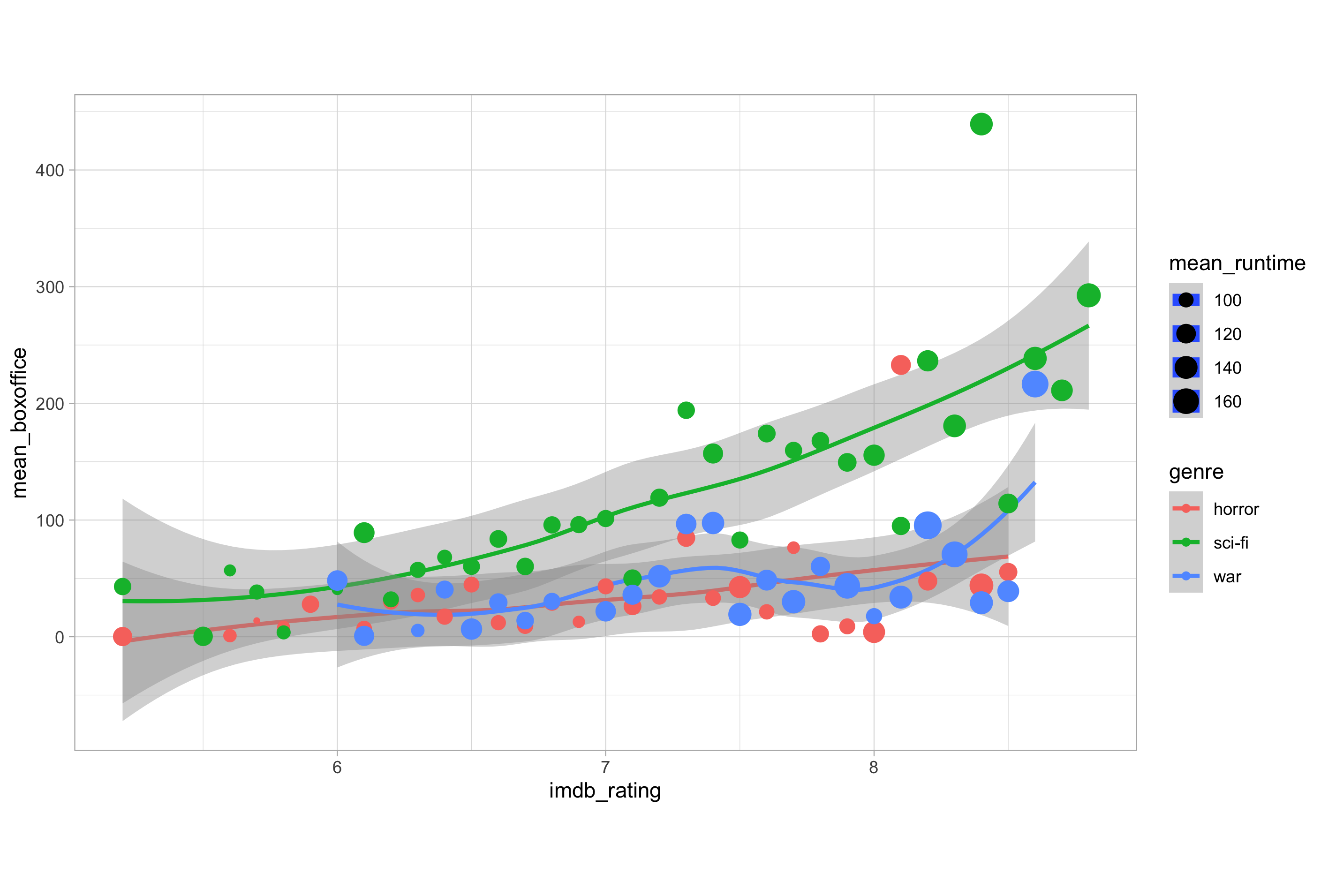
Specifying the aesthetic mapping inside the ggplot() function means that the mapping will affect all geom layers. In this case, the mapping of the genre variable to the colour aesthetic means that both points and lines are coloured according to genre. You might also notice that the mapping of size to mean_runtime is altering the line size in the legend created for this variable, though for reasons we’ll ignore for now it isn’t altering the plot itself.
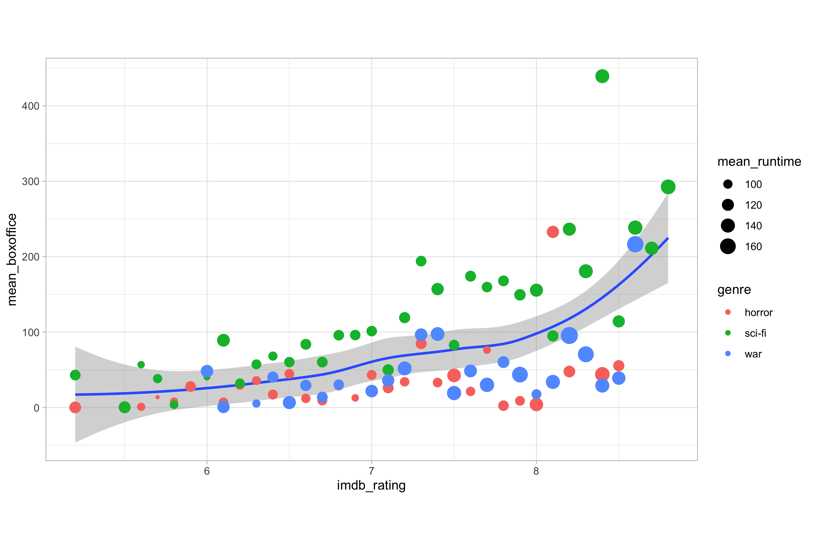
The solution to only having the points affected by the mapping of the size and colour aesthetics becomes obvious when you realise that you can map variables in the data to aesthetics within a given layer by passing arguments to the appropriate geom_*() function so that the mapping only affects that specific geom layer. In this case, we can move the mapping of size and colour aesthetics to the geom_point() layer so that these mappings only alter the points on the plot and not the line created by the geom_smooth() layer.
# mapping size and colour within a specific geom layer
ggplot(imdb_summary, aes(x = imdb_rating, y = mean_boxoffice)) +
  geom_smooth() +
  geom_point(aes(size = mean_runtime, colour = genre))
As we mentioned earlier, many aesthetics function as both aesthetic mappings as well as attributes of geom layers. What this means is that we can alter colour, fill, shape etc. independent of mapping to variables.
Take the following example. Here, we have mapped the genre and mean_runtime variables to the colour and size aesthetics, respectively.
# genre mapped to colour and mean_runtime mapped to size
ggplot(imdb_summary, aes(x = imdb_rating, y = mean_boxoffice, colour = genre, size = mean_runtime)) +
  geom_point()
Now, if we wanted to modify the default shape, we could do so according to the genre by mapping this variable to the shape aesthetic.
# genre mapped to colour and mean_runtime mapped to size
ggplot(imdb_summary, aes(x = imdb_rating, y = mean_boxoffice, colour = genre, size = mean_runtime, shape = genre)) +
  geom_point()
However, if we didn’t want different shapes for each genre but instead wanted to simply change the default shape attribute used by geom_point() layer to a diamond shape, we would have to do so by modifying the shape attribute which is done outside of aes().
# modify the shape attribute of the geom layer
ggplot(imdb_summary, aes(x = imdb_rating, y = mean_boxoffice, colour = genre, size = mean_runtime)) +
  geom_point(shape = "diamond")
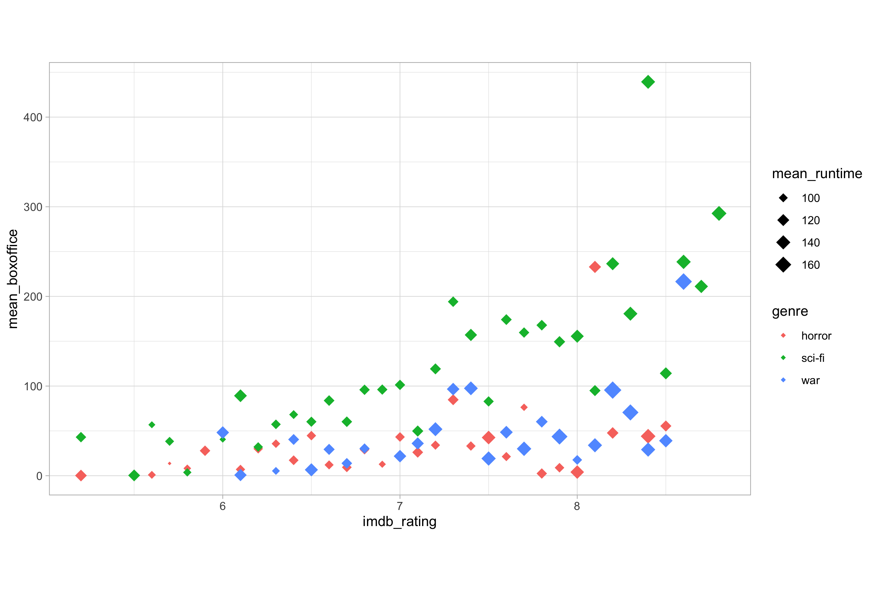
The call to aes() always relates to mapping of data variables to aesthetic parameters of your plots, be that at a plot-wide or geom-specific level. If you want to alter an attribute of a specific geometry, you do this outside of aes() and always do so inside the geom layer. This is one of the most frequently confusing topics for new ggplot2 users and worth keeping in mind.
Summary()
In this post we have introduced the “Layered Grammar of Graphics” and the different grammatical elements, as well as aesthetic mappings; the cornerstone of the grammar of graphics plotting concept.
We have looked at the types of data that are appropriate to map to different aesthetics, as well as looking at some of the more intricate concepts relating working with aesthetic mappings and geometries.
Next time in this post series we will look at modifying aesthetics and attributes a little more, as well as different geom types and the common plots such as scatter plots, bar charts and line plots that you can create using these.
Finally, we will look at the theme layer and discover the functions and arguments available to customise the non-data elements to make complex, publication quality exploratory plots. Then you’ll be ready for the intermediate ggplot2 series that will follow.
See you next time.
Thanks for reading. I hope you enjoyed the article and that it helps you to get a job done more quickly or inspires you to further your data science journey. Please do let me know if there’s anything you want me to cover in future posts.
Happy Data Analysis!
Disclaimer: All views expressed on this site are exclusively my own and do not represent the opinions of any entity whatsoever with which I have been, am now or will be affiliated.