Let’s Get Visual
Visualisation is one of the two main engines for generating knowledge and understanding from data, the other being statistical modelling. Visualisation is a fundamental exploratory activity that we as humans engage in and can reveal novel or unexpected aspects of your data, raise questions you hadn’t initially considered, and indicate the need to ask different questions or collect other data.
“The simple graph has brought more information to the data analyst’s mind than any other device.” — John Tukey
Data visualisation and modelling modalities have complementary strengths and weaknesses, and it is important to utilise and iterate over both of these any number of times during the analytical process to extract maximum insight from your data. This cyclic process of exploration and understanding is commonly referred to as exploratory data analysis or EDA. We will learn about all aspects of EDA in future posts.
Given that EDA inherently involves a lot of data visualisation, it should seem logical when I say that you will need to become very good at quickly generating several plots to effectively develop questions about your data, search for answers to those questions, and use the insights you gain to refine your initial questions or originate new ones.
Effective data visualisation is not only critical to EDA but also to the end stage of the analytical workflow - communication. As a data professional, you will eventually need to become adept in the art of impactfully communicating your results to your target audience in an effective and intuitive manner.
Tools for the Job
If you’re currently in or looking to get into the data science field, it seems almost inevitable that you will have encountered the R vs Python argument. I am not going to wade into that one here and I only really have two things to say on the matter anyway: the first being that you should (eventually) learn both due to their complementary strengths and weaknesses, and the second being that R absolutely steamrollers Python when it comes to data visualisation tools, a fact that is largely due to R having the ggplot2 package.
The ggplot2 package and “the grammar of graphics” framework that it employs are subjects that have entire books and course series devoted to them. Suffice it to say that we aren’t going to deep dive into those here, although I will do in future post series. What I will say for now is that the time invested in learning these will pay huge dividends in the long-term and will put an array of tools at your disposal to meet almost all your data visualisation needs.
A few months ago, I discovered the Esquisse (pronounced: /ɛs’ki:s/ ) package. Appropriately meaning “a rough or preliminary sketch”, Esquisse provides a Tableau-like drag-and-drop graphical user interface for rapid prototyping of ggplot2 graphs in R. Having now experimented with it extensively, I have concluded that Esquisse will serve as either an excellent gateway drug for new ggplot2 learners or a convenient means of speeding-up the tedious process of creating basic graph code for the experienced data scientist.
 Data Visualisation Needn’t Be This Complicated
In this post, I am going to cover how to use the Esquisse package as well as some of it’s strengths and limitations. We will use the skills we learn here in future posts to make animated and fully interactive graphs in R, as well as building on these skills when learning both EDA and how to use the ggplot2 package in greater detail. Let’s make some graphs!
Get Started with Esquisse
Let’s begin by loading the packages we will require. If you do not have the listed packages installed, you can do this by simply removing the “#” and running the install.packages() functions shown.
## install packages

# install.packages("dplyr")
# install.packages("esquisse")
# install.packages("ggplot2")

## load packages

library("dplyr")
library("esquisse")
library("ggplot2")
Now let’s get some data to work with. A few months ago, I wrote a series of posts on how to undertake basic web scraping in R that described how to create a data set from the IMDb list of top-rated sci-fi movies. I will be using the raw version of that data set in future to demonstrate how to clean, tidy and transform data. For now, I have wrangled the data and taken the liberty of scraping some similar data for top-rated horror and war movies. Go ahead and download this ready-to-use data set from here.
The file you’ve just downloaded is in one of the native R data formats, so we can simply use the load() function with the path to the file to make it available in our global environment. Here, I am going to load the file directly from my “Downloads” directory.
# load imdb top rated data set
load(file = file.path("~", "Downloads", "imdb_top_rated_clean.rds"))
If you don’t know how to use the file.path() function for writing paths in a platform-independent manner, I would recommend consulting the function’s help file using help(file.path) as it’s a really handy function to know.
Now we can launch Esquisse, either by running esquisser() directly in the R console (requires the Esquisse package to be loaded) or from the RStudio add-ins menu, which can be done without explicitly loading the Esquisse package.
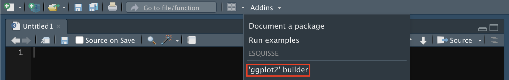
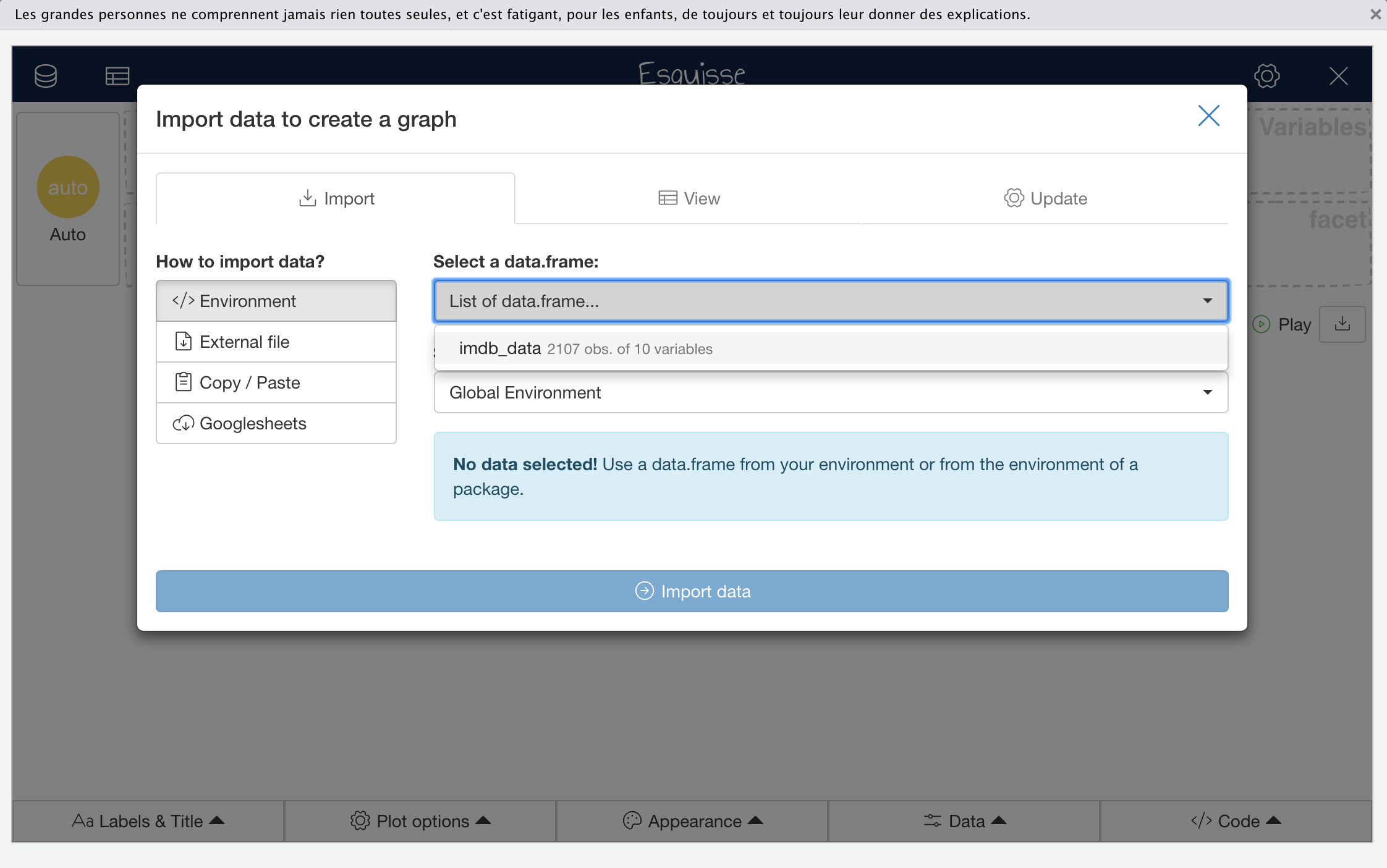
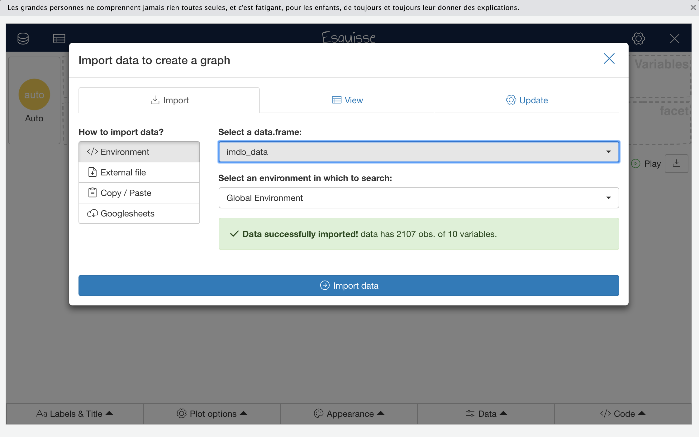
Launching Esquisse by either of these approaches will open a data import window in which you can select and load the data frame named imdb_data.
 Click to Zoom
 Click to Zoom
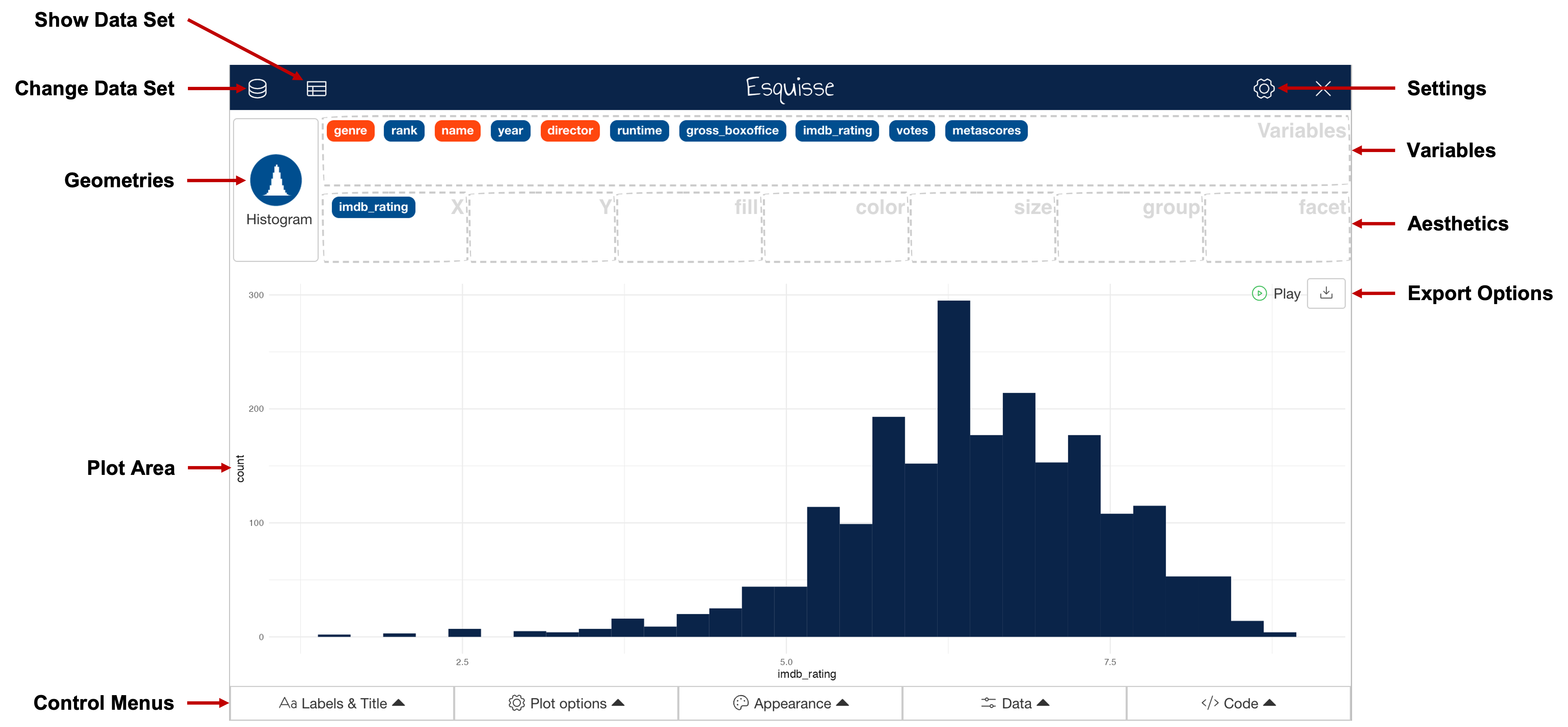
Once you have clicked “Import data”, you should be looking at the main Esquisse interface. An alternative way of getting here would have been to simply run esquisser() with the name of a data frame as the first argument e.g., esquisser(imdb_data). A breakdown of the Esquisse main interface features is shown below:
 Click to Zoom
In the main interface, you can drag-and-drop variables that exist in your data (colour coded by data type) into the boxes that will map them to ggplot2 aesthetics and create a plot. For example, mapping imdb_rating to the X-axis aesthetic and genre to the fill aesthetic will result in the plot shown below. You can add or remove aesthetic mappings available for use by clicking the gear icon shown in the top-right hand corner of the interface.
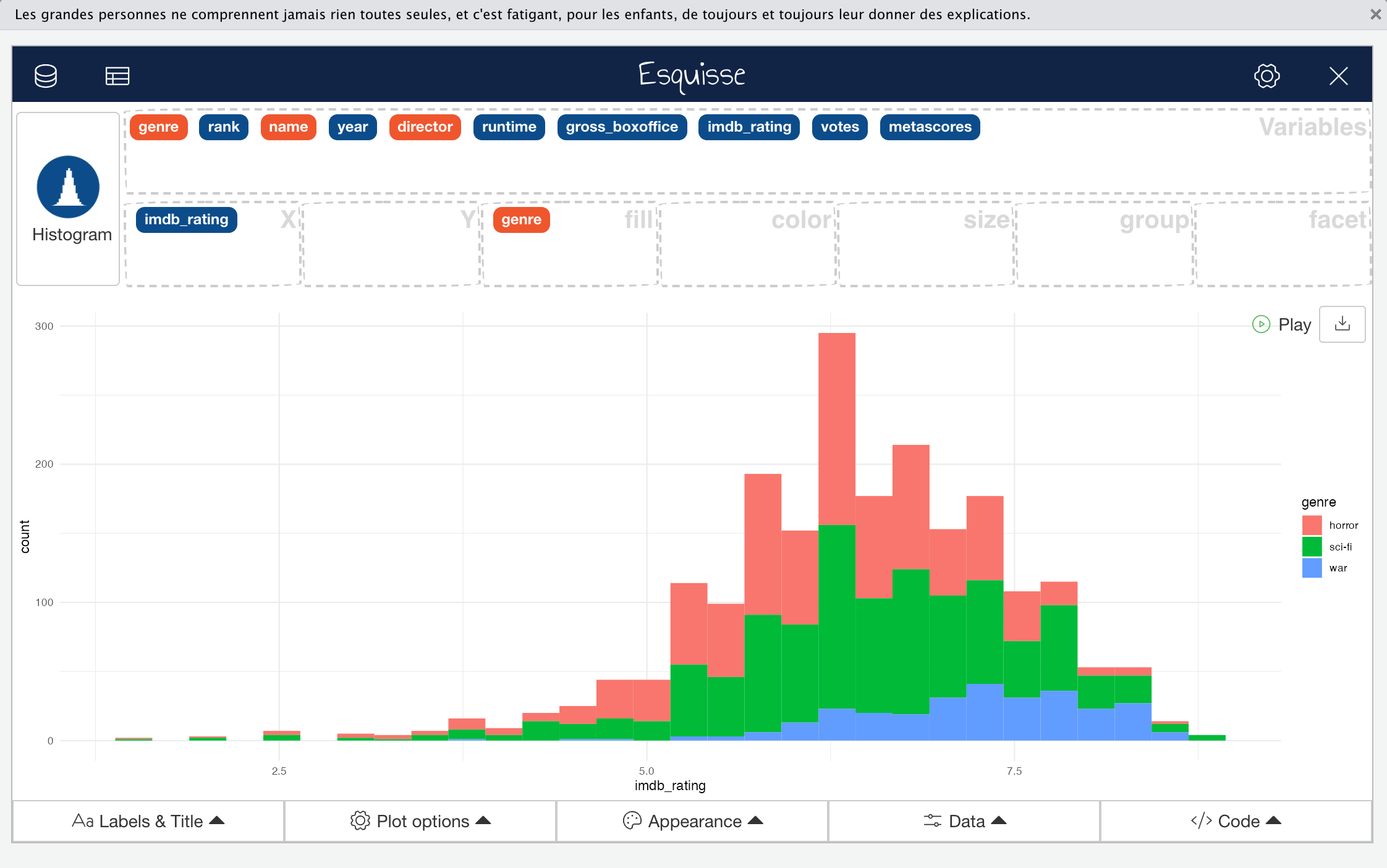 Click to Zoom
When you create a plot, a geometry deemed appropriate to represent the data will automatically be selected according to the types of variables you have mapped. In the example above, Esquisse has used a histogram for the numeric variable imdb_rating and indicated each category in genre by colour; this certainly wouldn’t be considered a bad choice. However, there are other acceptable ways of representing these data. Ignoring how you might break up the categories in genre (e.g., fill, colour, faceting etc.), you could use density, box and whisker, or violin plots to represent the imdb_rating variable. All of these would be suitable and would likely reveal different characteristics of the data. Normally, you might also consider the option of using a combination of multiple layered geoms to convey more information about your data but this functionality isn’t currently implemented in Esquisse. We’ll cover a few more limitations of the package later.
To select a different geom that would be appropriate for the data you want to display, you can click on the geom button in top-left corner, as shown here:
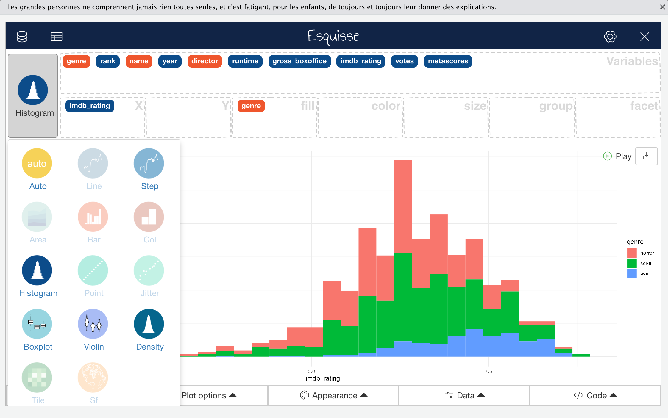 Click to Zoom
Controlling Esquisse
There are five control menus under the Esquisse plot area that are available to define plot parameters, filter the data on the fly and retrieve the code required to generate the plot. There is also a menu that allows you to output plots directly from Esquisse. Let’s go through each of the control menus in succession to build a plot that looks at the relationship between imdb_rating and metascores variables.
Start by ensuring that you have imported the imdb_data data frame as previously and mapped imdb_rating to the x aesthetic, metascores to the y aesthetic and genre to both colour, fill and facet aesthetics.
The first of the five menus “Labels an Title”, as you might expect, enables you to define your plot, axis and aesthetic mapping titles and formatting.
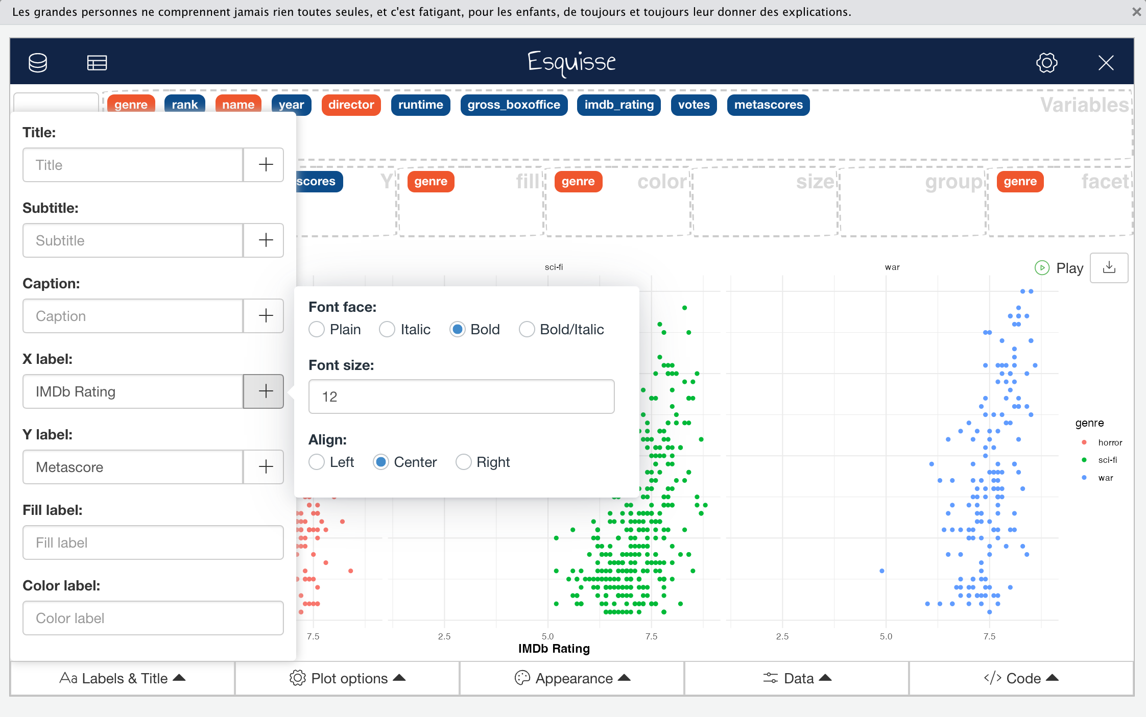 Click to Zoom
The second control menu is the “Plot Options” menu which controls the plot area and faceting parameters, the scale and limits of the axes, and the geometry sizes.
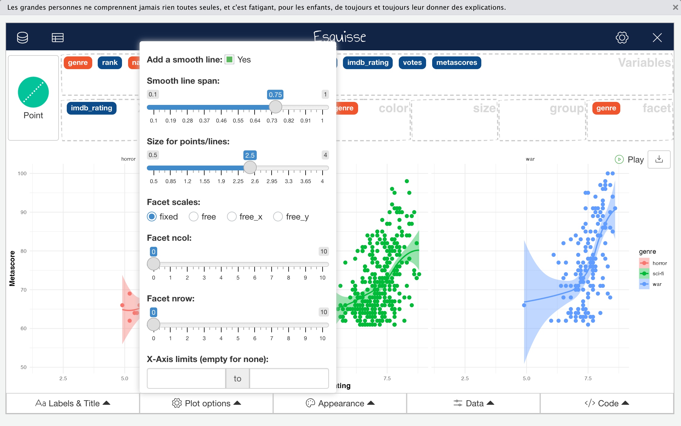 Click to Zoom
The next menu is the “Appearance” menu; another self-explanatory one. Here, you can set the colour palette, either from pre-defined options or by specifying hex codes, define the symbol used for data points where these are used by specific geometries (e.g., geom_point), set the base ggplot2 theme used for plot formatting, and set the legend position.
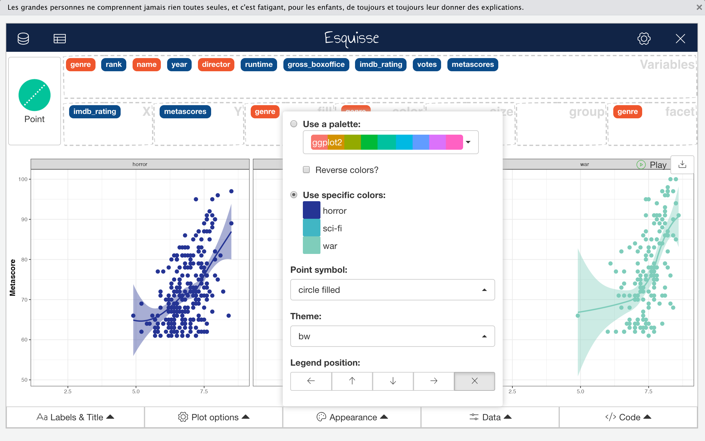 Click to Zoom
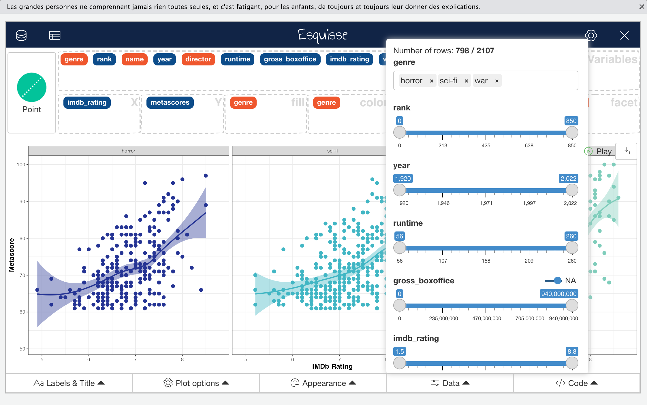
The fourth control menu “Data” is an interesting one because it allows you to redefine the actual input data while your visual preview remains available and is updated in real time.
For me, this menu is one of the defining features that makes Esquisse worth using during EDA or graph prototyping. Even if you have pre-filtered and transformed your input data, you might find the “Data” menu useful because it enables you to explore new ideas or rectify something you missed in the data without having to write data wrangling code. Those of you with more experience will be used to switching between wrangling data and visualisation quickly and iteratively but this option greatly speeds up the process.
In our worked example, I used the “Data” menu to remove observations with missing or NA values in the metascores variable.
 Click to Zoom
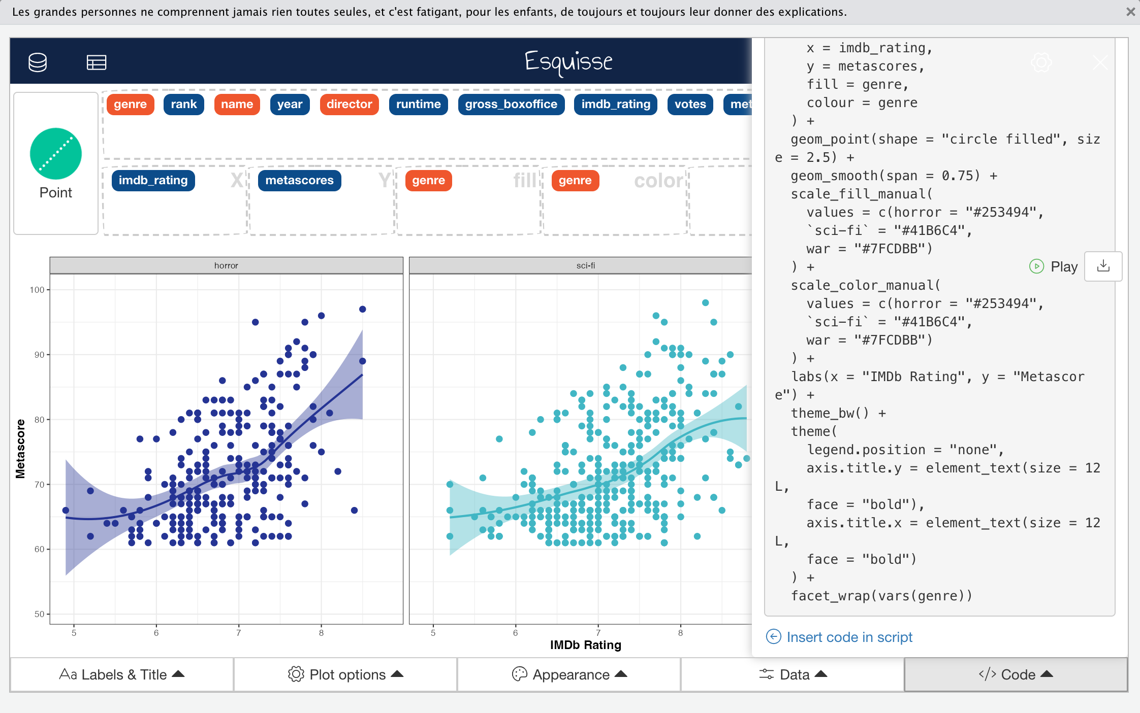
The fifth and final control menu on the Esquisse main interface is the “Code” menu, which allows you to copy all code required to build your graph to the clipboard so you can paste it into a script (or elsewhere). You can also directly insert the code into your RStudio script editor. As well as the code required to build the plot itself, any code used to modify the input data after it was imported i.e., that defined in the “Data” menu, is also provided.
 Click to Zoom
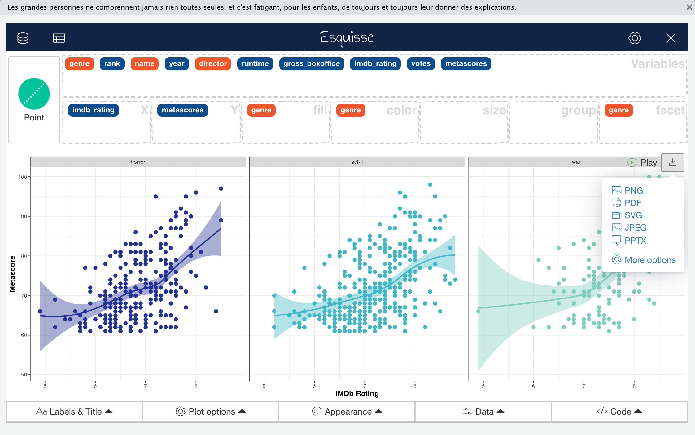
In addition to the control menus, Esquisse also provides a menu that allows you to directly export plots as images in a variety of formats.
 Click to Zoom
The export menu has more advanced options that allows a greater degree of control over some of the export parameters, including allowing you to set the filename and output dimensions in pixels.
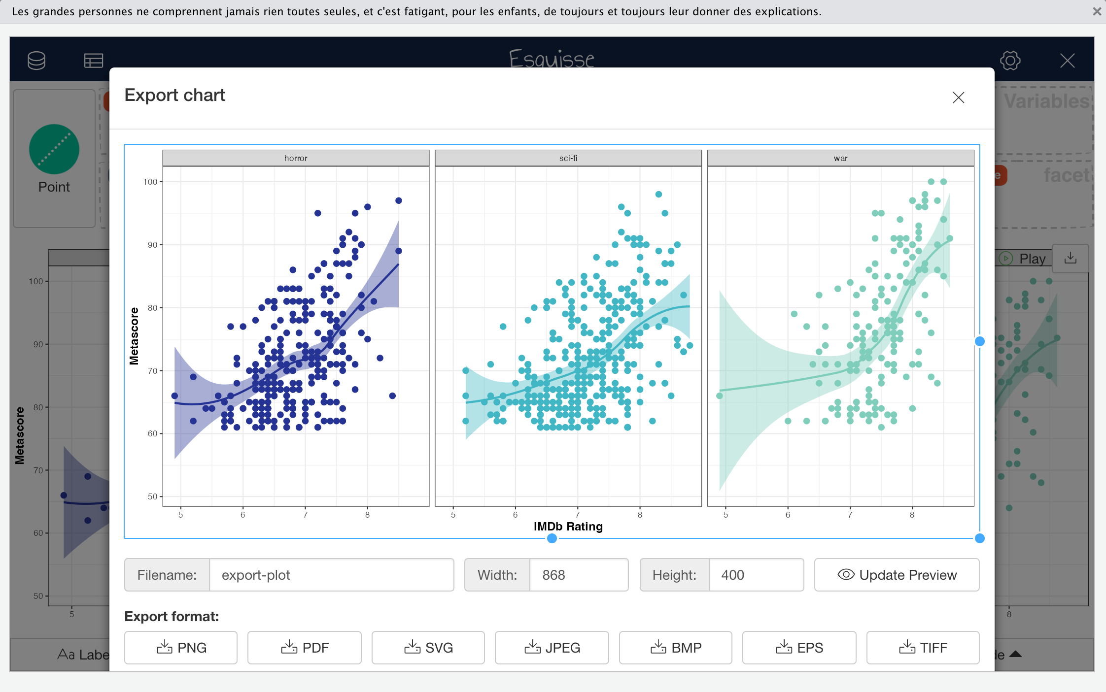 Click to Zoom
Some might find this direct export functionality useful but I personally prefer using ggplot2 and the ggsave() function for a greater degree of control when saving my plots. The ggsave() function is another great one to learn as it can be used with virtually any plotting package that uses conventional graphics devices.
Why Go Further?
By this point you can probably see that the Esquisse package is quite powerful and has some really great features. It should be obvious that it could be a useful tool for learners and to streamline quick data visualisation, the EDA process, and graph prototyping for experienced data professionals. That said, it is just that, a tool; you should use Esquisse to supplement ggplot2 not as a lazy replacement. Let’s take a quick look at some of the limitations of Esquisse and why learning ggplot2 will also be important.
Imagine that the question underlying our worked example using metascores and imdb_rating was to ask, “Does the Metacritic metascore correlate with the IMDb rating?”. Looking at the plot below with this question in mind should immediately cast light on one deficiency of Esquisse. Correlation is used to establish and determine the strength of a linear relationship between two variables, but you can’t change the smoothing method used by geom_smooth to plot the line describing a relationship between two numeric variables. You can see a non-linear relationship, but you can’t visualise a linear relationship that relates to any correlation coefficients calculated for the two variables.
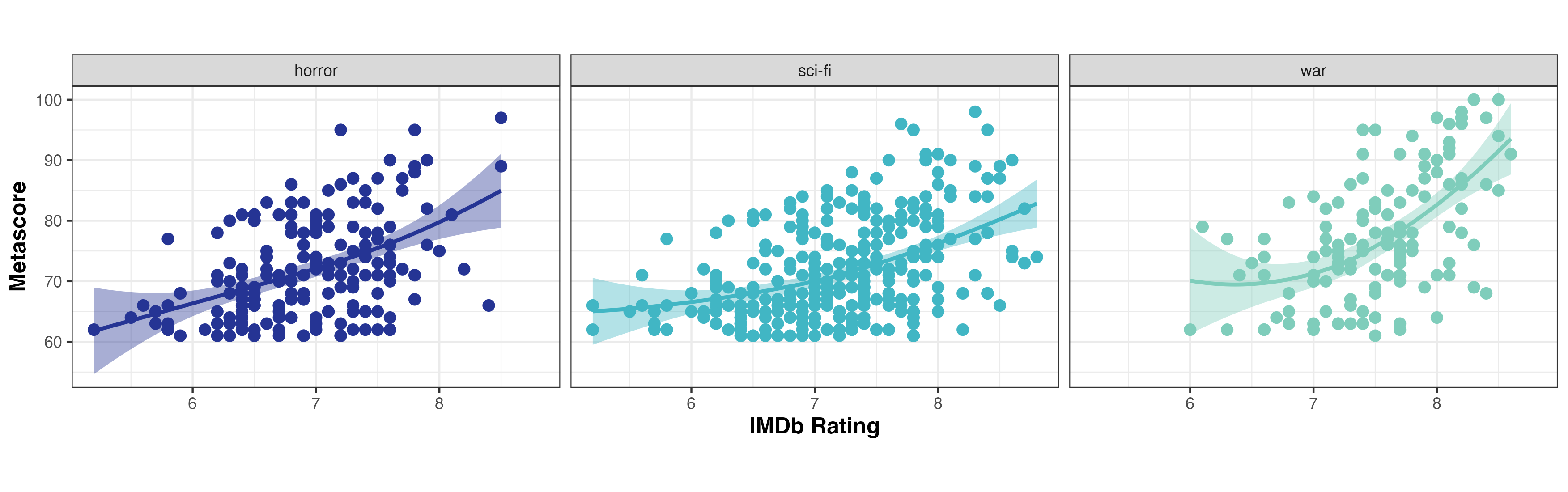 Click to Zoom
Show Graph Code
imdb_data %>%
  filter(!is.na(gross_boxoffice)) %>%
  filter(!is.na(metascores)) %>%
  ggplot() +
  aes(x = imdb_rating, y = metascores, fill = genre, colour = genre) +
  geom_point(
    shape = "circle filled",
    size = 2.5
  ) +
  geom_smooth(span = 1L) +
  scale_fill_manual(values = c(horror = "#253494", `sci-fi` = "#41B6C4", war = "#7FCDBB")) +
  scale_color_manual(values = c(horror = "#253494", `sci-fi` = "#41B6C4", war = "#7FCDBB")) +
  labs(
    x = "IMDb Rating",
    y = "Metascore",
    fill = "Genre",
    color = "Genre"
  ) +
  theme_bw() +
  theme(
    aspect.ratio = 0.618,
    axis.title.x = element_text(size = 12L, face = "bold"),
    axis.title.y = element_text(size = 12L, face = "bold"),
    legend.position = "none"
  ) +
  facet_wrap(vars(genre), nrow = 1L)
As I mentioned earlier, the scope for more refined control of ggplot2 code with Esquisse is limited. Just as you can’t really layer multiple geoms to simultaneously convey different aspects of your data, you can’t remove non-data ink such as tick marks or panel grid lines outside of changing the base theme; you can’t alter the axis or facet strip text size; you can’t remove the confidence interval around the smooth line; and probably most importantly here, you can’t use alpha (transparency) to minimise the impact of data points obscuring other data points (overplotting). The more critical of these issues hide potentially important aspects of the data, and while the others are mostly superficial, they do mean that the plot doesn’t conform to data visualisation best practices.
Anyone reviewing the graph code provided above might spot that I have added a modification to alter the plot aspect ratio (something else you can’t do in Esquisse easily). I did this simply because I couldn’t bear the default setting. Outside of minor styling for readability, the code created by Esquisse is otherwise unmodified.
Now consider the following version of the same graph generated from scratch using ggplot2.
 Click to Zoom
Show Graph Code
# additional packages required
library("magrittr")
library("stringr")

# filter data to remove NA values
plot_data <- imdb_data %>%
  filter(!is.na(gross_boxoffice)) %>%
  filter(!is.na(metascores))

# plot colours
plot_colours <- c("#253494", "#41B6C4", "#7FCDBB")

# custom facet strip labels
genre_labs <- imdb_data$genre %>%
  unique() %>%
  str_to_title()

genre_labs <- imdb_data$genre %>%
  unique() %>%
  set_names(genre_labs, .)

# plot code
ggplot(plot_data) +
  aes(
    x = imdb_rating,
    y = metascores,
    fill = genre,
    colour = genre
  ) +
  geom_point(
    shape = 21,
    size = 2.5,
    colour = "#FFFFFF",
    fill = "#FFFFFF"
  ) +
  geom_point(
    shape = 21,
    size = 2.5,
    alpha = 0.25
  ) +
  geom_point(
    shape = 21,
    size = 2.5,
    fill = "transparent"
  ) +
  geom_smooth(method = "lm", se = FALSE) +
  scale_x_continuous(
    position = "top",
    expand = c(0, 0),
    limits = c(4.5, 9.5),
    breaks = seq(5, 9, 1)
  ) +
  scale_y_continuous(
    expand = c(0, 0),
    limits = c(55, 105),
    breaks = seq(60, 100, 10)
  ) +
  scale_colour_manual(values = plot_colours) +
  scale_fill_manual(values = plot_colours) +
  theme_bw() +
  theme(
    aspect.ratio = 0.618,
    plot.title = element_text(size = 14, face = "bold"),
    panel.grid.minor = element_blank(),
    axis.title.x.top = element_text(size = 12, face = "bold", margin = margin(0, 0, 15, 0)),
    axis.title.y = element_text(size = 12, face = "bold", margin = margin(0, 15, 0, 0)),
    axis.ticks = element_blank(),
    legend.position = "none",
    strip.background = element_blank(),
    strip.text = element_text(size = 12, face = "bold", hjust = 0)
  ) +
  labs(
    x = "IMDb Rating",
    y = "Metascore",
    colour = "Genre",
    fill = "Genre"
  ) +
  facet_wrap(
    vars(genre),
    strip.position = "bottom",
    labeller = as_labeller(genre_labs)
  )
In this version, moving the X-axis to the top means that as the reader reviews the graph top-left to bottom-right (as we are trained to do in Western civilisation), the sub-conscious is already soaking up the information conveyed by the plot without any real need for conscious appraisal. The other fixes not only provide an appropriate visual representation of the linear relationships between IMDb score and Metascore within each genre, but also mean that overplotting is less of an issue. In addition, the overall cleanliness and visual appeal of the plot are improved, aiding conveyance of the underlying message and minimising distractions.
Reviewing the code required to generate this plot and comparing it with that for the Esquisse-generated plot above should demonstrate two main things: the first being that Esquisse has laid down a lot (around 50%) of the basic plot generation code, and the second being that there isn’t much more required to elevate a plot from passable to publication-quality using the relatively simple ggplot2 framework.
You shouldn’t take this example as me suggesting that Esquisse has glaring deficiencies, it doesn’t. While it does do less then ggplot2, Esquisse is not trying to replace ggplot2, it is trying to provide a means of generating a rough or preliminary plot to which you can add supplimentary ggplot2 code if needed. In this sense, it does exactly what it says on the tin.
Conclusion
That’s it for our crash course in the Esquisse package. Hopefully I have convinced you that Esquisse is a great tool, either for learning basic ggplot2 syntax interactively, for rapid generation of multiple plots and exploring ideas with ease during EDA, or for laying down basic code for more advanced ggplot2 graph generation.
I also hope that this post has inspired you to learn more ggplot2, as that’s what we’re going to be doing in upcoming posts; covering everything from introductory and intermediate ggplot2 to resources for more advanced ggplot2 data visualisations, as well as how to create fully animated and interactive graphs in R using ggplot2.
See you next time.
Thanks for reading. I hope you enjoyed the article and that it helps you to get a job done more quickly or inspires you to further your data science journey. Please do let me know if there’s anything you want me to cover in future posts.
Happy Data Analysis!
Disclaimer: All views expressed on this site are exclusively my own and do not represent the opinions of any entity whatsoever with which I have been, am now or will be affiliated.