ggplot(recap)
In the first part of this introduction to ggplot2 series, we introduced the “Layered Grammar of Graphics” and the component grammatical elements. We looked at aesthetic mappings, a linchpin of the grammar of graphics paradigm, and we covered some of the types of data that are appropriate to map to different aesthetics.
 By the end of this post you will be ready to have at it with many data visualisation tasks in R
In this post we are going to look at modifying aesthetics and attributes in more detail. We will also cover how to make some basic versions of staple plot types such as scatter plots, histograms, bar plots and line plots. This will ready you for the final post in this introductory series which will cover how to customise the non-data plot elements and output high-quality graphics.
Setup
We are going to continue working with the IMDb top-rated data set that we used previously and can be downloaded from here.
If you want to learn more about how this data set was harvested, checkout my series on basic web scraping in R.
As in the previous post, you will need to have installed and loaded the dplyr and ggplot2 packages. If you do not have these installed, you can do can do this first by removing the “#” at the start of each line and running the install.packages() functions shown in the code chunk below.
# install packages
# install.packages("dplyr")
# install.packages("ggplot2")

# load packages
library("dplyr")
library("ggplot2")
To load the data set, which is conveniently saved in one of the native R data formats, we can use the load() function with the path to the file; I am going to load the file directly from my “Downloads” directory.
# load imdb top-rated data set
load(file = file.path("~", "Downloads", "imdb_top_rated_clean.rds"))
Last time I mentioned that the IMDb top rated data set has some rows with missing values intentionally left in for a future data cleaning tutorial. Let’s remove these rows for sake of ease; we want to focus on what’s going on in the plotting code here and not get distracted by the data.
# remove missing observations from the data
imdb_data_clean <- imdb_data %>%
  filter(!is.na(gross_boxoffice)) %>%
  filter(!is.na(metascores))
One last thing I have chosen to do is change the default theme used for plotting to theme_light(); this step is personal preference and entirely optional.
# update the default theme used for plotting to theme_light()
theme_set(theme_light())
That’s all the basic setup out of the way. Let’s make some more graphs.
Aesthetics and Attributes
As I mentioned in the previous post, the distinction between aesthetics and attributes is a frequent sticking point for new ggplot2 users and an important issue to get straightened out early on.
I reckon that one of the main reasons for aesthetics and attributes being problematic is the word “aesthetics”. When we say “aesthetics” in daily conversation we’re usually describing how something looks. In ggplot2, when we say “aesthetics” we actually mean “aesthetic mapping”.
Aesthetic mapping is essentially how the appearance of the geom and stat elements of the plot directly depend on values in the data.
In ggplot2, aesthetic mappings are always created within the call to the aes() function. This results in creation of scales that show how values in the data relate to values of the aesthetic parameter.
Don’t forget that X and Y axes are themselves scales to which the variables assigned within aes() are respectively mapped.
# mapping data to scales of aesthetic parameters
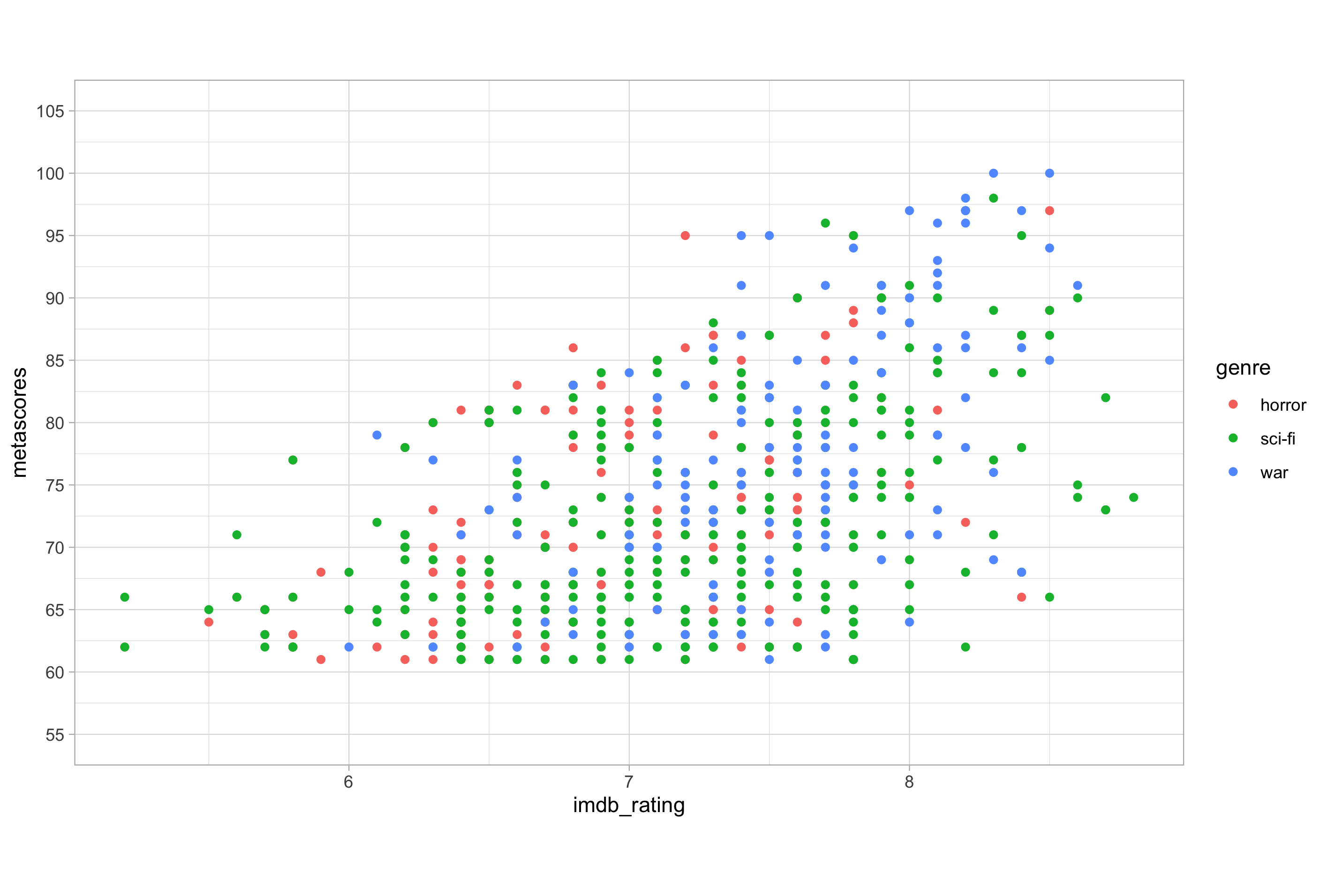
ggplot(imdb_data_clean, aes(x = imdb_rating, y = metascores, colour = genre)) +
geom_point()
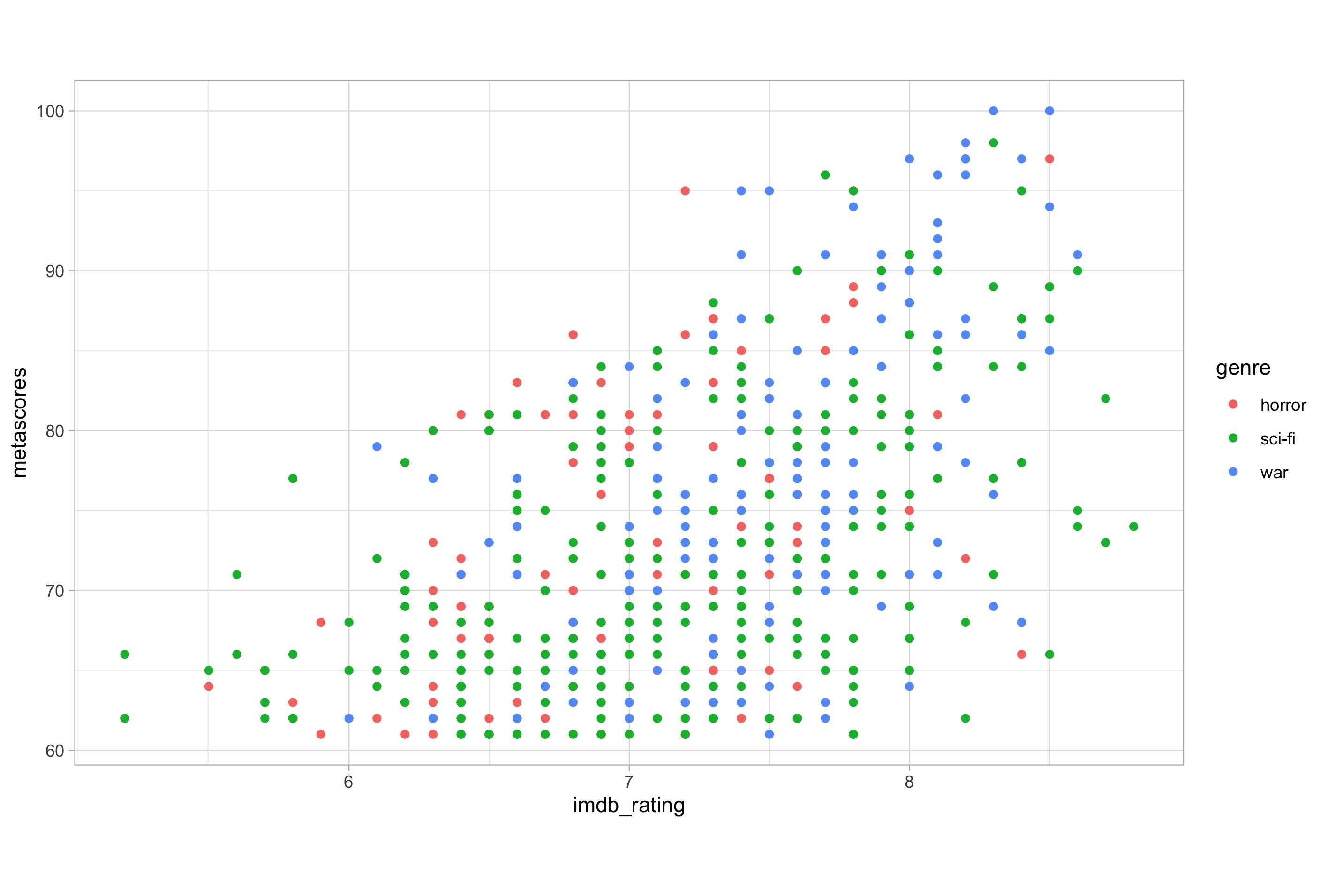
In this example, the mapping of genre to colour has resulted in the creation of a mapping scale which is displayed within the figure legend. The legend enables us to decode how the original data values relate to the mapped scale. In this case, because genre is a categorical variable, the scale depicted in the legend is simply a colour indicating each of the three possible values of the genre variable.
In ggplot2, when we want to refer to how something looks but not how it relates to values in the data, we should refer to its aesthetic attributes or just attributes for short.
Any property that can be mapped to the data by aes() can also be set as an attribute of a geom layer.
Attributes are always called in the geom layer and modify that layer while ignoring any aesthetic mappings.
# assigning an aesthetic attribute
ggplot(imdb_data_clean, aes(x = imdb_rating, y = metascores, colour = genre)) +
  geom_point(colour = "royalblue")
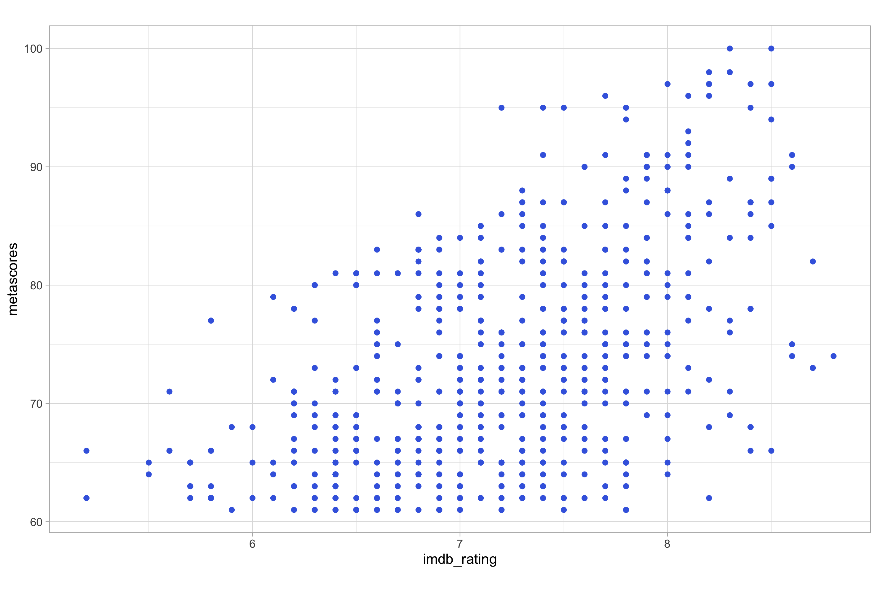
Notice how, in this example, the colour “royalblue” assigned within the geom layer applies to all points plotted by geom_point(), irrespective of category of genre to which it belongs or the fact that genre is still mapped to colour. Assigning attributes will overwrite any aesthetic mapping to the same type of aesthetic parameter.
If we wanted to colour all points with royal blue, we could remove the mapping of genre to colour all together and still get a plot identical to the one shown above.
# assigning an attribute and removing redundant aesthetic mapping
ggplot(imdb_data_clean, aes(x = imdb_rating, y = metascores)) +
  geom_point(colour = "royalblue")
The second point of confusion with aesthetics and attributes seems to stem from the fact that aes() can be called either within the ggplot() function, as a layer of its own added to the initial ggplot() call (both work in the same way), or within a specific geom layer.
When placed at a global level (i.e., when called within ggplot() or when added as a distinct layer) the mapping created by aes() will affect all geom layers, but when the call to aes() is placed within a specific geom layer it will only alter that layer. Consider the following example:
# global mapping of colour to genre with two different geom layers
ggplot(imdb_data_clean, aes(x = imdb_rating, y = metascores, colour = genre)) +
  geom_point() +
  geom_smooth(method = "lm", se = FALSE)
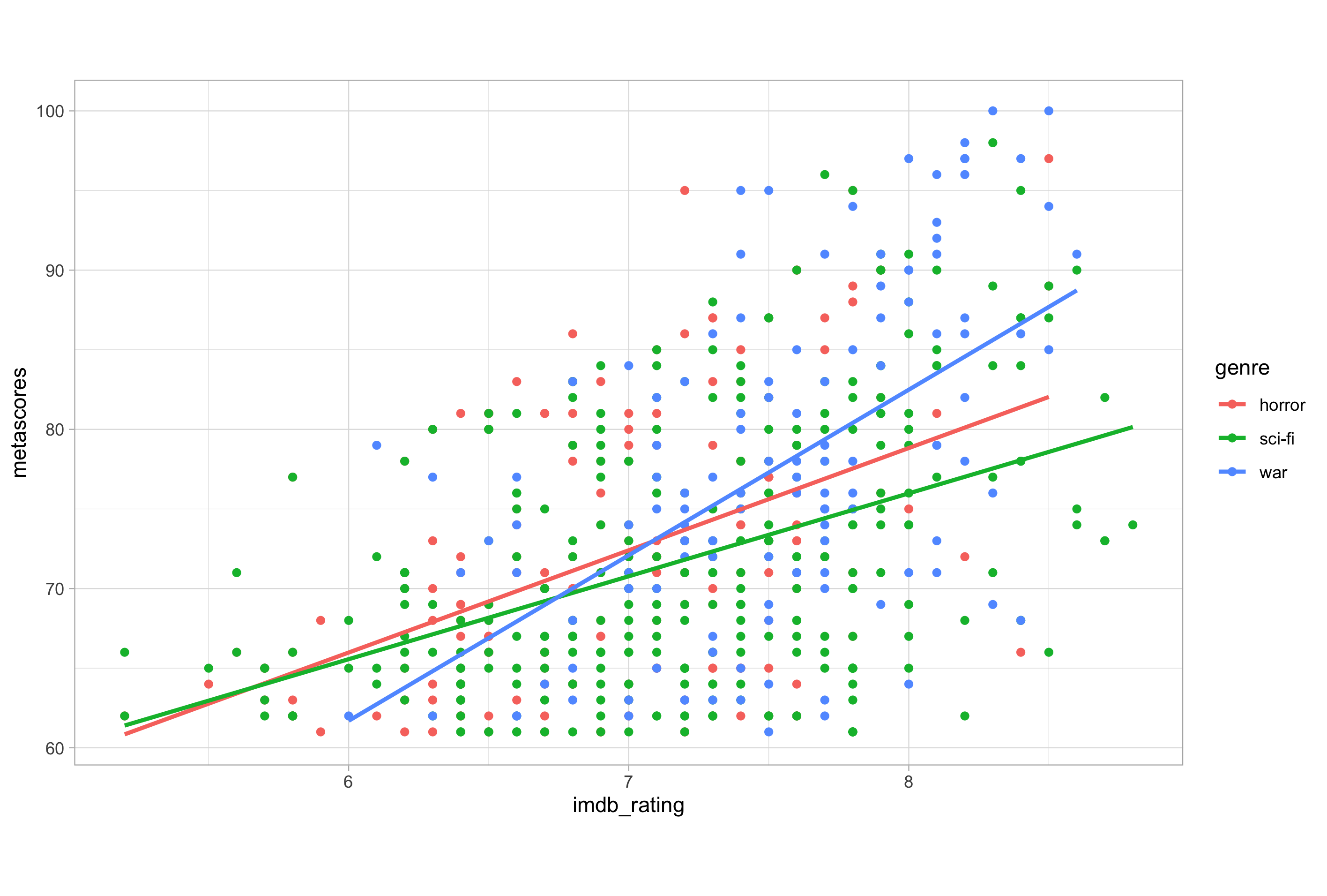
Here, I have added a second geometry with geom_smooth() in order to plot a linear trend line without a confidence interval ribbon. As the genre variable in the data is mapped to the colour aesthetic at the global level, a coloured line for each category of the genre variable is drawn.
But what if we still wanted to colour by genre while still having a single line of best fit for the entire data set? In this case, we would have to move the genre-to-colour mapping to the geom_point() layer within a separate aes() call, thereby preventing this specific mapping being applied globally to all geoms on the plot.
# moving the mapping of colour to the geom_point layer
ggplot(imdb_data_clean, aes(x = imdb_rating, y = metascores)) +
  geom_point(aes(colour = genre)) +
  geom_smooth(method = "lm", se = FALSE)
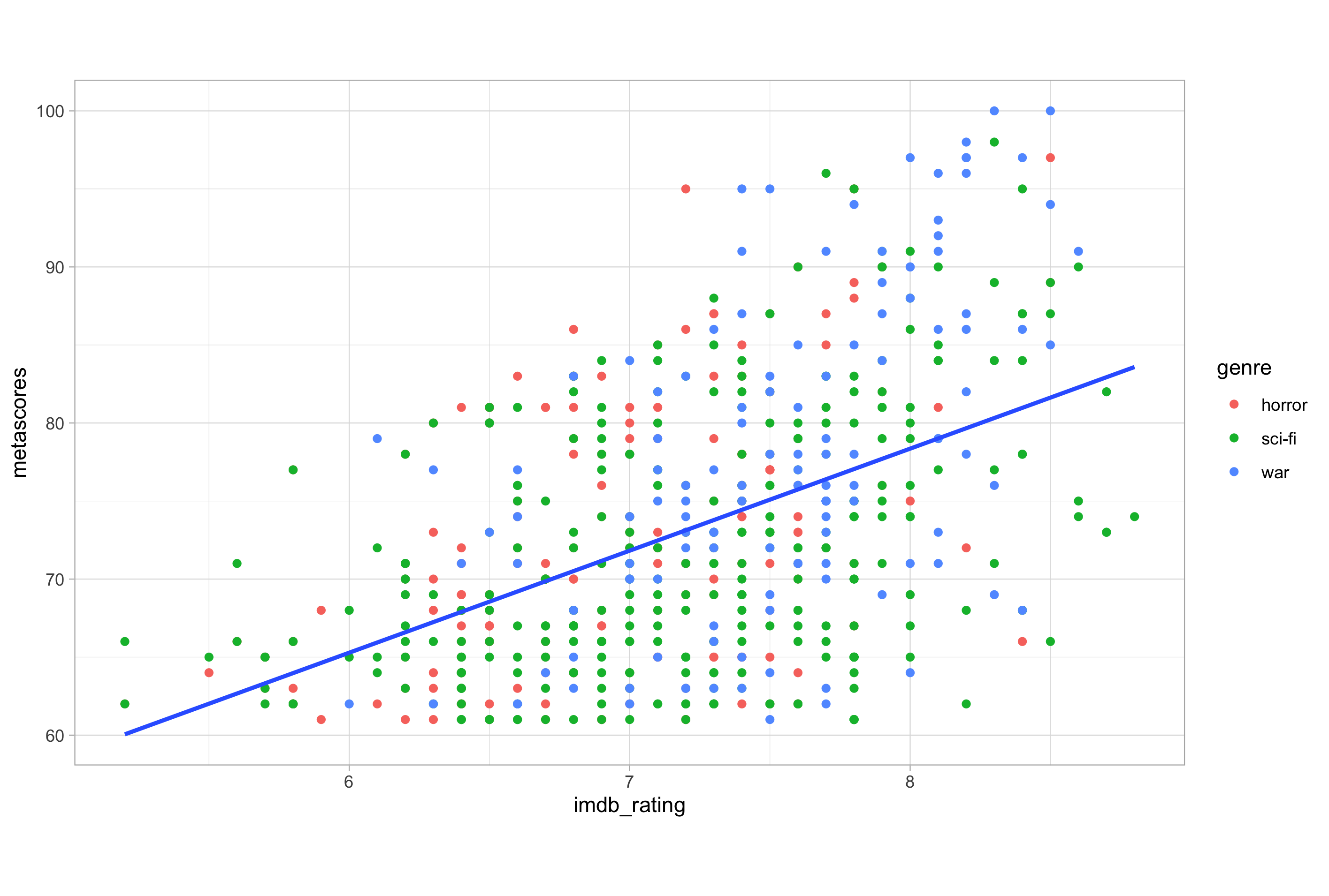
Now, if we wanted to change the colour of this single line to grey, we would have to specify the attribute in the geom_smooth() layer.
# mapping colour in the geom_point layer and modifying the geom_smooth colour attribute
ggplot(imdb_data_clean, aes(x = imdb_rating, y = metascores)) +
  geom_point(aes(colour = genre)) +
  geom_smooth(method = "lm", se = FALSE, colour = "grey50")
The rules I have given here are equally true for working with other aesthetic parameters and attributes e.g., fill, shape, size etc. Hopefully they will prevent you getting mixed up with aesthetics and attributes in future.
Modifying Aesthetics
Now that we’re clear about what aesthetics are, how to choose them appropriately and how to distinguish them from attributes, let’s look at how to modify them.
The two most frequent modifications to aesthetic mappings are the position of point or bar geoms and the adjustment of scales; we will look at these two cases in turn.
Positions
Position specifies how ggplot2 positions and adjust for overlapping bars or points in a single geom layer.
The different type of position include:
- identity
- dodge
- stack
- fill
- jitter
- jitterdodge
- nudge
The “identity” position is the most common and straightforward. We have actually already encountered this position, as it is the default for the scatter plots that we have seen in the examples so far.
The “identity” position means that the value in the data frame is exactly where the value will be positioned in the plot; it basically says to ggplot() “plot the information where the data say to plot the information on the respective scale(s) to which they are mapped”.
Sometimes “identity” is not the default position for a geom and we do have to explicitly set it; we will look at this later when we see how to make bar plots.
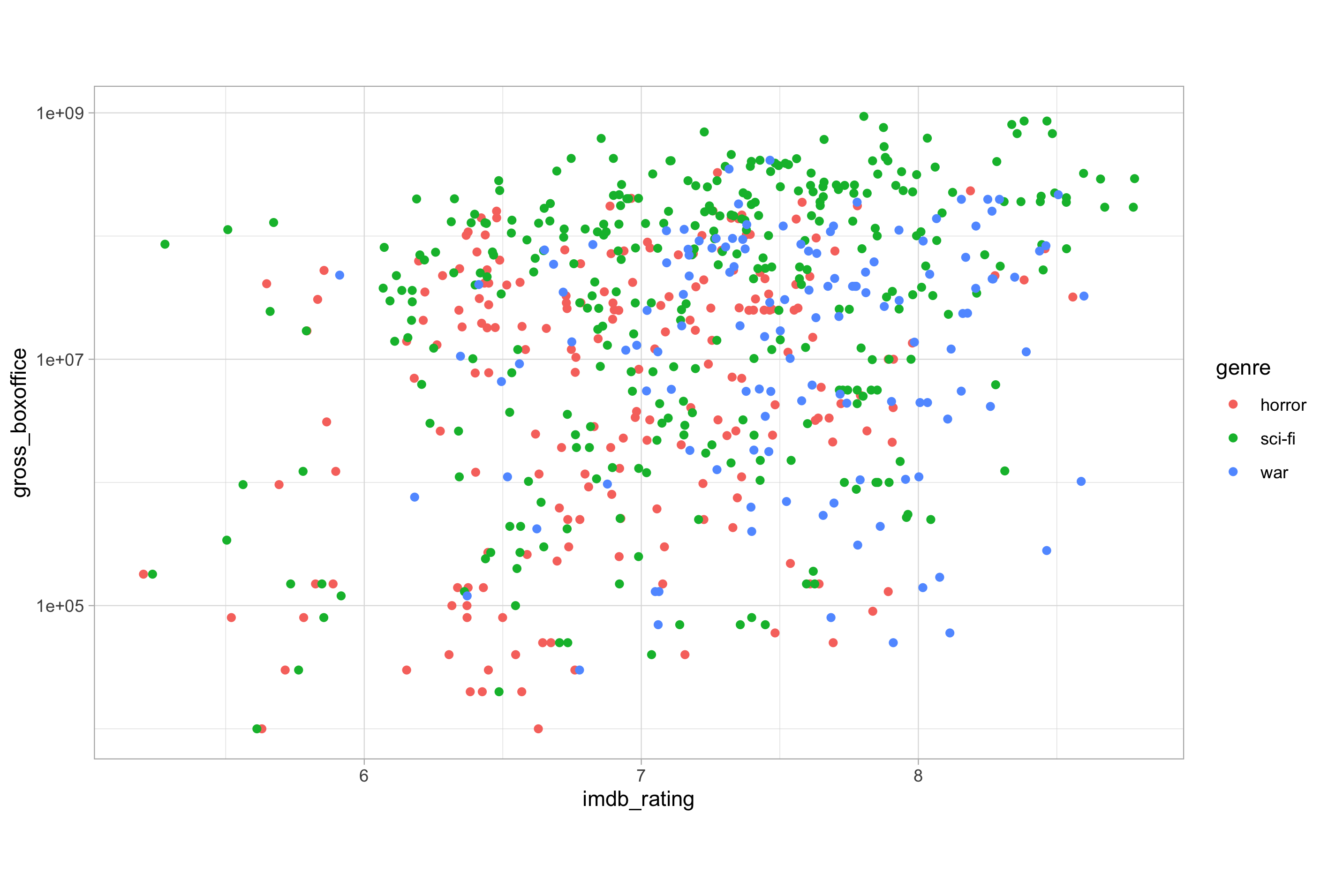
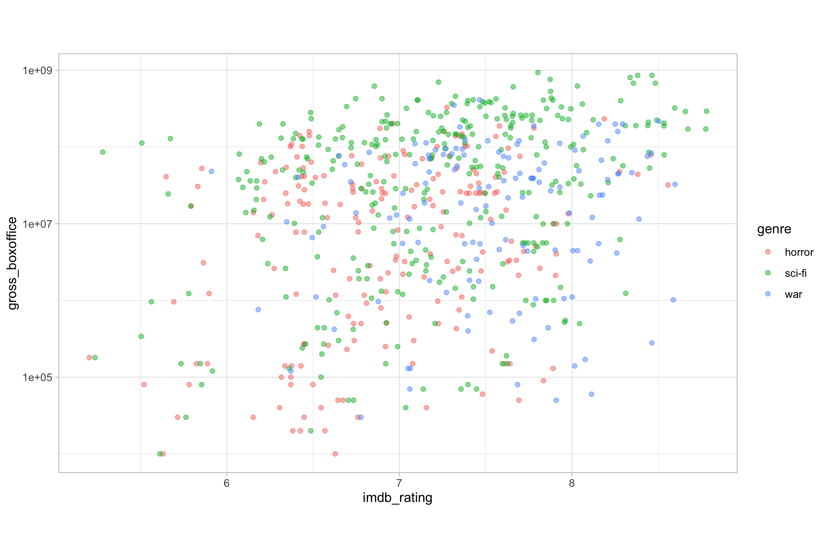
Another position commonly used to modify geom plotting is “jitter”. Consider the following plot:
Here, the imdb_rating variable is stated to a single decimal place. Although this is unavoidable, given that this is the usual format for an IMDb rating score, such instances of low precision measures tend to create an issue with overplotting, where many points lie on top of one another.
The “jitter” position can be helpful in instances of overplotting, as it adds some random noise to X and Y axes, enabling you to see regions of high density.
# set seed for reproducible results when working with randomness
set.seed(123)

# using position = "jitter" to add random noise
ggplot(imdb_data_clean, aes(x = imdb_rating, y = gross_boxoffice)) +
  geom_point(aes(colour = genre), position = "jitter") +
  scale_y_log10()

Each position type can not only be passed to the position argument but can also be accessed as a function.
Using the position functions such as position_jitter() has a number of advantages, the most obvious of these is the possibility of defining the position once as a variable and then reusing it to maintain consistency across subsequent plots.
Position functions also allow us to set specific arguments, such as the width, which defines how much random noise should be added, and a seed number, which is important for reproducing results when using the randomisation capability of R and conveniently prevents us from having to call set.seed() each time to achieve this.
# define the jitter variable using position_jitter()
jitter <- position_jitter(
  width = 0.1,
  seed = 123
)

# using the jitter variable to add random noise
ggplot(imdb_data_clean, aes(x = imdb_rating, y = gross_boxoffice)) +
  geom_point(aes(colour = genre), position = jitter) +
  scale_y_log10()
Scales
As we mentioned earlier, each of the aesthetics is a scale onto which we map data; fill, colour, shape, size, and alpha are all scales just as x and y are scales.
All aesthetic scales can be accessed with their associated scale function.
Scale functions take the form scale_<scale>_<type>() where <scale> defines which scale we want to modify and <type> matches the type of data we are using or specifies manual assignment.
For example, if we want to modify the Y-axis, we must consider the type of data that we want to plot. In the examples so far, we have been plotting a continuous numeric variable on the Y-axis, so to modify it we could use scale_y_continuous().
There are many arguments for the scale functions, some of the most commonly used include limits, breaks, expand and labels.
The limits argument specifies the scale’s range using a numeric vector of length two. The breaks argument controls the tick mark positions. The expand argument also takes a numeric vector of length two, giving a multiplicative and additive constant used to expand the range of the scales so that there is a small gap between the data and the axes. As you may guess, the labels argument adjusts the labels assigned to the scale breaks.
Now let’s see these in action. Here’s the code for a plot we made earlier on:
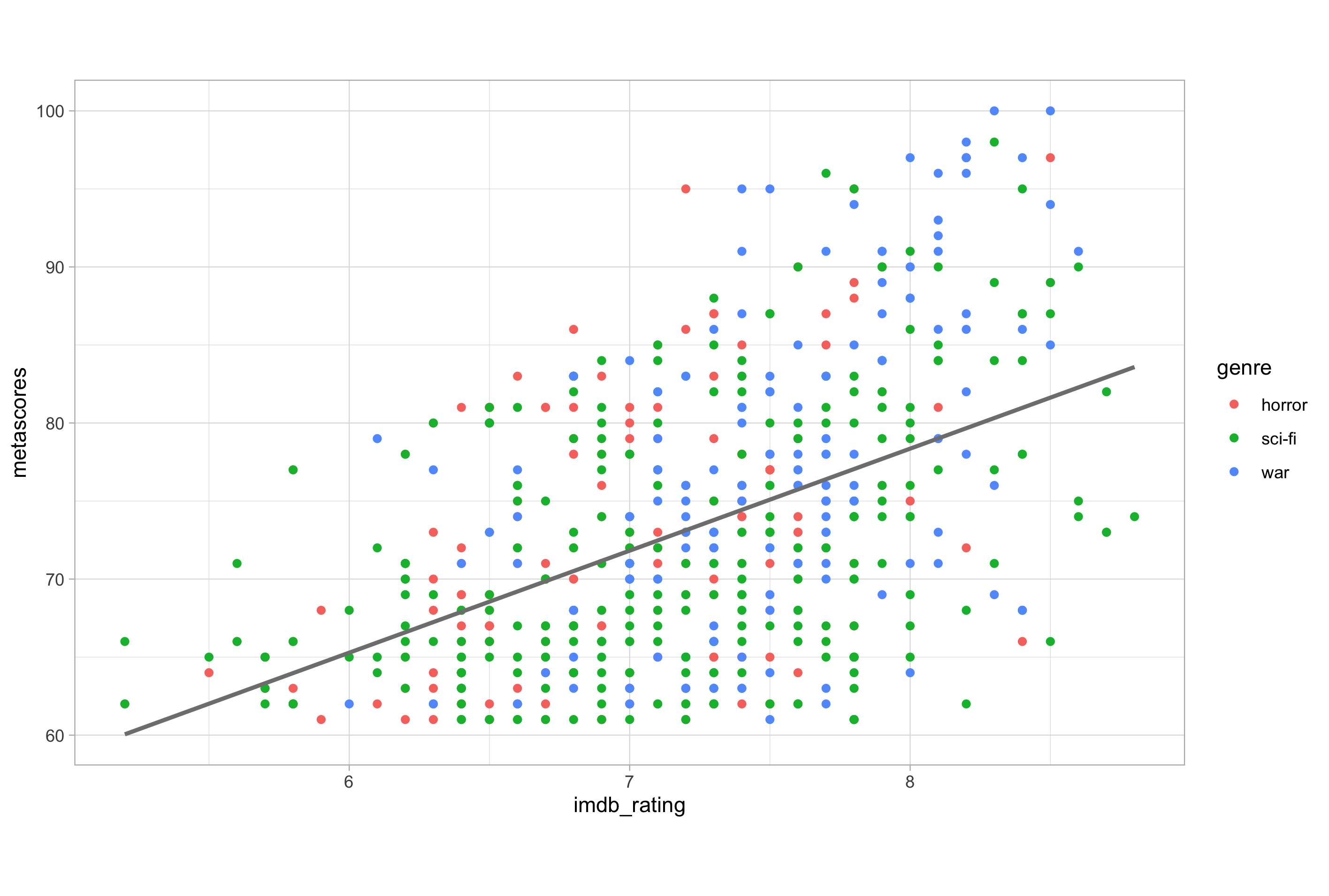
# base plot for modifying scales
ggplot(imdb_data_clean, aes(x = imdb_rating, y = metascores)) +
  geom_point(aes(colour = genre))

Now let’s modify the Y-axis scale:
# modifying the y-axis scale
ggplot(imdb_data_clean, aes(x = imdb_rating, y = metascores)) +
  geom_point(aes(colour = genre)) +
  scale_y_continuous(
    limits = c(52.5, 107.5),
    breaks = seq(from = 55, to = 105, by = 5),
    expand = c(0, 0)
  )
Here, I have set the Y-axis scale breaks to a sequence of numbers from 55 to 105 in intervals of 5, generated using the seq() function. I have set the limits of the range to half an interval (2.5) either side of the breaks minimum and maximum, and then set the additional expansion to 0 at both ends of the range. I haven’t set a labels argument in this case because the defaults were acceptable.
There are clearly too many scales for me to work through an example of each one. However, now that you have seen how scale modification works, you can identify the aesthetic mapping scale that you wish to modify and consult the help pages to see all the arguments available for modifying it.
For example, another common scale that people will want to modify is the colour scale. On the plot above we have mapped colour to a categorical variable which means we can modify the colour mapping with scale_colour_discrete(). A good exercise would be to try and modify this for yourself.
You can use the help() function with the scale name given as a character string e.g., help("scale_colour_discrete") to see what arguments are available and how they should be used when modifying a mapping scale.
As a side note on the topic of colours; it is possible to specify colours in R using either colour names or hex codes: a hash followed by two hexadecimal numbers each for red, green, and blue i.e., “#RRGGBB”.
The colourpicker package can generate hex codes for you, or you can get them from websites such as rapidtables. For colour names, I often use this excellent R colours cheat sheet. There are also several packages for setting and generating colour scales, such as RColorBrewer and viridis; both firm favourites in my data viz work.
Making Basic Common Plot Types
Now that we are familiar with most of the fundamental plotting concepts, we can look at basic plotting code for constructing four of the most fundamental plot types.
Scatter Plots
Scatter plots are useful when we want to visualise the relationship between two continuous numeric variables.
We have already seen multiple examples of scatter plots, so I won’t bother showing a rudimentary example nor dwell on this plot type for too long; I will just add a couple of extra points, no pun intended…well, maybe a bit 😜
The first thing to add is that there are 25 point shapes available. You can view these with the show_point_shapes() function from the ggpubr package, which you will have to install using install.packages("ggpubr") if you don’t already have it on your system.
Point shapes numbers 21 - 25 are not simply repeats of earlier codes, these shapes have both fill and colour, which can be controlled independently.
The second thing to mention is that, on top of the jittering technique we saw in the last chapter, we can also combat overplotting of points by adjusting the alpha-blending attribute. This helps us to see regions of high density.
Consider taking measures against overplotting in the following situations:
- Large datasets
- Values align on one axis i.e., when one axis is a categorical variable
- Low-precision data
- Integer data
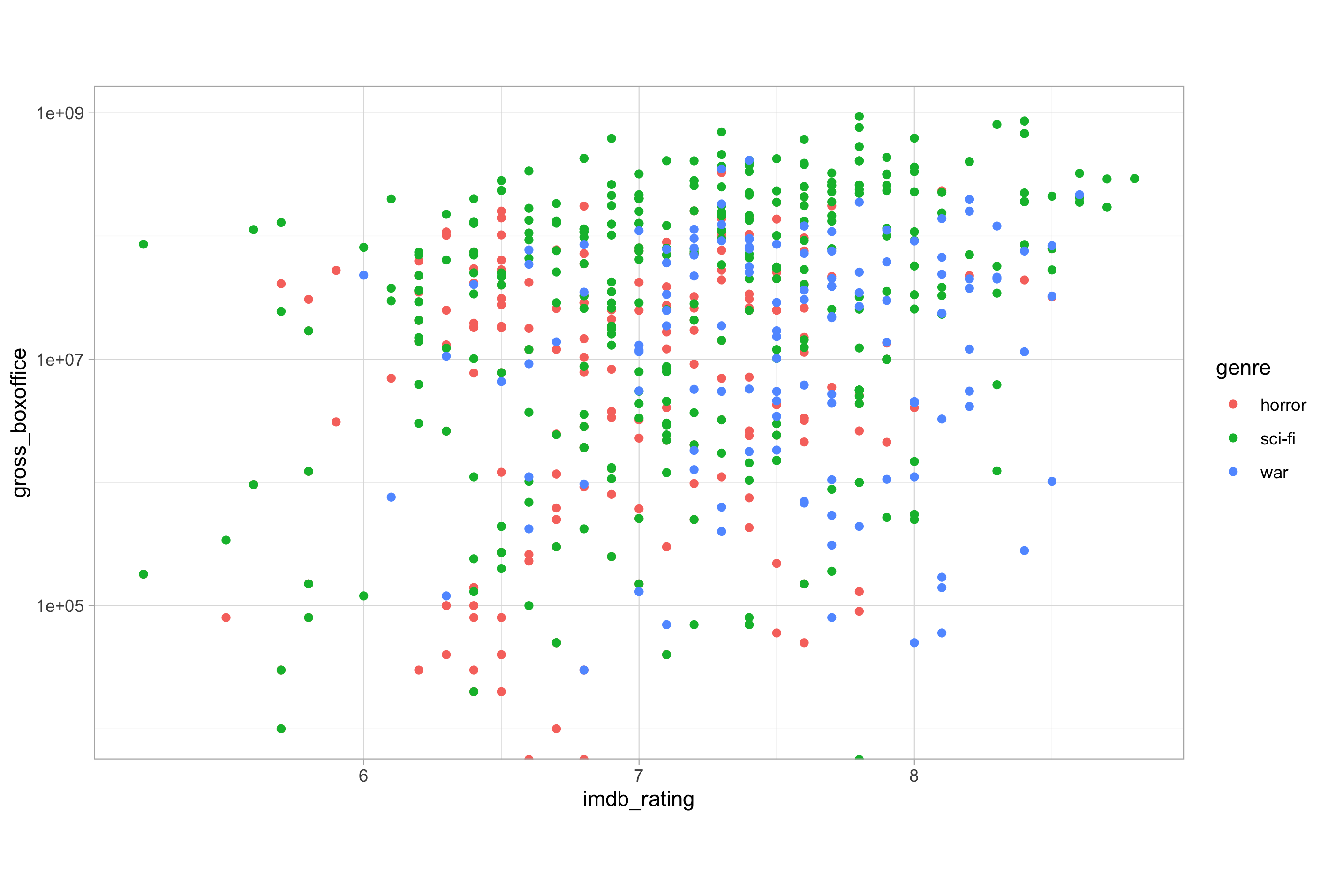
Modifying one of our earlier plots nicely demonstrates jittering and alpha blending in action:
# define the jitter variable using position_jitter()
jitter <- position_jitter(
  width = 0.1,
  seed = 123
)

# using jitter and alpha to combat overplotting
ggplot(imdb_data_clean, aes(x = imdb_rating, y = gross_boxoffice)) +
  geom_point(aes(colour = genre), position = jitter, alpha = 0.5) +
  scale_y_log10()
Histograms
A histogram is a special type of bar plot that shows the binned count distribution of a single continuous variable.
To create a histogram, we only need to map the x aesthetic to a single continuous variable and geom_histogram() will plot a binned version of the data. Here’s an example:
# plotting a histogram of movies over time
ggplot(imdb_data_clean, aes(x = year)) +
  geom_histogram()
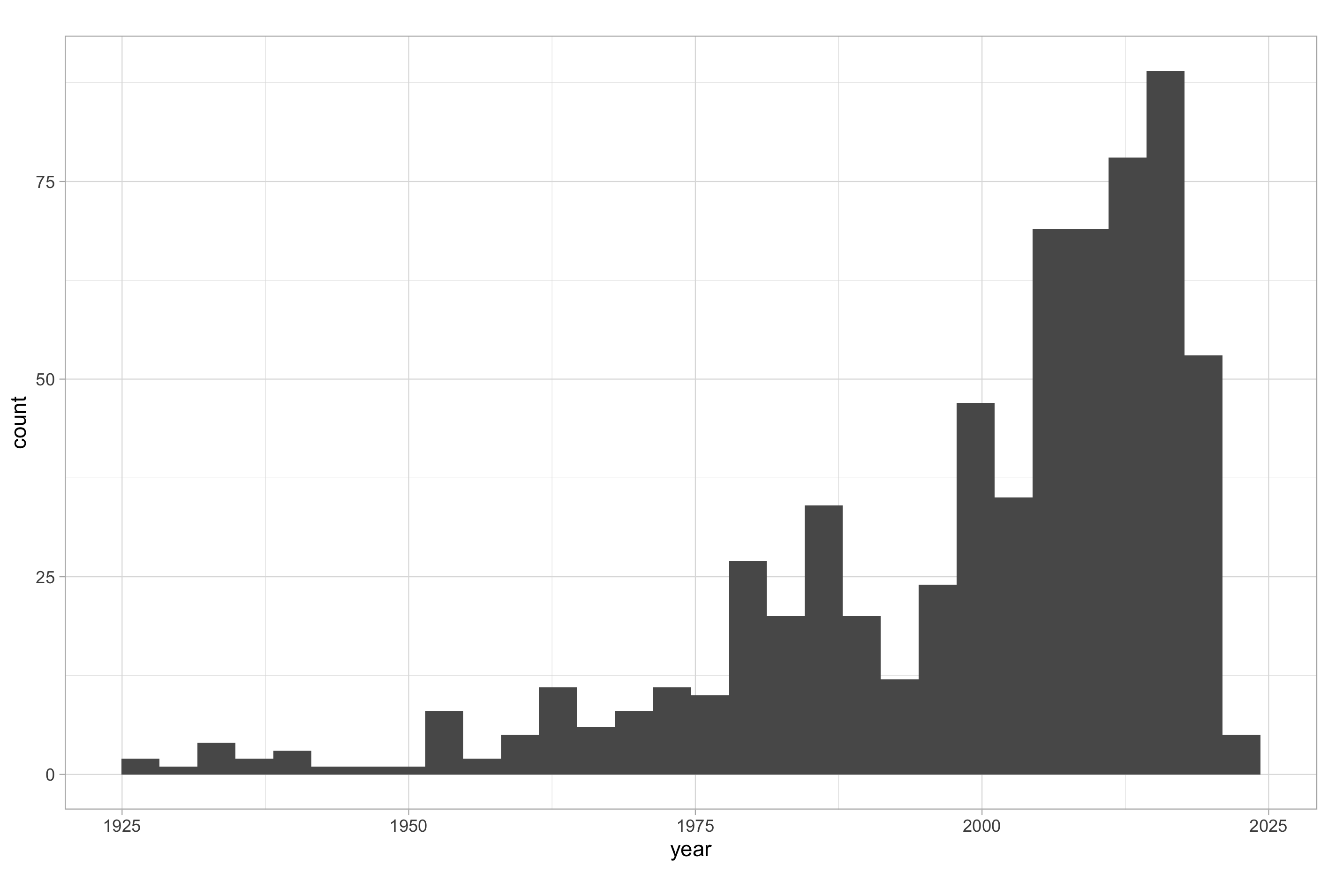
When you use geom_histogram() without any arguments, you will receive a message in the R console that reads:
`stat_bin()` using `bins = 30`. Pick better value with `binwidth`
The geom_histogram() is associated with a statistic called “stat_bin”, the number of bins calculated for the range of values mapped to the x aesthetic, which has a default value of 30.
You should use the bins or binwidth argument to set a more sensible value and give a more intuitive impression your data. Here, a bin width of around 3 years makes much less sense than a bin width of 1 year, 5 years or 10 years in terms of allowing the viewer to gain a meaningful impression of the frequency distribution of the number of movies over time.
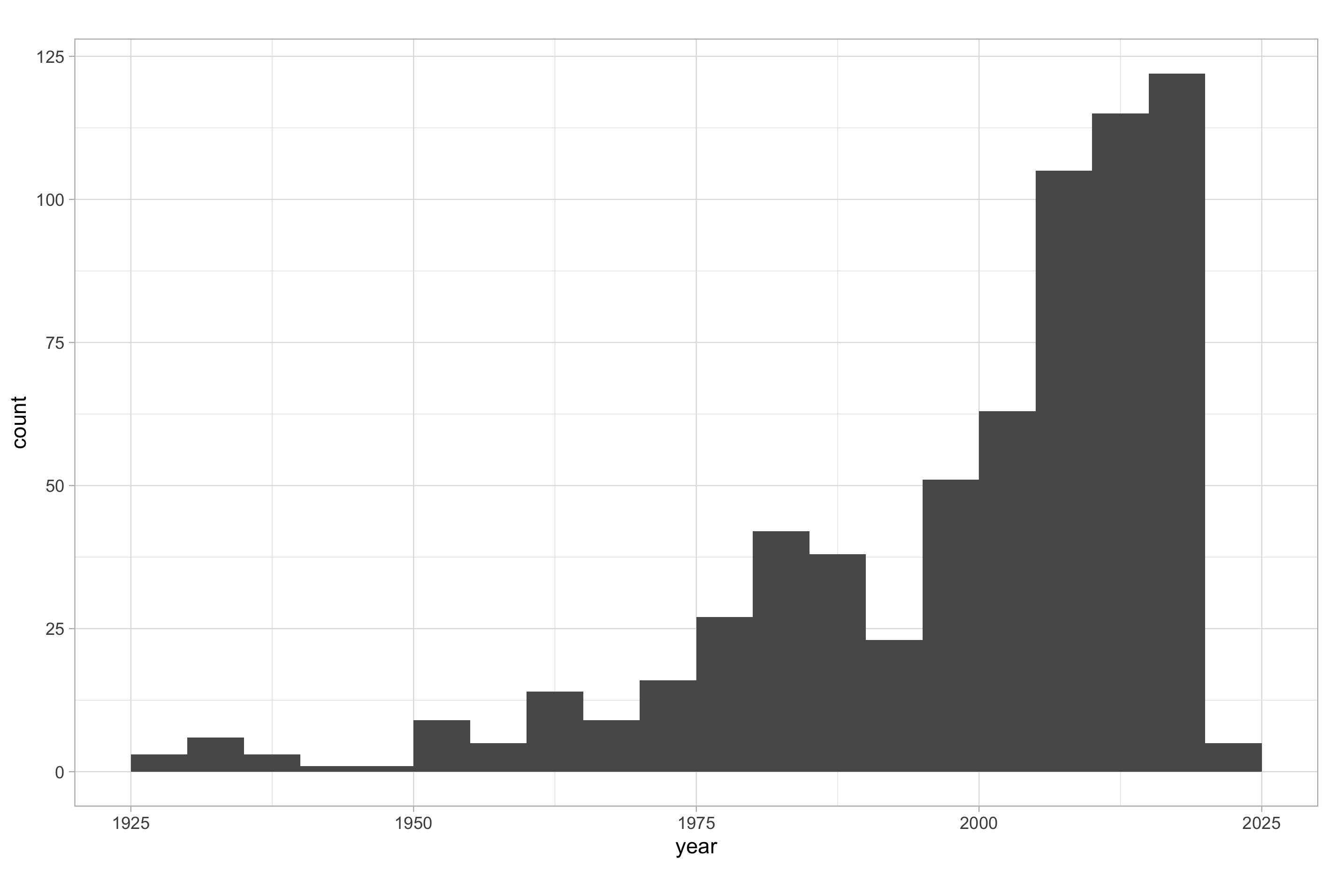
Note that there is no space between the histogram bars; this emphasises the fact that it is a representation of an underlying continuous distribution. For this reason, the labels on the X-axis shouldn’t fall directly on the bars, but between the bars; they represent intervals and not actual values. Setting the center argument to half that of the value assigned to binwidth does the trick.
In the below example I have set a more intuitive bin width and altered the label position:
# plotting a more intuitive histogram of movies over time
ggplot(imdb_data_clean, aes(x = year)) +
  geom_histogram(binwidth = 5, center = 2.5)
As we have three genres of movie in our data set, we can fill the bars according to each genre making it so that we have three histograms in the same plotting space.
# plotting a histogram with a categorical variable
ggplot(imdb_data_clean, aes(x = year, fill = genre)) +
  geom_histogram(binwidth = 5, center = 2.5)
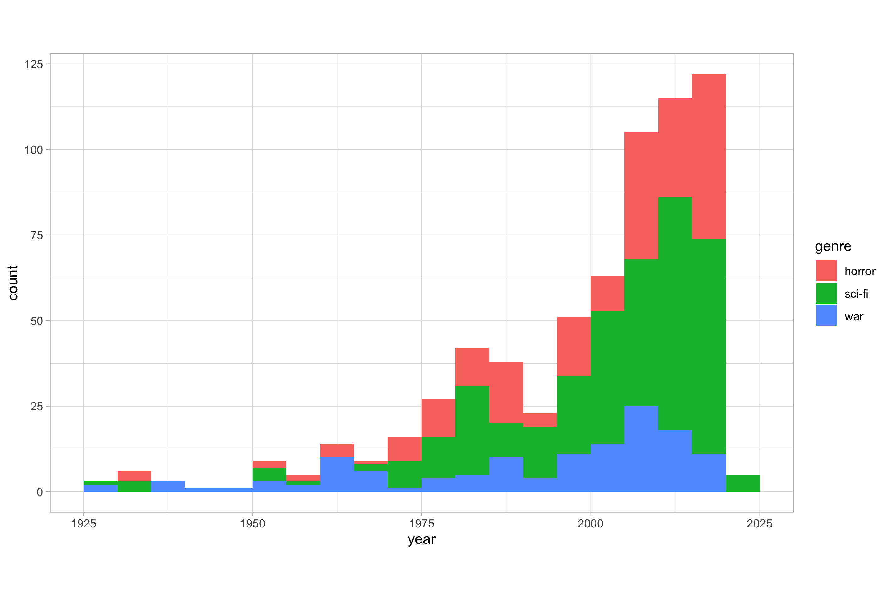
By default, this creates a perceptual problem; it is not immediately clear if the bars are overlapping or if they are stacked on top of one another. This occurs because the default for the position argument is “stack”. It also means that some bars can obscure others. Don’t risk confusing viewers with stacked bars.
Other than faceting, which we will cover in a future post, we basically have two alternatives: setting the position argument to either “dodge” or “fill”. Dodging the bars simply off-sets each data point in each category, while the “fill” position normalises each bin to represent the counts for each category as a proportion of all observations in that bin.
Here’s an example of dodging:
# histogram with a categorical variable and position = "dodge"
ggplot(imdb_data_clean, aes(x = year, fill = genre)) +
  geom_histogram(binwidth = 5, center = 2.5, position = "dodge")
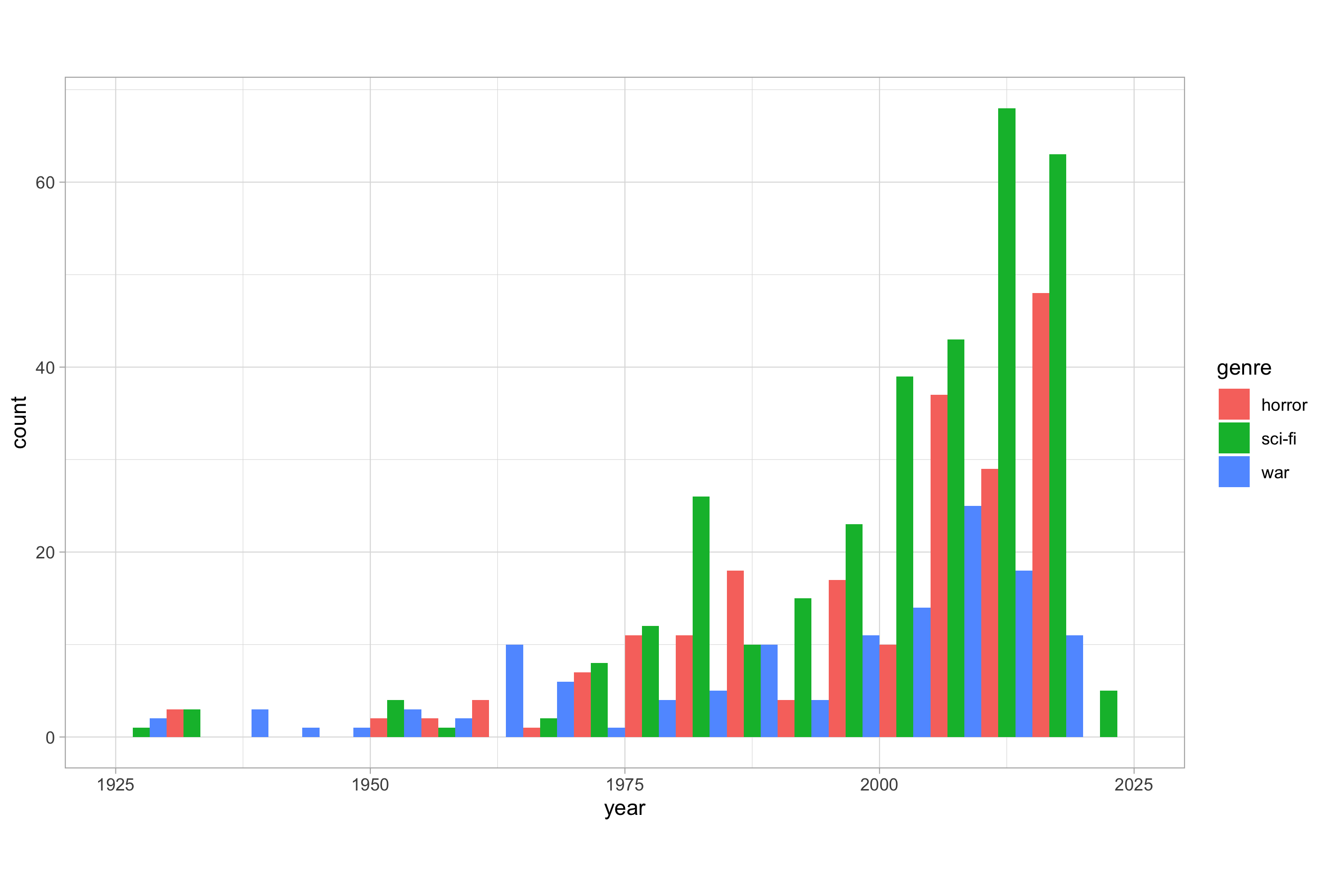
As you can see, dodging doesn’t really work in this instance as it is difficult to clearly see what’s happening. We’ll encounter dodging again later in instances where it can be used to good effect.
Here’s an example of using the “fill” position:
# histogram with a categorical variable and position = "fill"
ggplot(imdb_data_clean, aes(x = year, fill = genre)) +
  geom_histogram(binwidth = 5, center = 2.5, position = "fill")
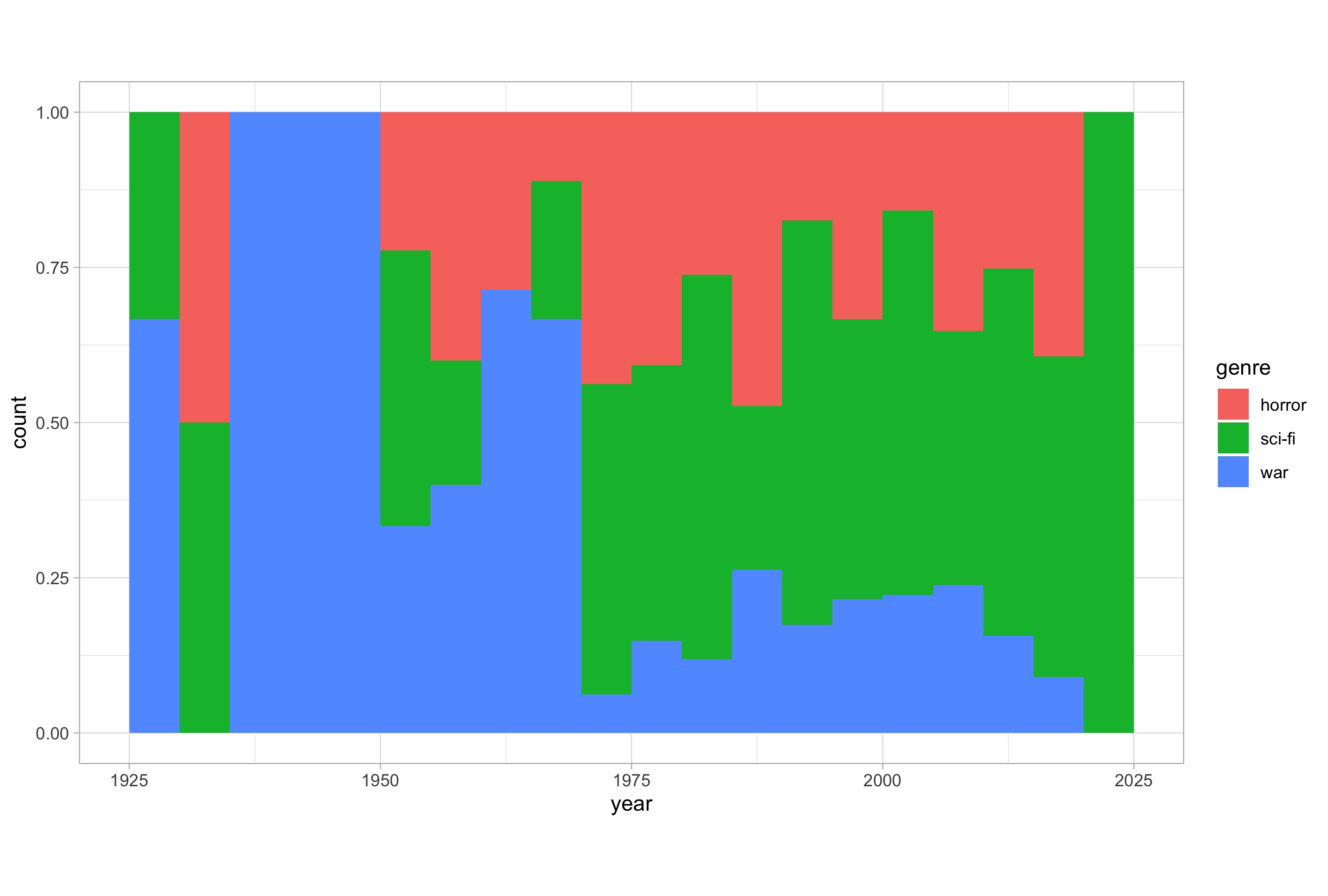
This is better than dodging but still somewhat confusing without further modification. Note that the Y-axis title doesn’t change automatically but it should say now say “proportion” and not “count”. We’ll see how to modify things like the axis titles and other non-data ink plot components when we look at the theme layer.
Bar Plots
Bar plots are useful when one of the mapped axes related to a categorical variable and the other a numeric variable.
There are two geom options for plotting bar plots: geom_bar() or geom_col(); the distinction and which one to use is can be another sticking point for the uninitiated.
The first, geom_bar(), applies a statistical summary to the data, “stat_count” by default, so it’s default behaviour is to count the number of cases in each category of the variable mapped to the X-axis.
# default behaviour of geom_bar()
ggplot(imdb_data_clean, aes(x = genre)) +
  geom_bar()
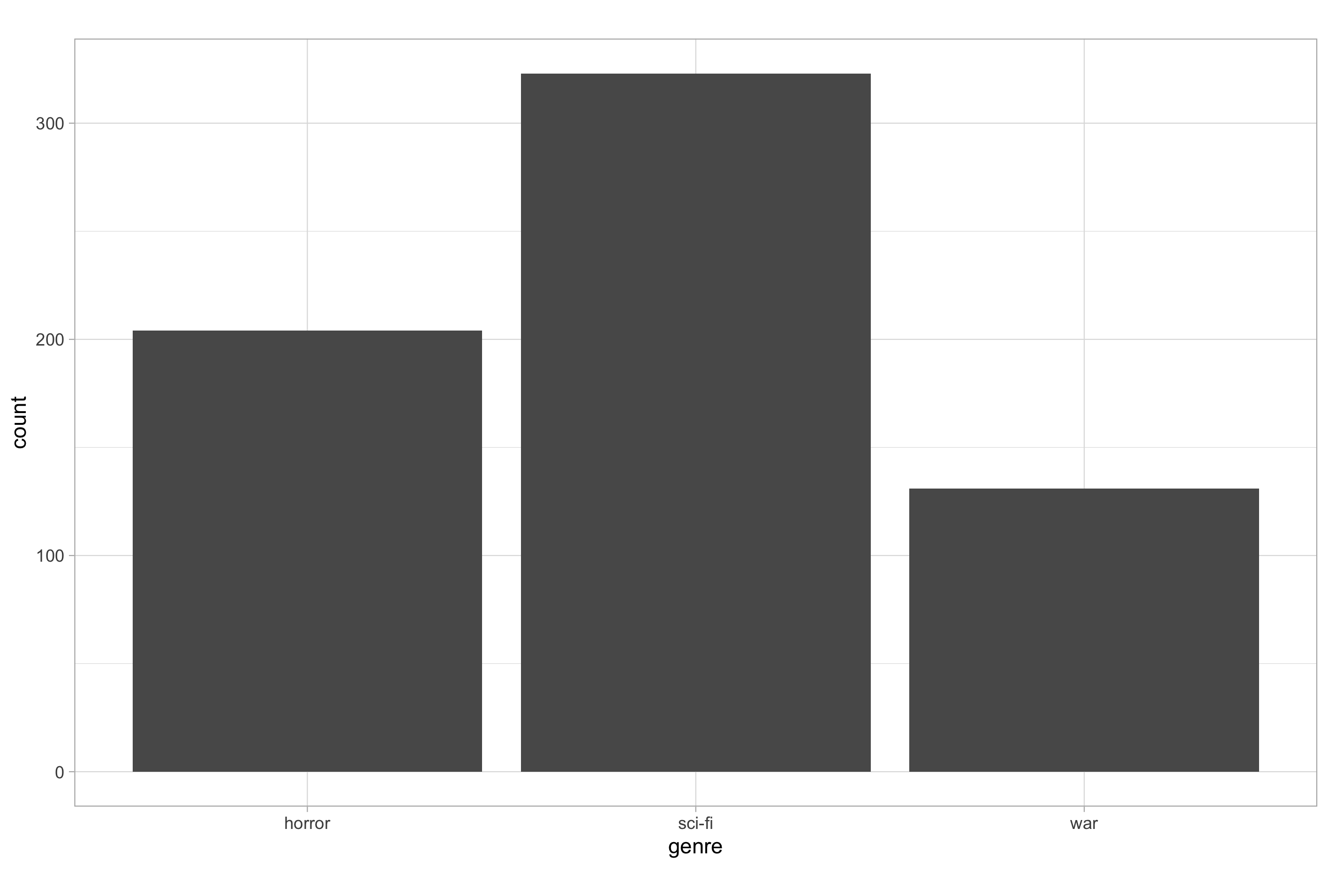
As this plot shows, the default behaviour of geom_bar() is to plot the univariate distribution of a categorical X-axis variable, i.e., a count of the number of observations in each category, in a similar manner to how geom_histogram() does for a each bin of a continuous X-axis variable.
By contrast, geom_col() plots the data as is using “stat_identity” so it will just plot values it finds in the data set, calculating a sum total value if multiple values exist in the data.
# default behaviour of geom_col()
ggplot(imdb_data_clean, aes(x = genre, y = runtime)) +
  geom_col()

One obvious distinction between geom_bar() and geom_col() is that the minimum number of aesthetic mappings required differs due to what each will plot by default; notice that geom_bar() only requires an X-axis variable (and will complain if you try to give it two), while geom_col() requires both an X-axis and Y-axis variable to be mapped (and will complain if you try to give it just one).
The thing that I think confuses people with these two geoms is that, if you set the stat argument of geom_bar() to “identity” it will behave the same as geom_col().
# force geom_bar() to behave as geom_col()
ggplot(imdb_data_clean, aes(x = genre, y = runtime)) +
  geom_bar(stat = "identity")
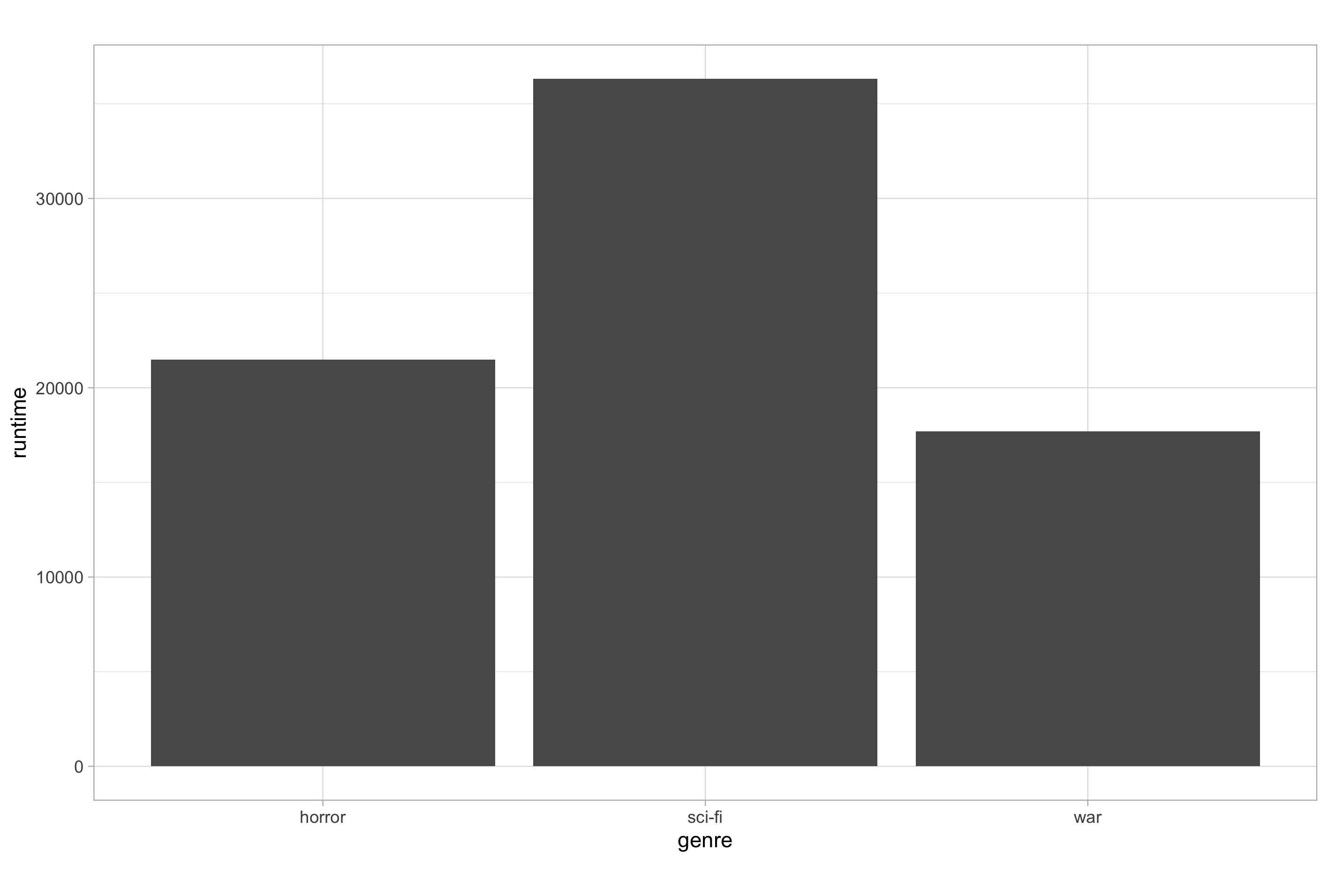
This demonstrates the point that geom_col() is just a convenient version of geom_bar() where stat and position are set to “identity” by default. The take away here is that you can use geom_bar() for all eventualities if you remember to alter its behaviour to your needs.
Something people will often want to do is plot a summary statistic other than the sum total for a continuous variable as a function of levels in a categorical variable e.g., the mean average. This requires that you either pre-calculate the summary statistic or modify the statistical transformation applied; we will cover these cases in the intermediate ggplot2 post series.
One final thing to mention here is regarding positions. All the positions we looked at for histograms are available for bar plots. The “stack” position is the default, and the “fill” position is available to show proportions. Just as with histograms, the “dodge” position is also available, though unlike with histograms, “dodge” is often the preferred position when plotting bar plots.
Just as with our position_jitter() example earlier, it is often more practical to use the position_dodge() function in order to explicitly set the amount of dodging you want, rather than just using “dodge”.
Line Plots
The last common plot type we are going to look at here is line plots, which are very well suited to plotting time-series data.
Let’s create a very simple time-series summary data frame to use in our examples; don’t worry if you don’t understand the code, just run what’s provided and then lookout for my future posts on data manipulation where we will learn all about the functions you see here.
# data frame of thousands of votes cast for movies by decade
votes_by_decade <- imdb_data_clean %>%
  mutate(decade = 10 * (year %/% 10)) %>%
  group_by(decade) %>%
  summarise(thousands_votes = round(sum(votes)/1000))
We have just created a data frame that summarises the number of votes cast (to the nearest thousand) relating to IMDb score for movies made in each of the decades represented within the IMDb top-rated data, irrespective of genre. Now let’s plot these data:
# basic line plot of thousands of votes cast for movies by decade
ggplot(votes_by_decade, aes(x = decade, y = thousands_votes)) +
  geom_line() +
  scale_x_continuous(breaks = seq(from = 1920, to = 2020, by = 10))
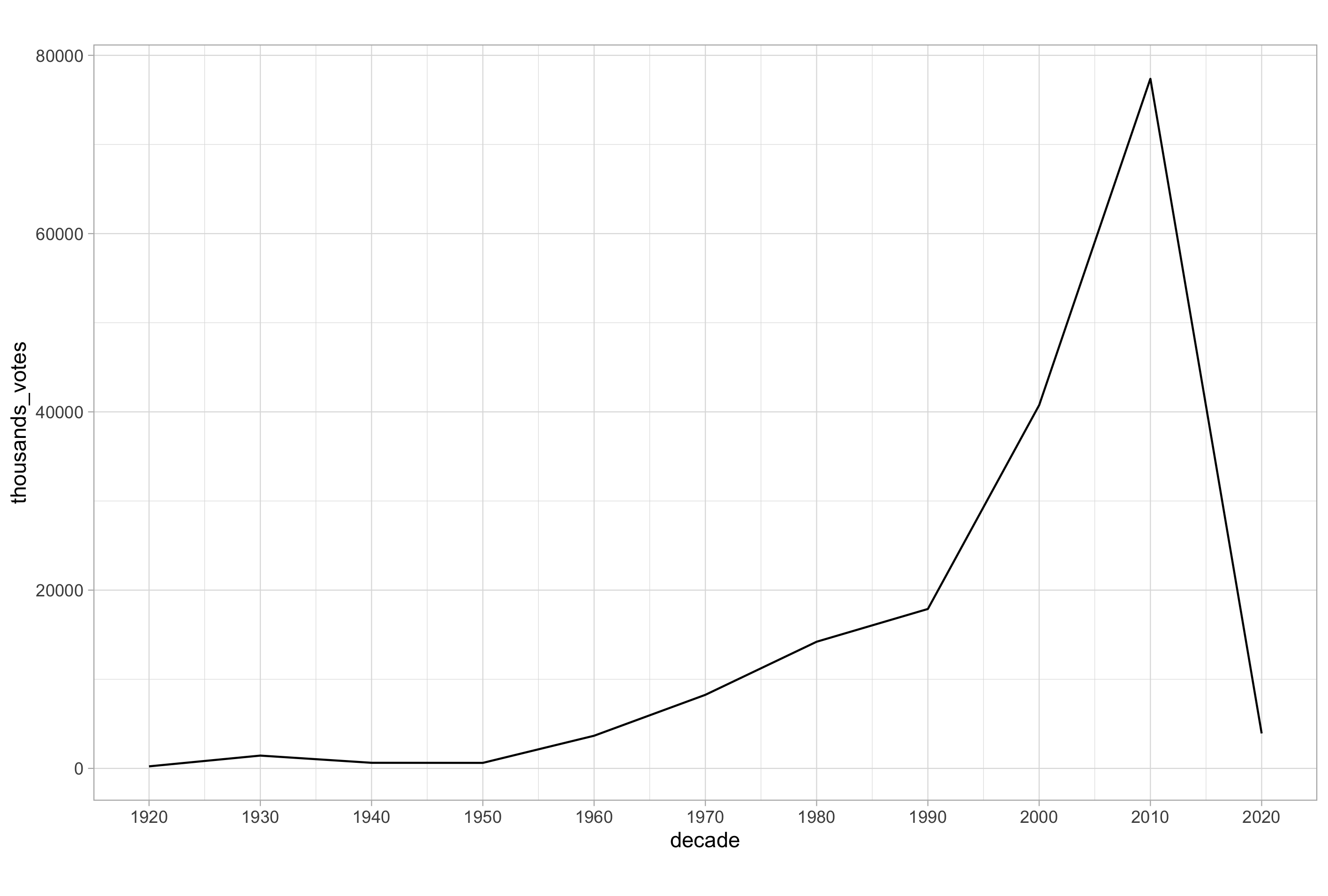
The basic line plot shown here follows a similar plotting syntax to what we’ve seen so far. I have also added a customisation to the X-axis scale to display the data intuitively. This is the simplest scenario, but we can of course add other variables.
Let’s modify the above code chunks to incorporate the genre variable:
# data frame of thousands of votes cast for movies by decade and genre
votes_by_decade_genre <- imdb_data_clean %>%
  mutate(decade = 10 * (year %/% 10)) %>%
  group_by(genre, decade) %>%
  summarise(thousands_votes = round(sum(votes)/1e+03))

# line plot of votes cast for movies made in each decade by genre
ggplot(votes_by_decade_genre, aes(x = decade, y = thousands_votes, colour = genre)) +
  geom_line() +
  scale_x_continuous(breaks = seq(from = 1920, to = 2020, by = 10))
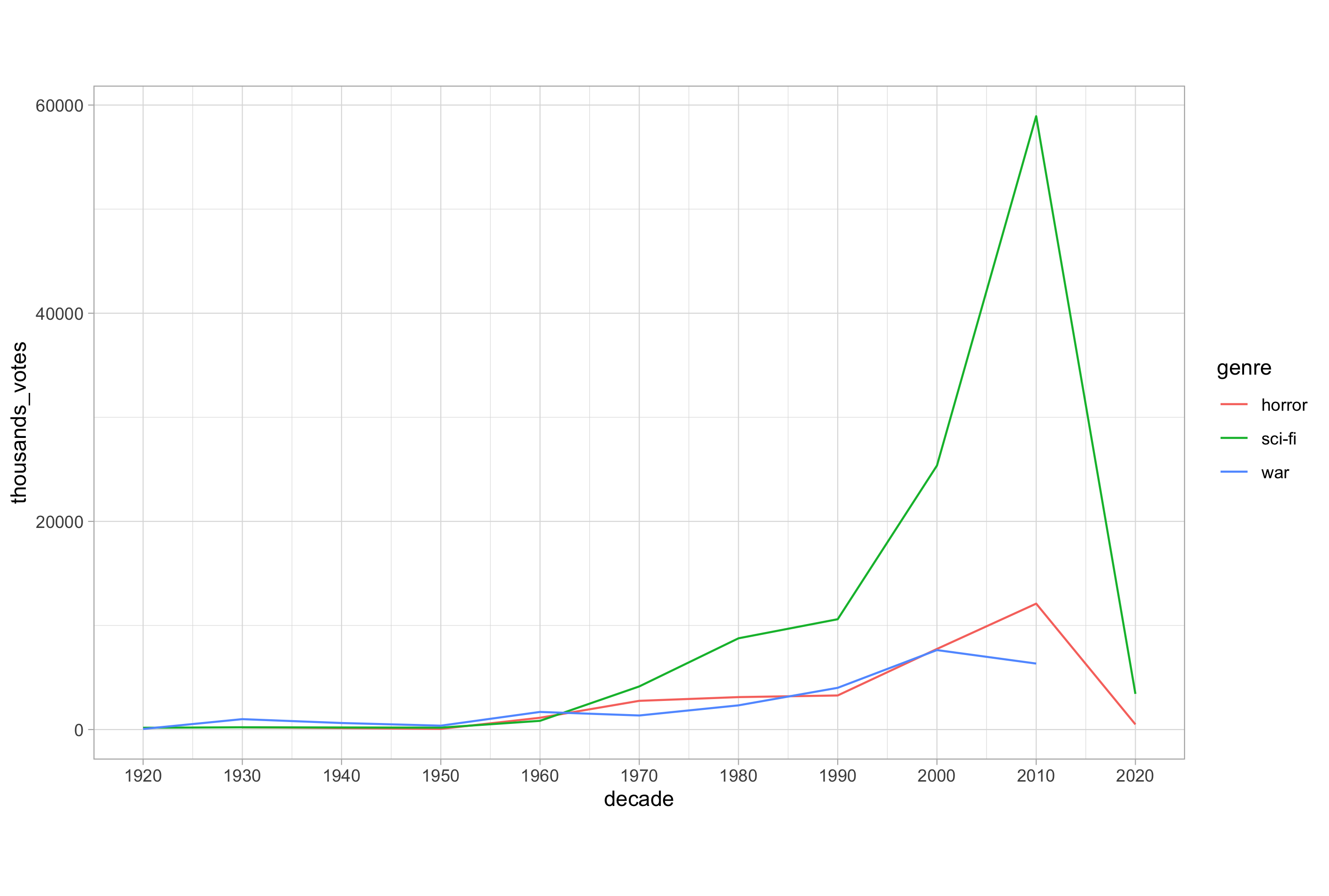
When we have multiple lines, we must consider which aesthetic is most appropriate in allowing us to distinguish individual trends.
Mapping to colour is often the most salient choice, when available since it provides the easiest way of distinguishing between each series. Mapping to linetype (the line plot equivalent of the shape aesthetic used in scatter plots) is also a possibility, but the number of line types available is limited and they can be difficult to distinguish when you have more than 3 or 4 levels in a categorical variable.
Summary()
That’s it for this post; a relatively long one but we have covered many important topics that will form the foundations for much of the plotting we will do in the next post and into the intermediate plotting with ggplot2 series.
Next time, we will look at the theme layer and probably my favourite part of the plotting process; customising all the non-data ink on your plots, after which you will be ready to make some publication quality graphs.
See you next time.
Thanks for reading. I hope you enjoyed the article and that it helps you to get a job done more quickly or inspires you to further your data science journey. Please do let me know if there’s anything you want me to cover in future posts.
Happy Data Analysis!
Disclaimer: All views expressed on this site are exclusively my own and do not represent the opinions of any entity whatsoever with which I have been, am now or will be affiliated.