In my last blog post I waxed lyrical about resurrecting a tutorial that had been unceremoniously kneecapped by Spotify’s changing API moods. Having patched authentication, sidestepped rate limits, and rebuilt the audio-feature workflow from the ground up, I figured I might as well put the data to work.
This time, the aim isn’t to rank tracks, crown champions, or argue whether White Lines deserves a higher spot (it does for it’s bassline alone); we’re going to take the familiar audio features, explore how they relate and determine whether PCA can help us make sense of how critics allocated their points. Party up.
Let’s load the pre-built dataset from last time that you can grab from here. Dependencies first.
# load packages
library(tidymodels)
library(tidyverse)

# custom plot theme
theme_custom <- function() {
  theme_light() +
    theme(
      axis.text = element_text(size = 10),
      axis.title.x = element_text(size = 12, margin = margin(t = 15)),
      axis.title.y = element_text(size = 12, margin = margin(r = 15)),
      panel.grid.minor = element_blank(),
      plot.margin = margin(1, 1, 1, 1, unit = "cm"),
      plot.title = element_text(size = 14, face = "bold", margin = margin(b = 10)),
      strip.background = element_blank(),
      strip.text.x.top = element_text(colour = "black", size = 9, hjust = 0),
      strip.text.y.right = element_text(colour = "black", size = 10, hjust = 0)
    )
}

# set plot theme
theme_set(theme_custom())

# load data
rankings_audio <- read_csv(here::here("data", "2020_04_14_rankings_with_audio_features.csv"))
Now with the data loaded, exploratory data analysis is our first task.
Da Art of Storytellin’
In his original Datawrapper article “The best hip-hop songs of all time, visualized”, Simon Jockers did a lot of the fundamental EDA legwork for us. I thought it would be nice to just rebuild his flagship plot with a few light embellishments to aid interpretability.
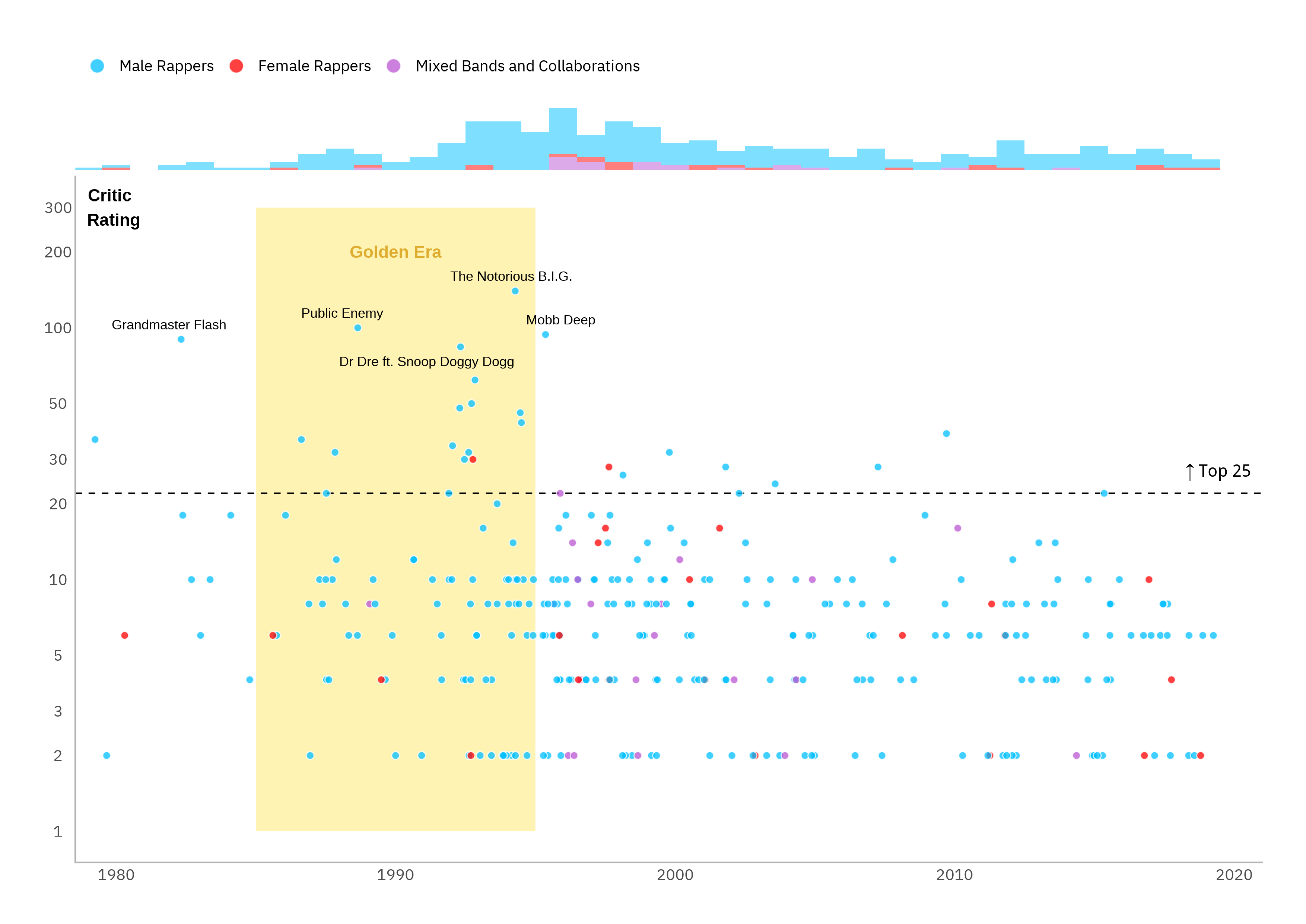
We can see that the most highly rated tracks are from the “golden era” of hip-hop between the mid-eighties and the mid-nineties, tailing-off into the new millennium with the emergence of next generation artists like Eminem, Outkast and Kanye West. We can also see that this is a male artist-dominated space with only two of the top 25 and none of the top 10 tracks being by female artists.
Before diving into PCA, it’s worth looking at the simple relationships between features. Even loose structure can guide interpretation later. A correlation plot lays out the story nicely.
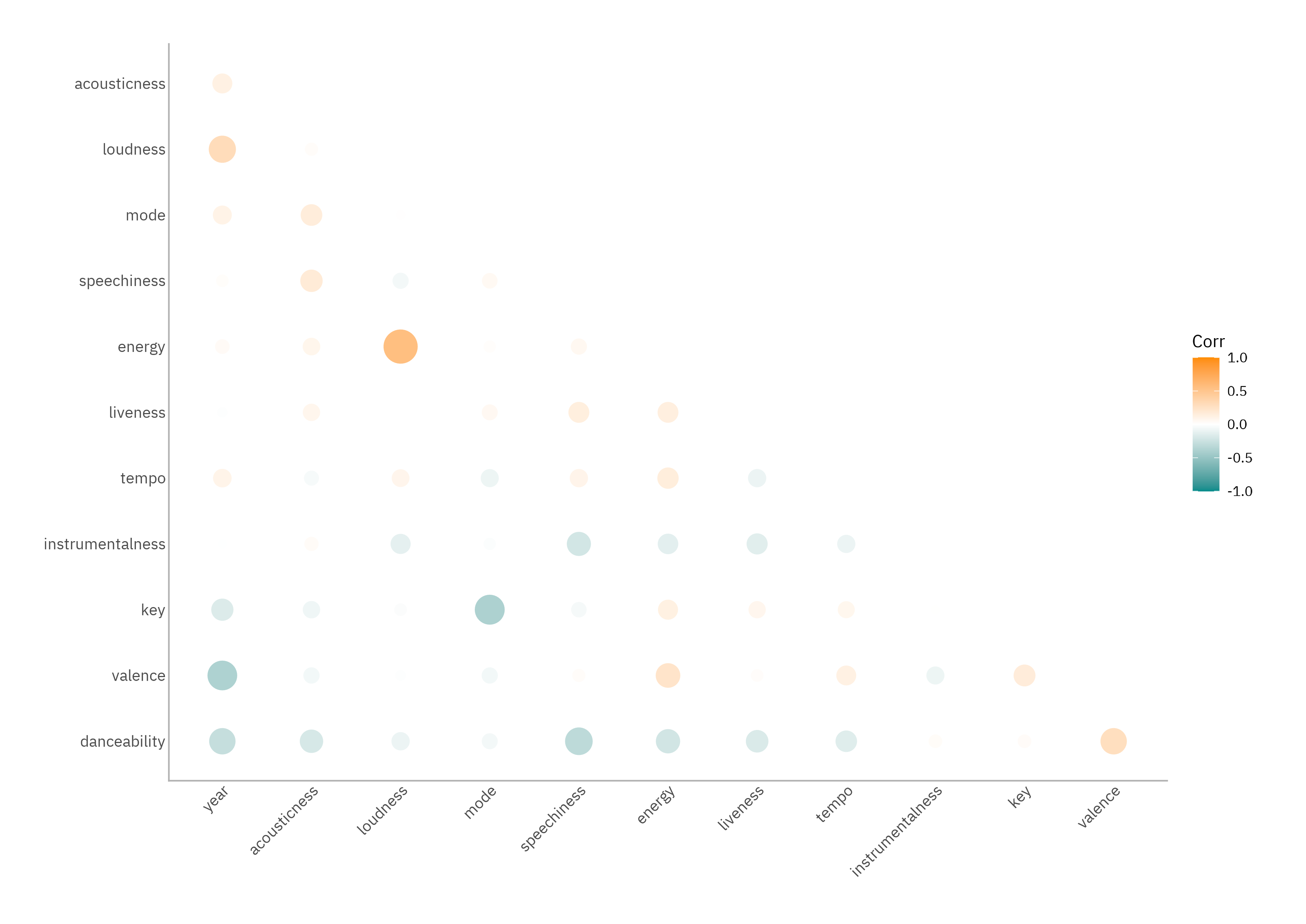
The absolute magnitudes here aren’t enormous (these aren’t omics data) but there are patterns worth keeping: newer tracks tend to be louder, less upbeat, and less danceable. Older ones lean more towards groove and positivity. This shouldn’t shock anybody who’s ever compared The Breaks (Kurtis Blow, 1980) to something released more recently. Energy, loudness, and valence also hang together: hype tracks are louder, more energetic, and generally more positive. Meanwhile, tracks heavy on speechiness tend to be less instrumental and less danceable. Makes sense.
As a final step before PCA, we can run a quick linear regression. The goal here isn’t prediction but orientation; it allows us to see which raw features, if any, appear associated with critic scores.
# model spec
lm_spec <-
  linear_reg() %>%
  set_mode("regression") %>%
  set_engine("lm")

# fit the model and wrangle the output
rankings_audio %>%
  select(points, year, acousticness:last_col()) %>%
  fit(lm_spec, log(points) ~ ., data = .) %>%
  broom::tidy() %>%
  filter(str_detect(term, "Intercept", negate = TRUE)) %>%
  rstatix::add_significance()
# A tibble: 12 × 6
   term             estimate std.error statistic   p.value p.value.signif
   <chr>               <dbl>     <dbl>     <dbl>     <dbl> <chr>
 1 year             -0.0307    0.00746   -4.11   0.0000557 ****
 2 acousticness      0.316     0.348      0.908  0.365     ns
 3 danceability      0.532     0.499      1.06   0.288     ns
 4 energy            0.144     0.501      0.288  0.774     ns
 5 instrumentalness  0.0106    0.422      0.0252 0.980     ns
 6 key               0.0173    0.0170     1.02   0.309     ns
 7 liveness          0.181     0.316      0.573  0.567     ns
 8 loudness          0.0215    0.0247     0.873  0.384     ns
 9 mode              0.0211    0.124      0.170  0.865     ns
10 speechiness      -0.0508    0.487     -0.104  0.917     ns
11 tempo             0.00241   0.00188    1.28   0.201     ns
12 valence          -0.304     0.323     -0.940  0.348     ns
Unsurprisingly, the only consistently significant predictor is year: older tracks score higher. The genre’s canon skews nostalgic. Hip-hop is one of the few areas in life where being around in the ’80s and ’90s is still a compliment.
Mask Off
Let’s see if PCA uncovers structure in the relationships between these features that we can reason about: the raw features alone don’t have an especially strong impact on the number of points allocated (with the exception of release year) but if PCA delivers as advertised, we’ll end up with a set of uncorrelated components that might reveal the underlying patterns in the data i.e., the hidden scaffolding that critics might have been responding to when they dished out their points, whether consciously or not.
We can use the recipes package within tidymodels for this and it’s much more elegant than the classic prcomp() workflow.
# data processing recipe
rankings_rec <-
  rankings_audio %>%
  select(!c(collab, gender, n:n5, spotify_id)) %>%
  recipe(points ~ ., data = .) %>%
  update_role(title, artist, new_role = "id") %>%
  step_log(points) %>%
  step_normalize(all_predictors()) %>%
  step_pca(all_predictors(), num_comp = 12)

# train the preprocessor
rankings_prep <- prep(rankings_rec)
The recipe we have defined does four important things:
- Strips non-predictive clutter
- Clearly marks the predictors and identifiers that will be useful for later interpretability while explicitly stopping them from participating in transformations
- Makes the numeric features comparable by centring and scaling (typically to mean 0 and standard deviation 1) ensuring that variables with larger numeric ranges don’t dominate
- Rotates these into a compact set of uncorrelated components
The log-transformation of points is essentially unrelated to the PCA analysis and will be most useful when we rerun the OLS linear regression later. OLS still assumes roughly constant score variance by year which hip-hop critics violate gently because variance shrinks in the streaming era, but PCA is our hedge against those pairwise assumption wobbles.
Once the recipe object is defined, the prep() call estimates everything that needs learning from the training data: the means and standard deviations for normalisation, and the PCA rotations. This results in a trained pre-processor you can then apply with bake(). The output is a compact set of orthogonal components that can be inspected for loadings, truncated based on explained variance, and interpreted individually.
To get the track coordinates in principal component space for our data set:
pc_coords <- bake(rankings_prep, new_data = NULL)
We will use these a little later. The next step is where running PCA via tidymodels rather than conventional workflows comes into it’s own.
It’s a little-known fact that the tidy() function from broom has S3 methods for the objects returned by a recipe or recipe step function. What this means is that it can be used to return a data frame containing information regarding a recipe or operation within the recipe. More specifically, in this case it means we can easily obtain the variable loadings and variance explained; the latter is also available as absolute or cumulative amount and percentage of total.
# variance explained
pca_vars <- broom::tidy(rankings_prep, number = 3, type = "variance")

# pc loadings
eig_vec <- broom::tidy(rankings_prep, number = 3, type = "coef")
Just to emphasise how relatively obscure this is: Julia Silge (the inspiration behind the previous post and one of the authors of tidymodels) used a much cruder method in her original tutorial, seemingly unaware of this functionality. That said, her method was still easier than how these are obtained when using prcomp().
A quick scree plot - because we can make a quick scree plot - confirms that the first four components capture just over half the variance.
# cumulative variance labels for above bars
cum_var <-
  pca_vars %>%
  filter(terms == "cumulative percent variance") %>%
  pull(value) %>%
  round(digits = 2)

# scree plot
pca_vars %>%
  filter(terms == "percent variance") %>%
  mutate(
    component = component %>%
      factor() %>%
      fct_inorder()
  ) %>%

  ggplot(aes(x = component, y = value)) +
  geom_col(colour = "midnightblue", fill = "midnightblue", alpha = 0.5) +
  geom_text(aes(label = cum_var), vjust = -1) +
  scale_y_continuous(limits = c(0, 20)) +
  labs(
    x = "Principal Component",
    y = "Variance Explained (%)"
  )
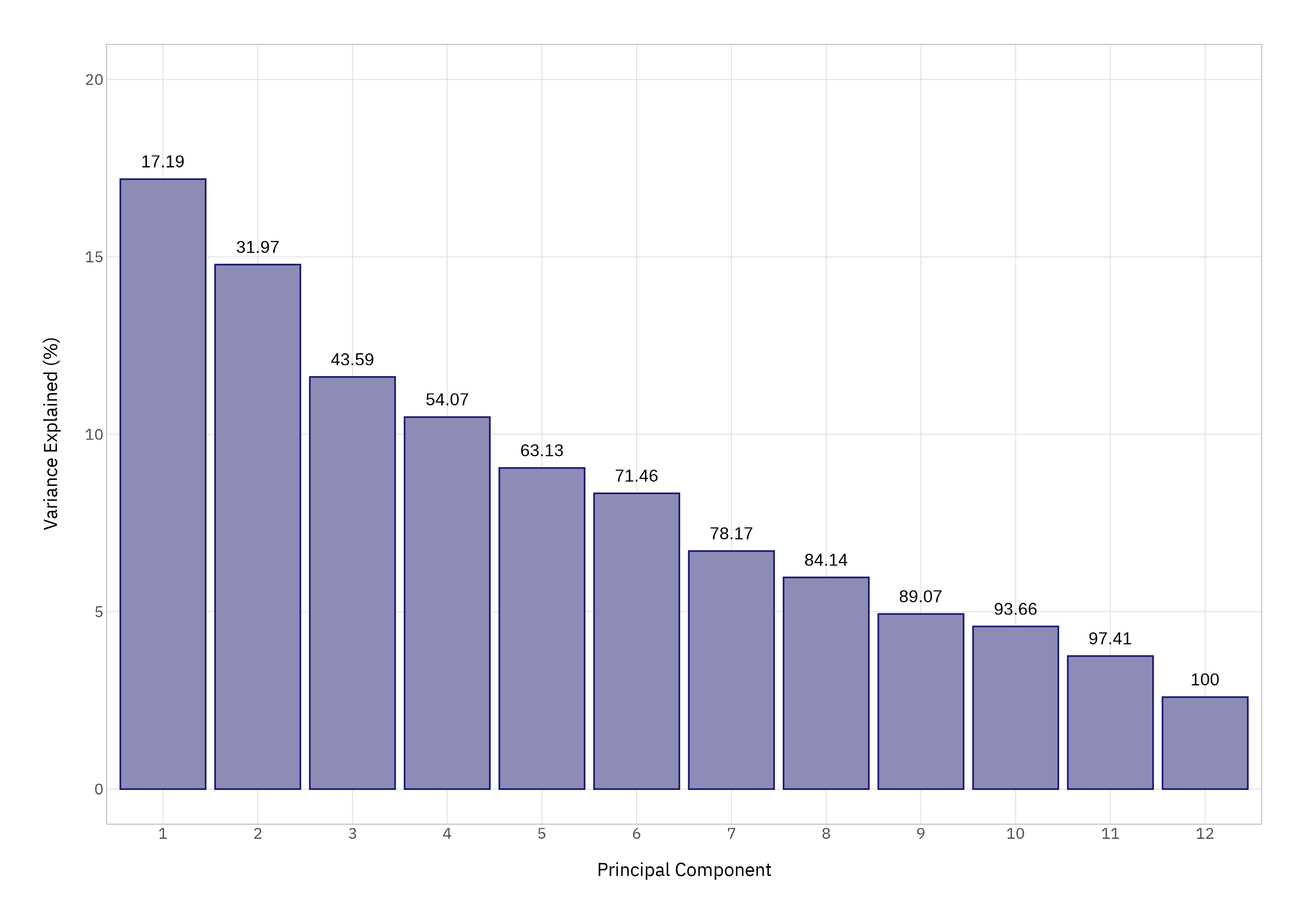
We’ll focus on those first four components; diminishing returns set in quickly.
The Message
The loadings plot for these components is where things get interesting. I haven’t shown the plotting code for the below so that the emphasis is on unpacking the insights that these plots deliver; these can easily be composed using the pc_coords and eig_vec objects that we have created, and some time playing with ggplot2.
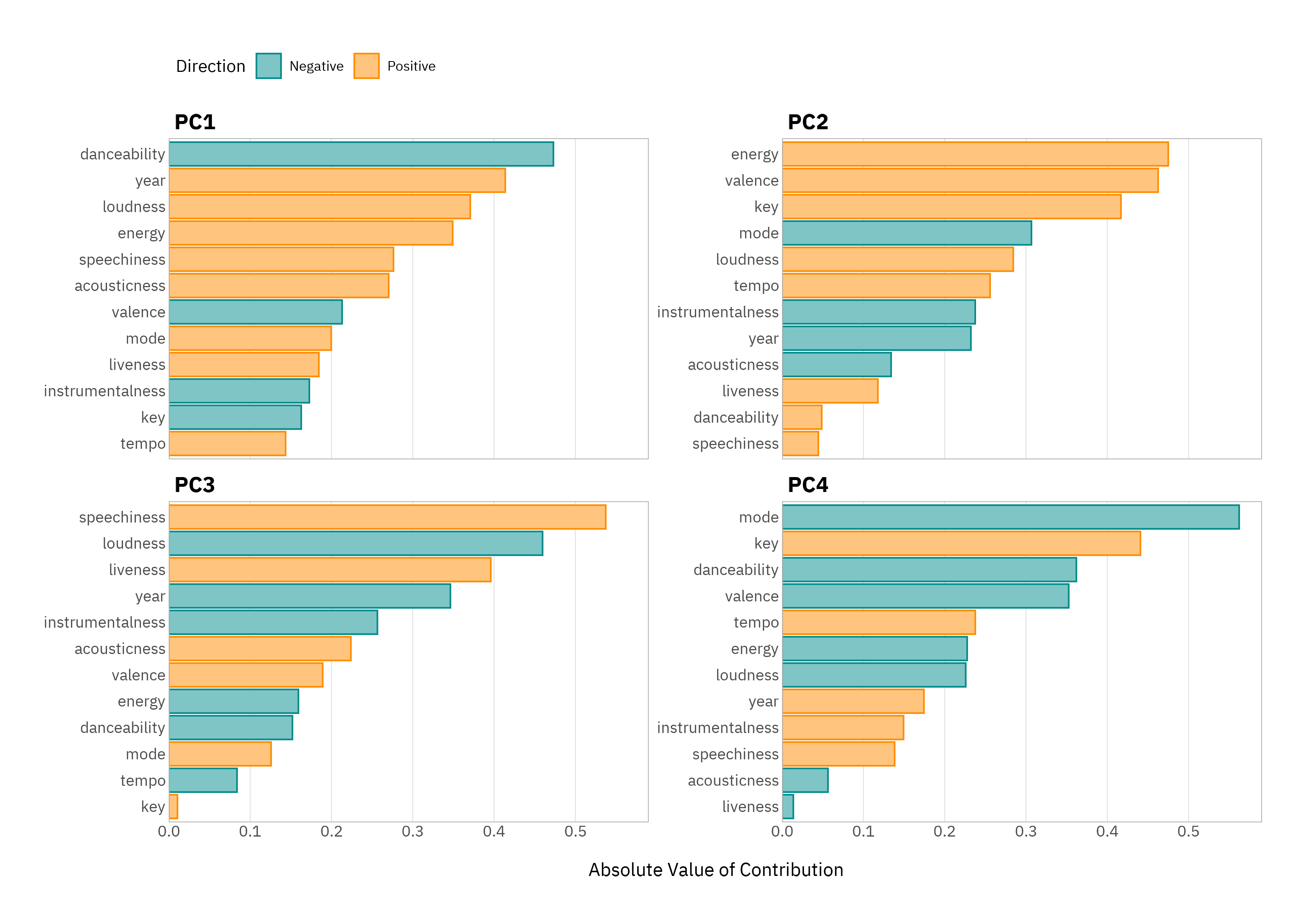
A few patterns jump out. PC1 is mostly about the danceability versus track release year; older tracks are more danceable. PC2 is the “good vibes versus gloom” axis - it’s mostly energy and valence. PC3 is mostly speechiness versus loudness - think spoken-word-heavy, less “produced” tracks versus more instrumented, polished ones. Finally, PC4 is about the musicality - key, mode, harmonic characteristics.
This is already more informative than the regression alone: PCA picks up the latent structure, not just pairwise relationships.
Plotting tracks using their coordinates along the first two components gives us an intuitive landscape to understand these patterns further.
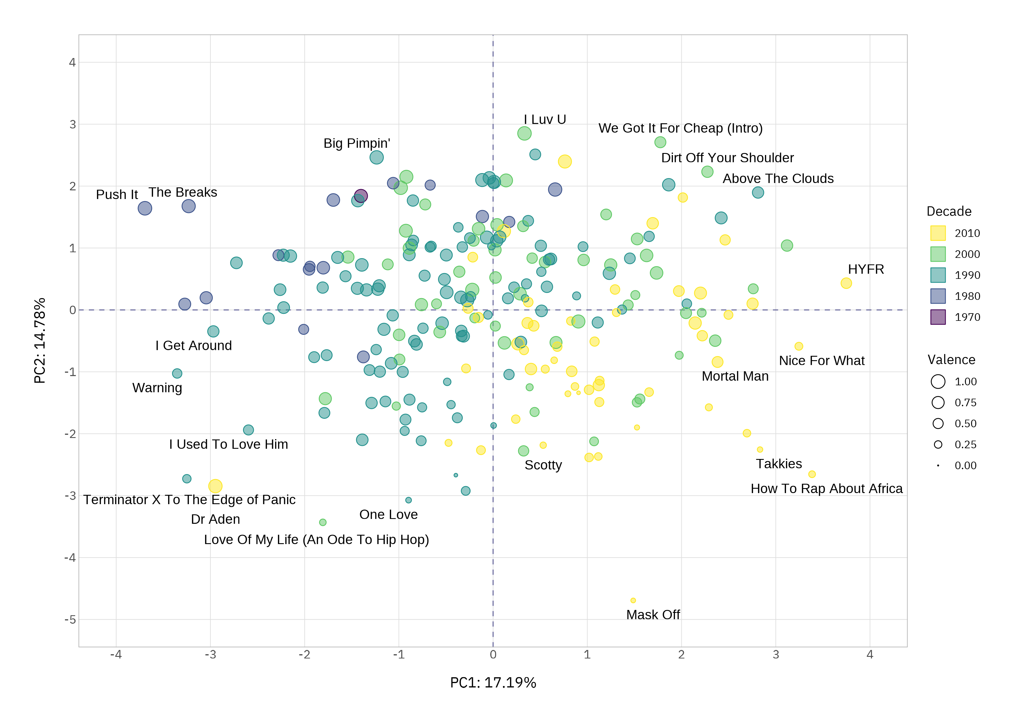
We can sanity-check this using the corners and by listening. In the top-left we should have old, danceable and high valence songs. Yes! The Breaks (1980) and Push It (1986) are definitely in this class. Bottom-right should be newer, less danceable, low energy and low valence songs. How to Rap About Africa (2016) and Mask Off (2017) confirm the data behaves.
Just in case there’s any doubt, we can see how the features we are interested in map onto the PCs in the biplot. Note that the coordinates have been rescaled here to match those of loadings.
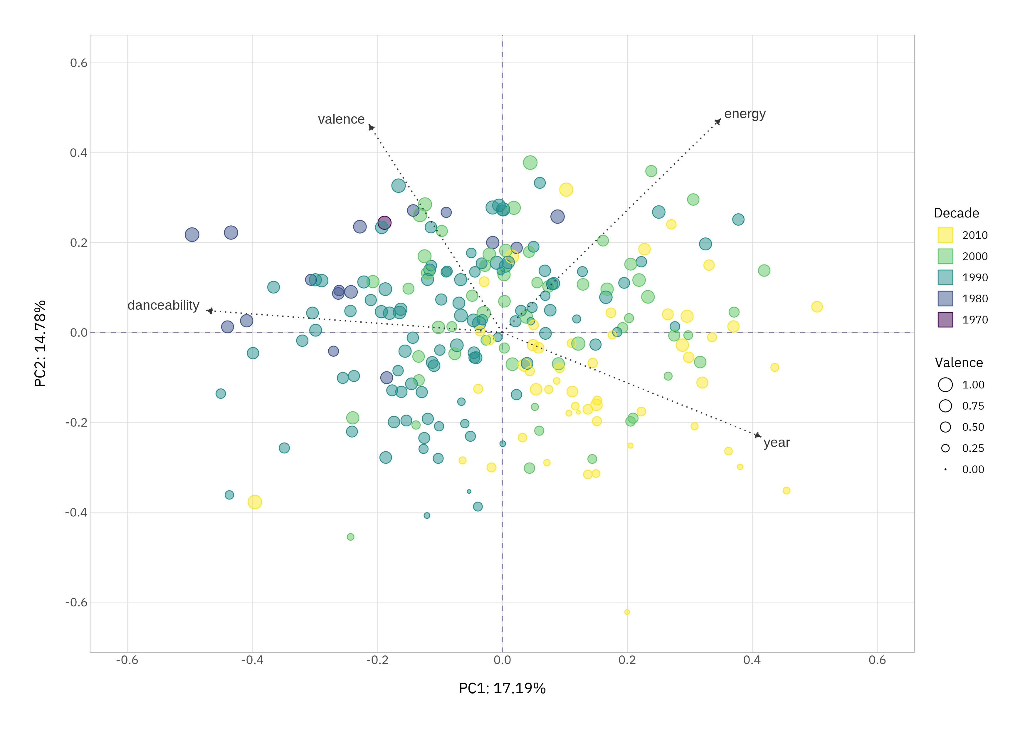
Whether or not your tastes align, PCA placement tracks the audio profiles.
Moment of Truth
Fitting a linear model with the PCA-derived features gives us the same signal but with more simplistic structure.
pc_coords %>%
  select(!c(title, artist)) %>%

  fit(lm_spec, points ~ ., data = .) %>%
  broom::tidy() %>%
  filter(str_detect(term, "Intercept", negate = TRUE)) %>%
  rstatix::add_significance()
# A tibble: 12 × 6
   term  estimate std.error statistic p.value p.value.signif
   <chr>    <dbl>     <dbl>     <dbl>   <dbl> <chr>
 1 PC01  -0.0816     0.0389    -2.10  0.0370  *
 2 PC02   0.106      0.0419     2.52  0.0125  *
 3 PC03   0.0560     0.0473     1.18  0.237   ns
 4 PC04  -0.0349     0.0498    -0.702 0.483   ns
 5 PC05   0.0304     0.0536     0.567 0.571   ns
 6 PC06   0.0566     0.0558     1.01  0.312   ns
 7 PC07   0.00672    0.0622     0.108 0.914   ns
 8 PC08   0.0113     0.0660     0.171 0.864   ns
 9 PC09  -0.0978     0.0725    -1.35  0.179   ns
10 PC10  -0.100      0.0753    -1.33  0.185   ns
11 PC11   0.231      0.0832     2.78  0.00597 **
12 PC12   0.0567     0.100      0.567 0.571   ns
Tracks that scored highest tend to be older, high valence and more danceable, which is why they tend to be sitting low on PC1 but high on PC2 and PC11 (which captures danceability independent of mood). Hip-hop critics, it seems, still have a soft spot for the old-school “move the crowd” ethos.
Where The Top 10 At?
One final visual: we can plot the top ten ranked tracks in PC space to confirm that this checks out.
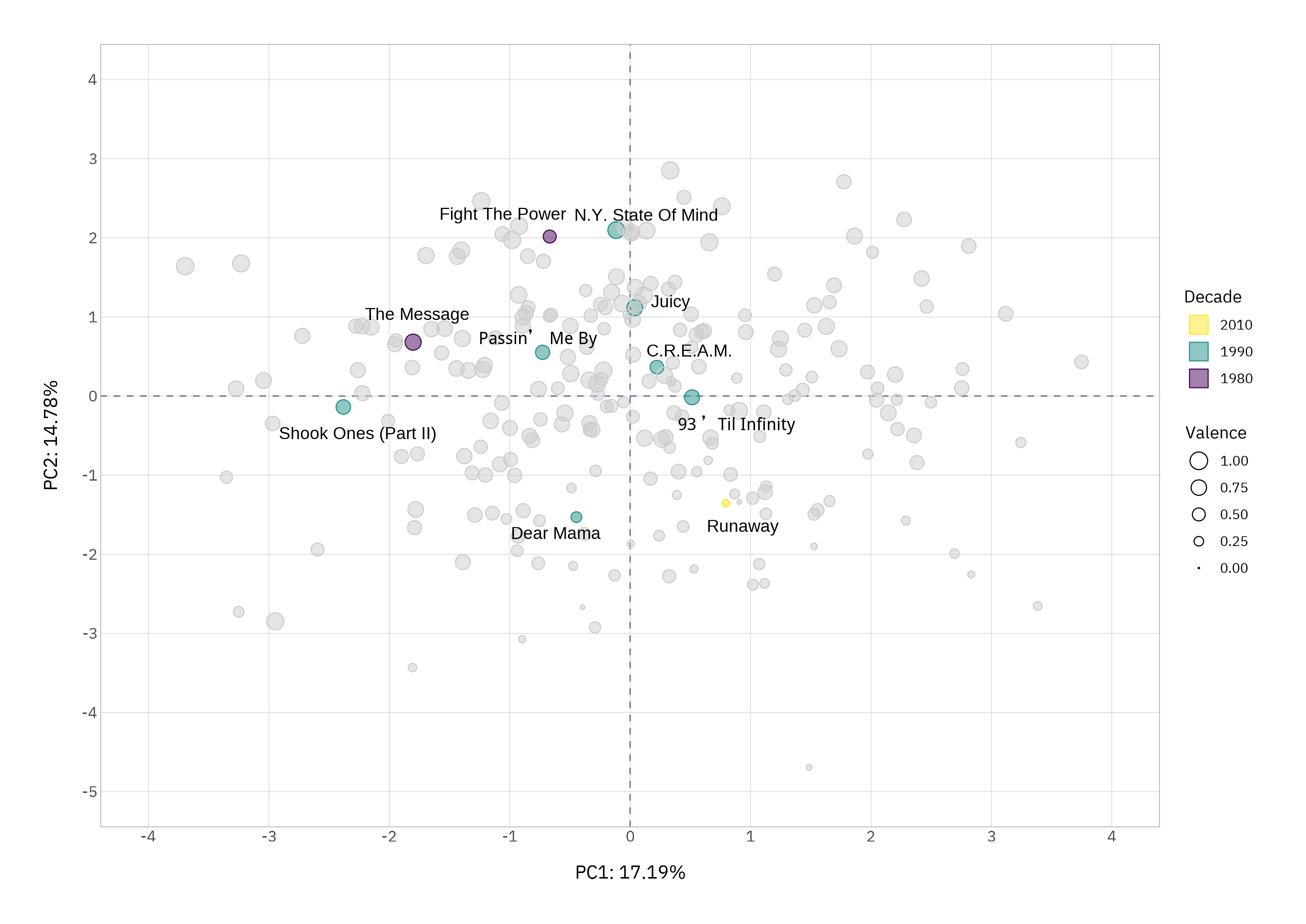
Most of the top ten sit in the top (6/10) or left (7/10) regions where older, high-energy, danceable, positive tracks dominate. The top-left quadrant contains more tracks in the top ten (4/10) than any of the other three.
A couple of “outliers” are interesting: Dear Mama by 2Pac (1995) is danceable, but also a melancholic, heartfelt, low-tempo, low-valence track. An absolute masterpiece that for me should sit joint top with Biggie’s Juicy (1994). PCA places it low on the happy dimension but left on danceability, which is uncannily accurate.
Runaway by Kanye West (2010) is less melodic and less emotive; it would still bag a net negative sentiment but for different reasons. It’s not a bad track, but lyrically there’s no comparison. PCA gives it a quiet corner of its own, which feels right musically and thematically.
The old school earn their stripes here for good reason.
Rapping Up
What PCA reveals here isn’t a new ranking or prescriptive formula for what makes a classic hip-hop track - it simply makes the structure of the genre visible: how groove, energy, positivity, and era intertwine.
While I still don’t understand how the critics left out some tracks (Gangsta’s Paradise, Who Shot Ya? and Forgot About Dre would get my vote) and ranked Push It at #137, it shows why they might have leant towards certain tracks; because the traits that characterise foundational hip-hop still resonate.
Catch you in the next one.
Thanks for reading. I hope you enjoyed the article and that it helps you to get a job done more quickly or inspires you to further your data science journey. Please do let me know if there’s anything you want me to cover in future posts.
If this tutorial has helped you, consider supporting the blog on Ko-fi!
Happy Data Analysis!
Disclaimer: All views expressed on this site are exclusively my own and do not represent the opinions of any entity whatsoever with which I have been, am now or will be affiliated.